Expressive Hand Lettering & Font Creation
This is my compilation of creations that are typography-related works. From traditional hand lettering to digitally creating a font along with the type specimen for that font.
This is my compilation of creations that are typography-related works. From traditional hand lettering to digitally creating a font along with the type specimen for that font.

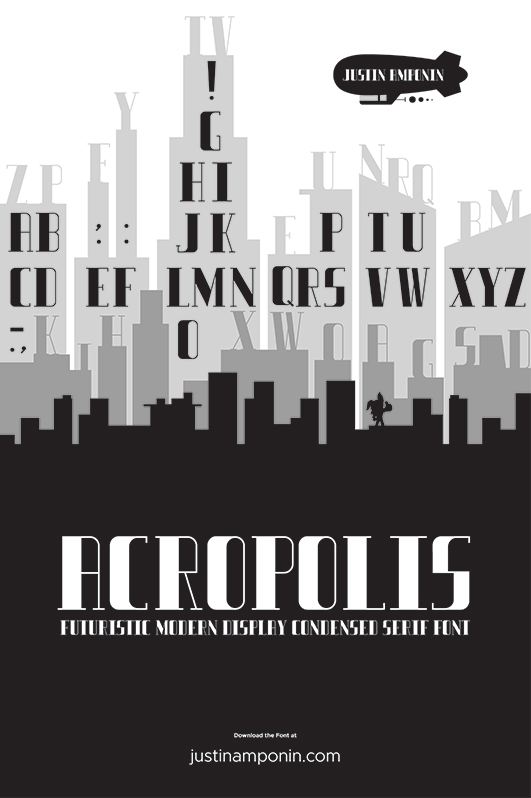
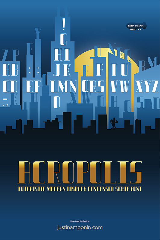
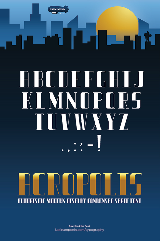
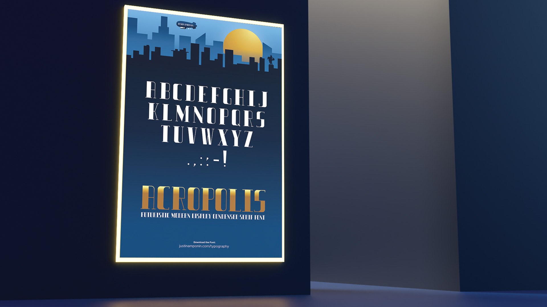
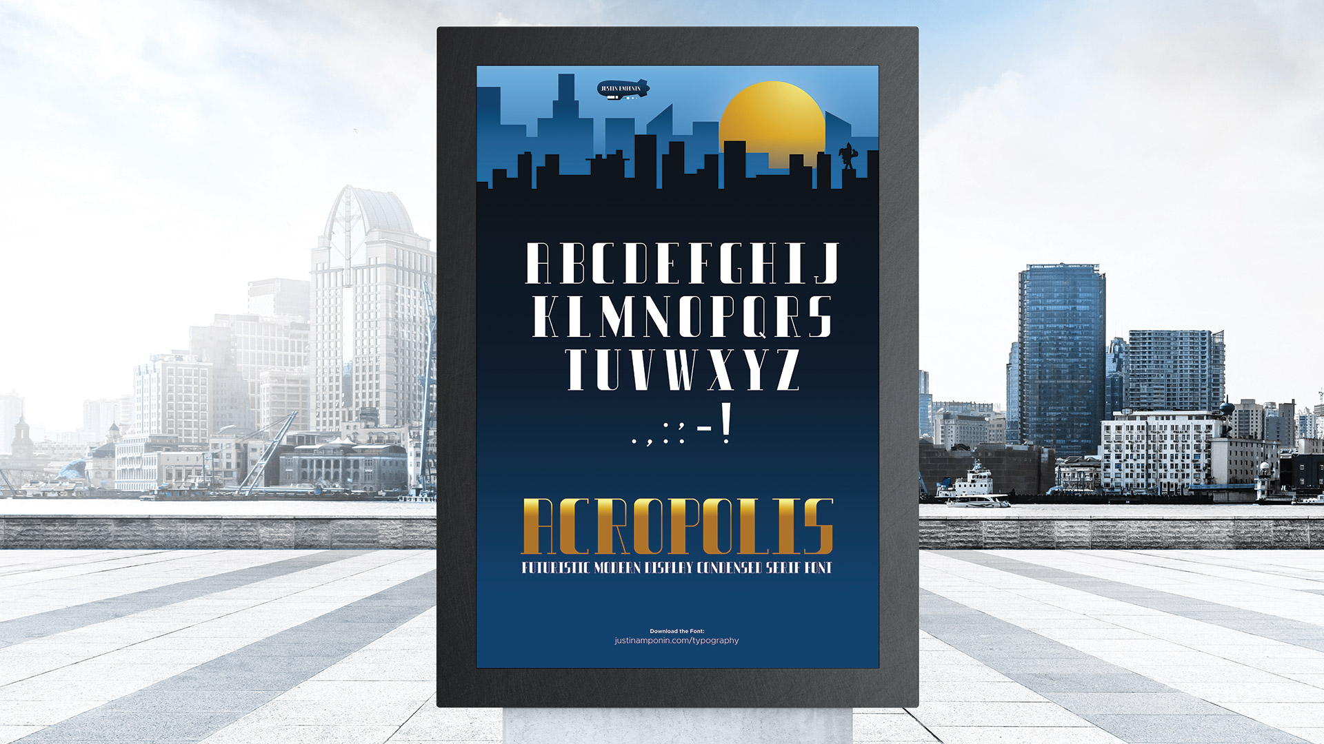
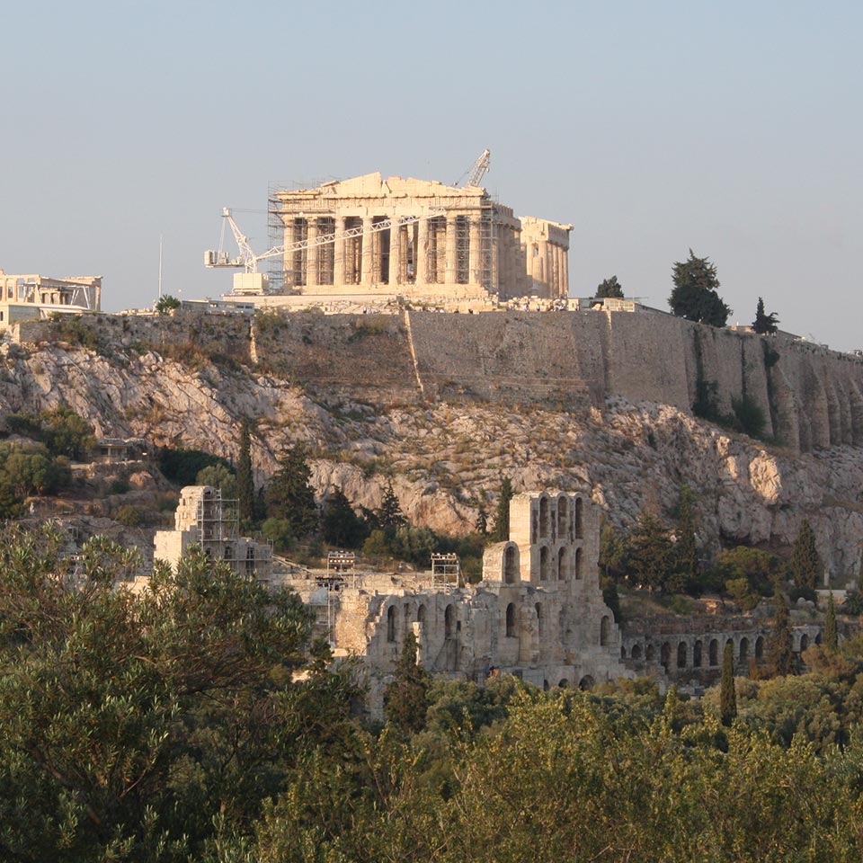
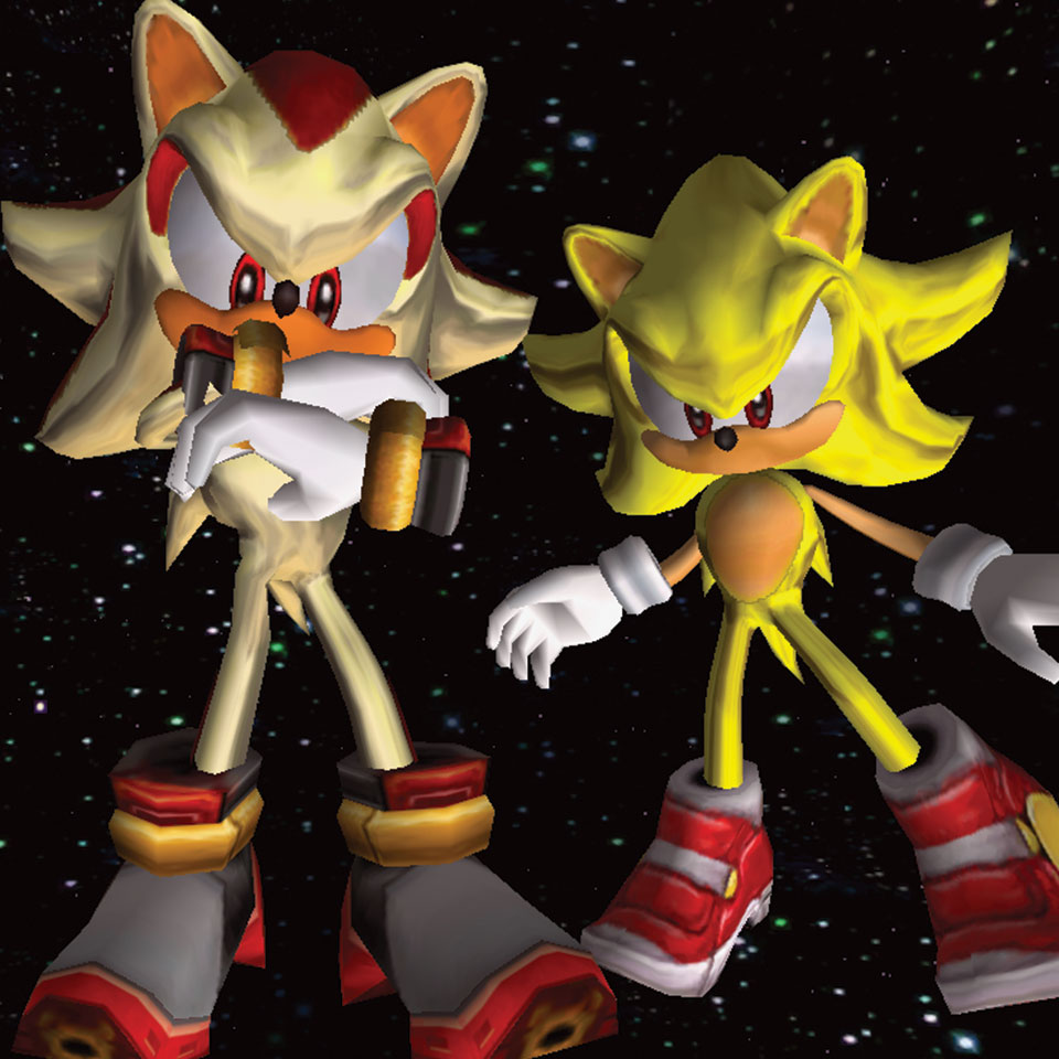
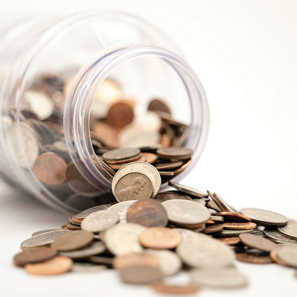
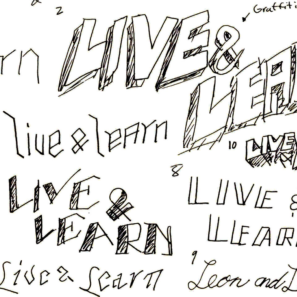
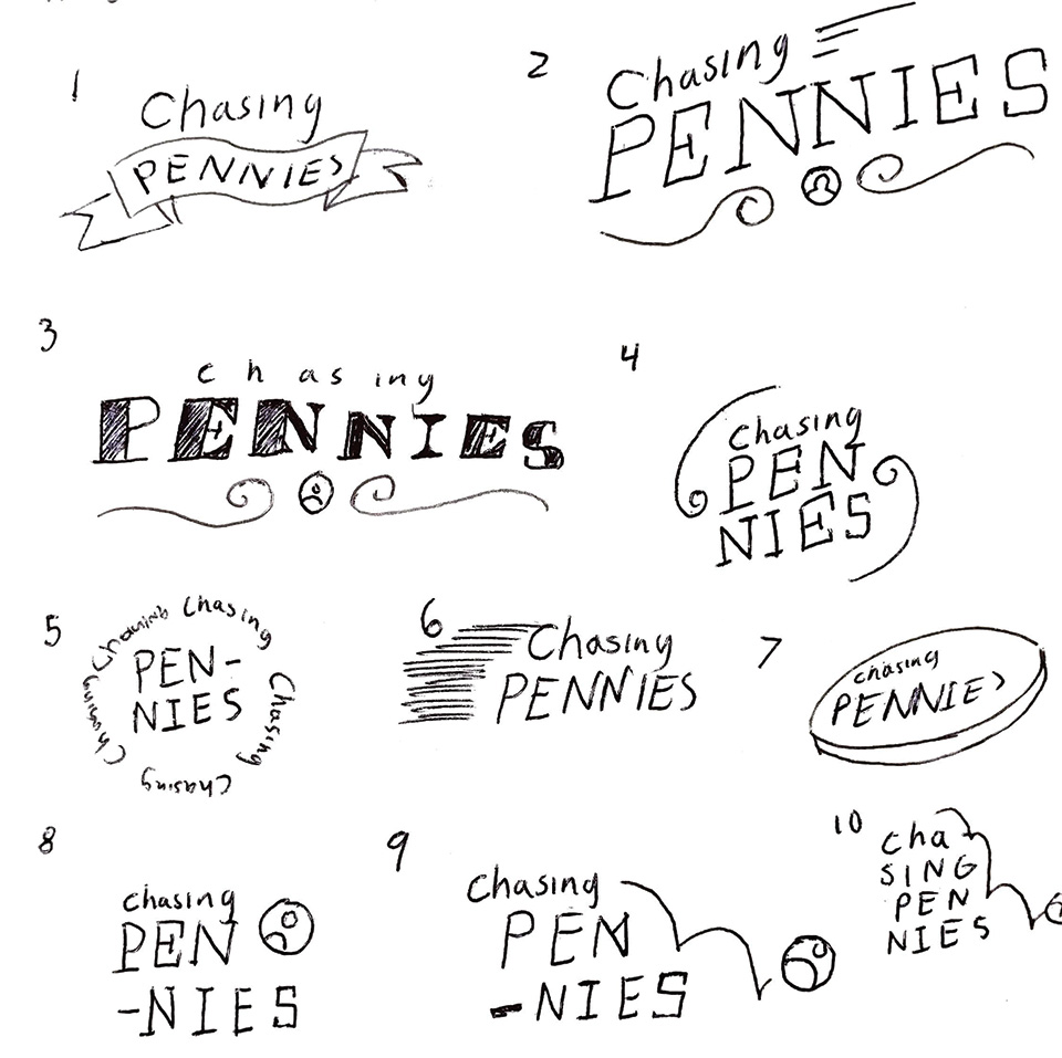
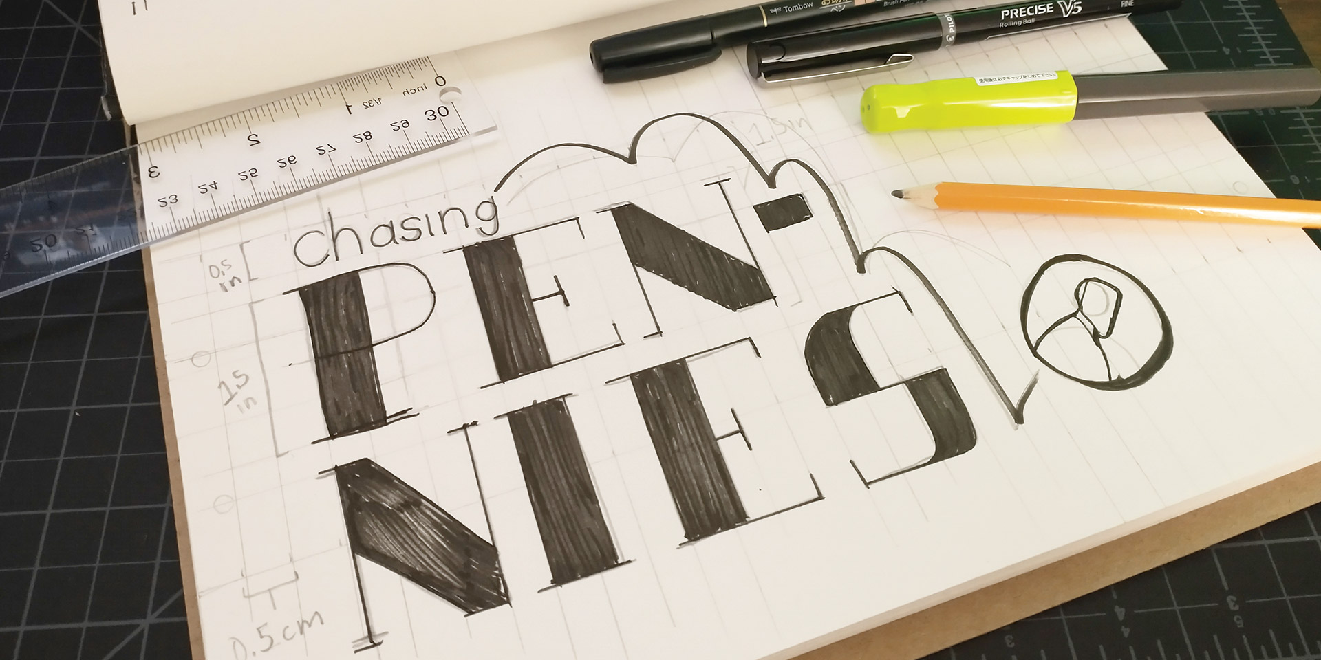
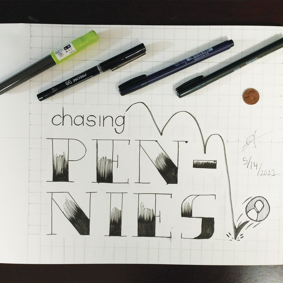
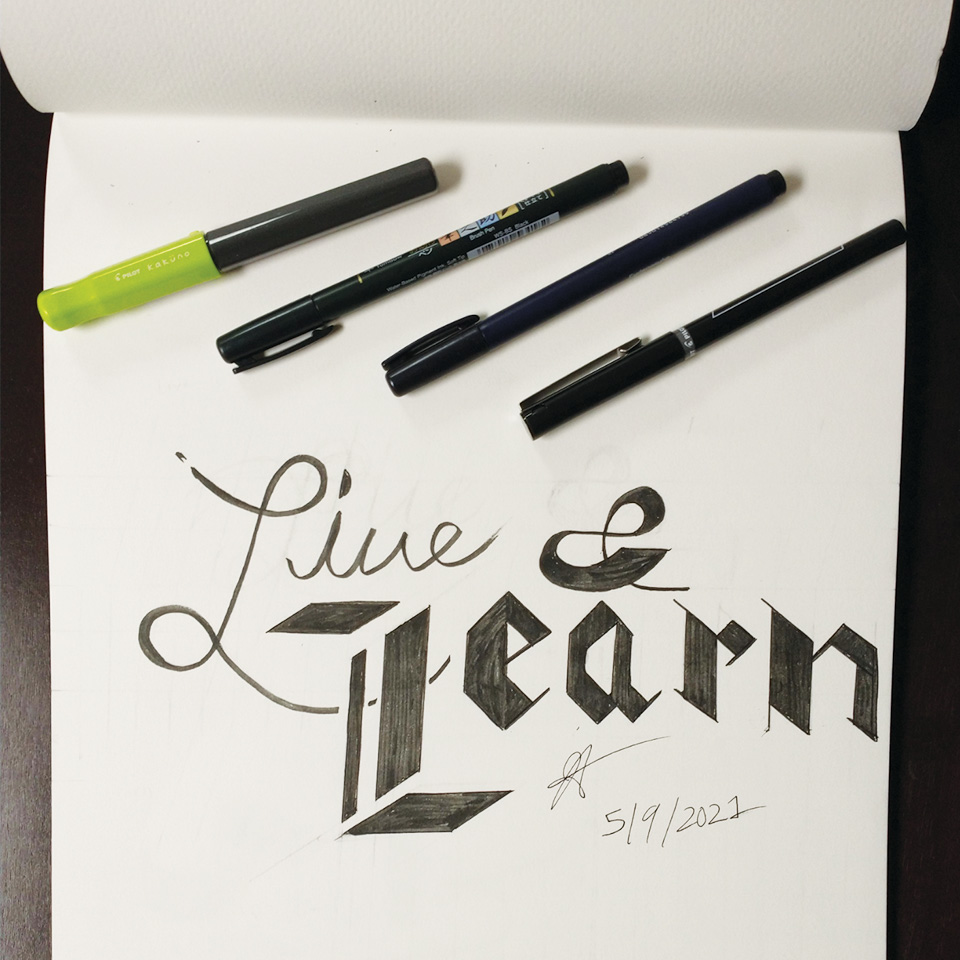
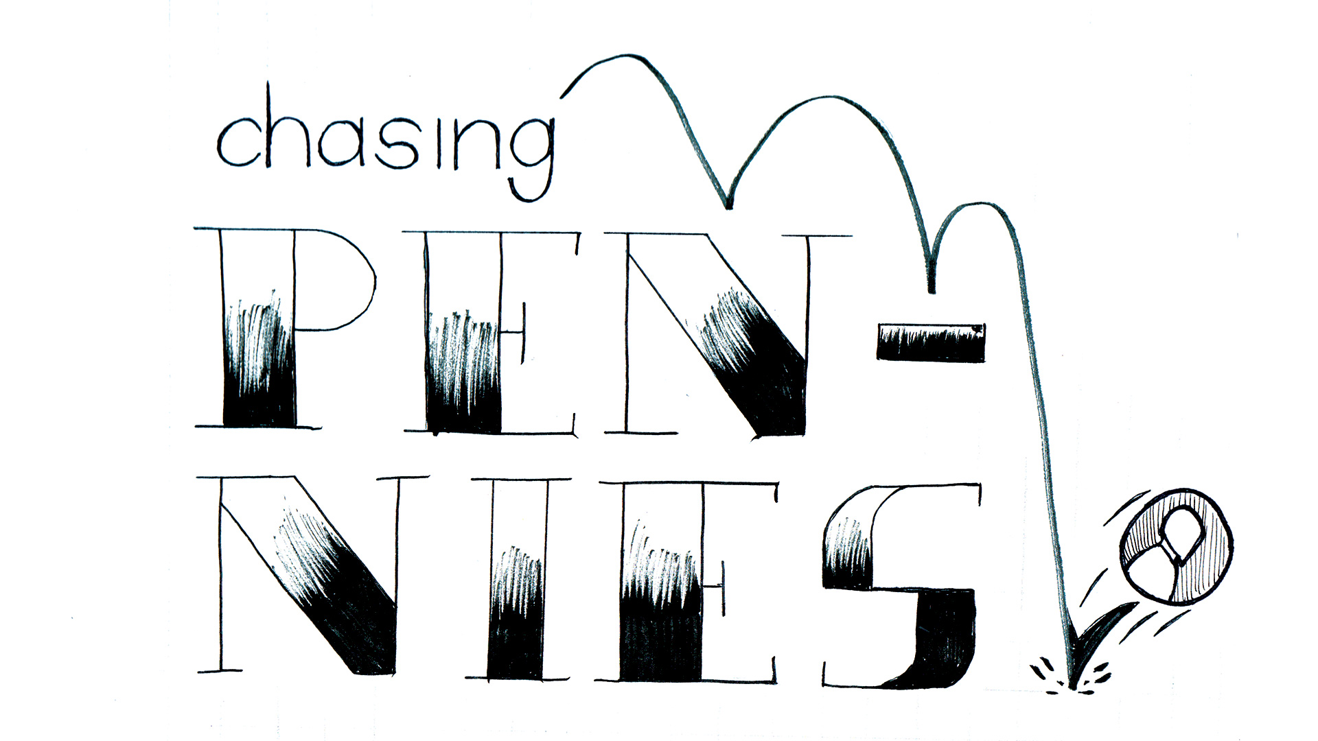
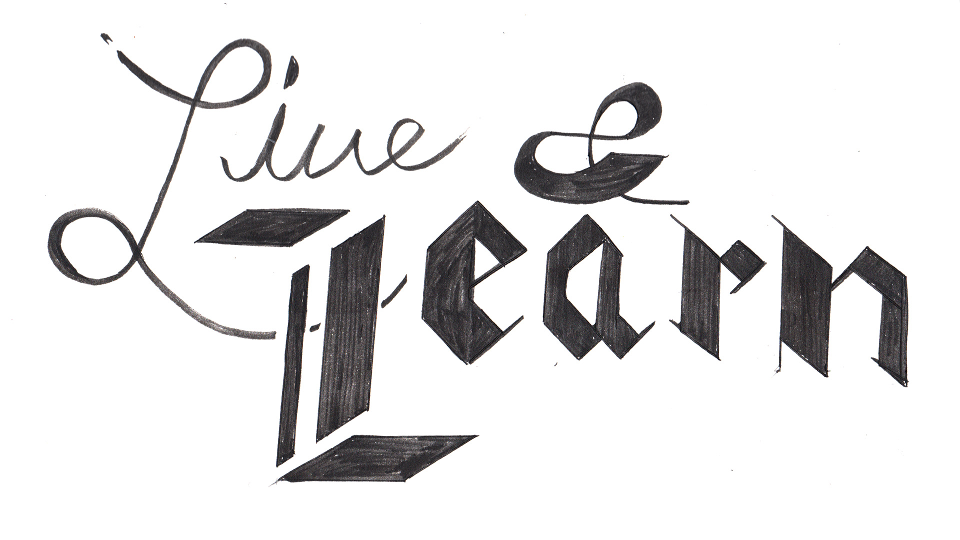
During the time, it was my least strong skill but as time flies my skills for expressive typography skills began to refine in my opinion. These are the projects I had fun with and the proudest of. I picked two phrases that inspire me and irritates me. “Live & Learn” is the main/final boss theme of Sonic Adventure 2. That phrase means about me is always have that strive to improve by learning something new and live to enjoy. The phrase “Chasing Pennies” was a quote from a speaker at a seminar that I attended in the past. That speaker mocked teacher, and other jobs are not real jobs because they don’t make more money than the speaker makes. He said that those people are chasing pennies. Let people work whatever they want. For the font, my focus is a display cities and White Acropolis from SONIC THE HEDGEHOG futuristic and making the display font a headline for jumbotrons and wayfinding.
Adobe Photoshop
Adobe Illustrator
Adobe Dimension
FontLab7
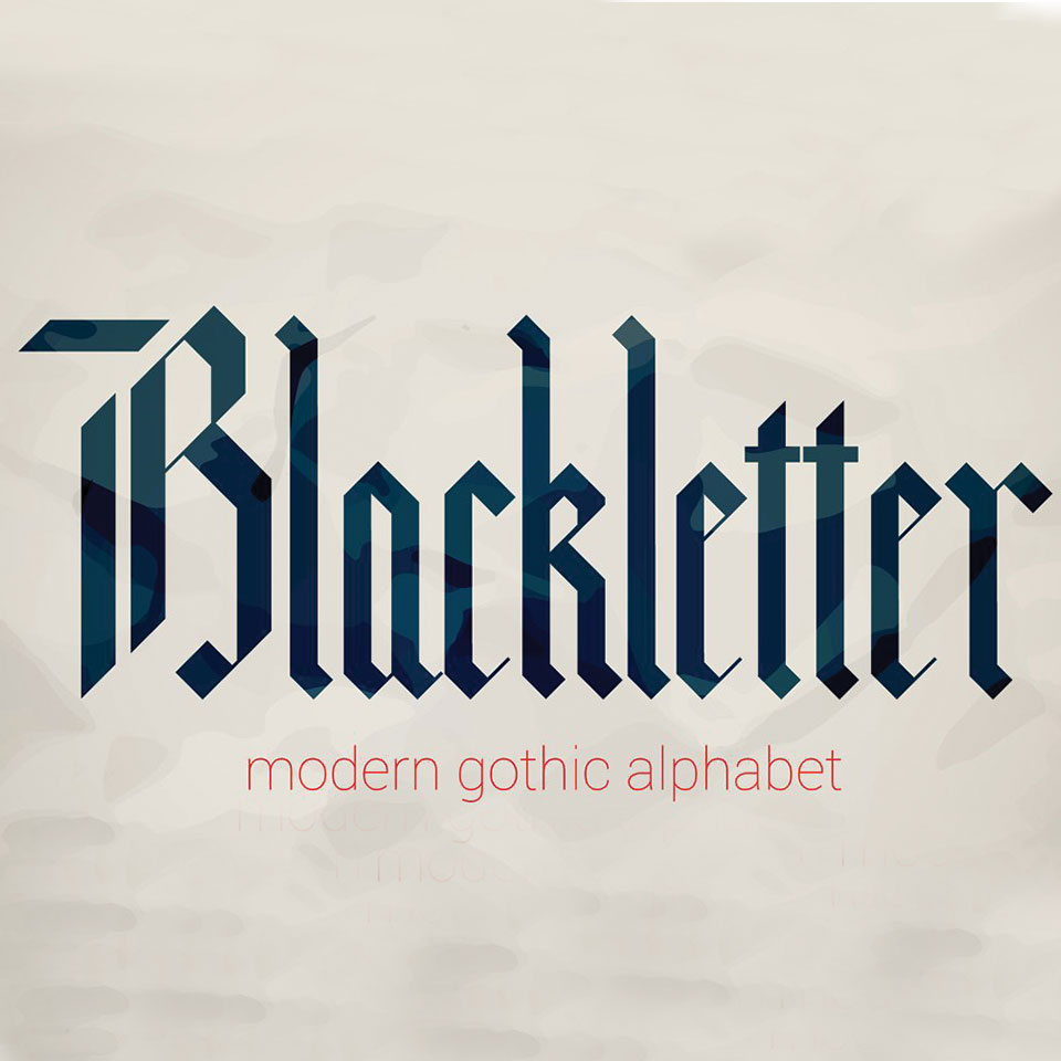
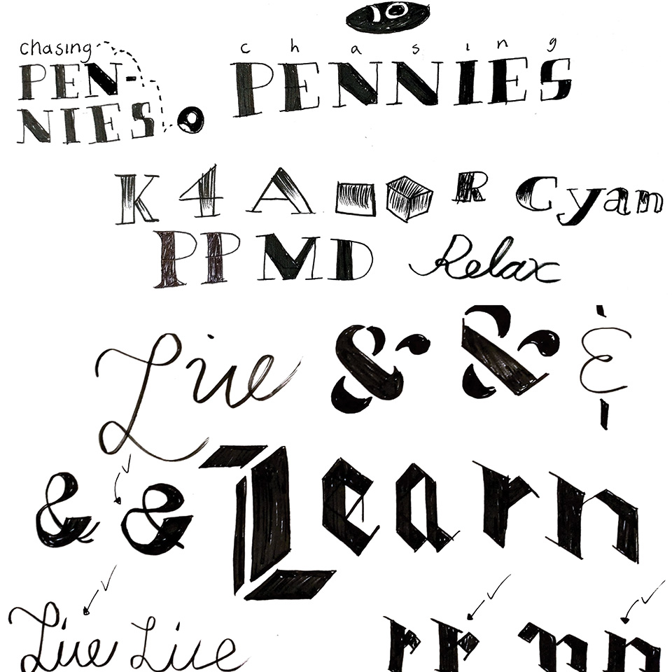
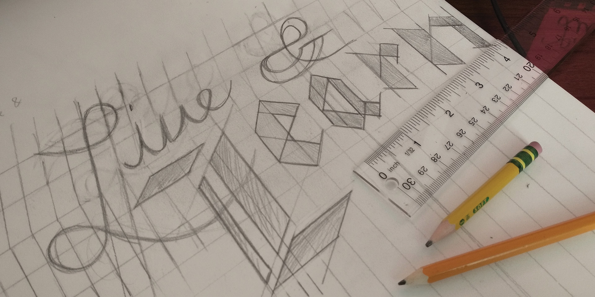
After concept sketching the phrase in different lettering styles for Live & Learn, I have made my direction. The script “Live” where it’s living to the fullest which reminds me of wavy and cursive lettering. Gothic “Learn” where it’s always learning as time goes by regardless if the process is easy or difficult. It reminds me of Gothic lettering more specifically modern gothic lettering. The ampersand is more script since it will be aligned with “live” but it will be a mix of script and gothic-like transition.
The Chasing Pennies piece will include some visuals to support the phrase. From the floral penny shape enclosure, the speed dash effect, and the coin itself. It was for sure I was going towards the san-serif and serif direction for this quote. I made sure that “Pennies” was emphasized the most. At the end, I decided to go with the concept where the penny coin is falling down. The coin falling down is a node that pennies are becoming more undervalued as time goes by. The coin bounces down in a stairs-like setting. Serif lettering as a node of being rich and valued. On the very bottom, those are just experiments on the serif lettering.
Tombow Fudenosuke Brush Pennies
Pilot Kakuno Fountain Pain
Pilot Precision Pen
Strathmore 500 Series Bristol Paper
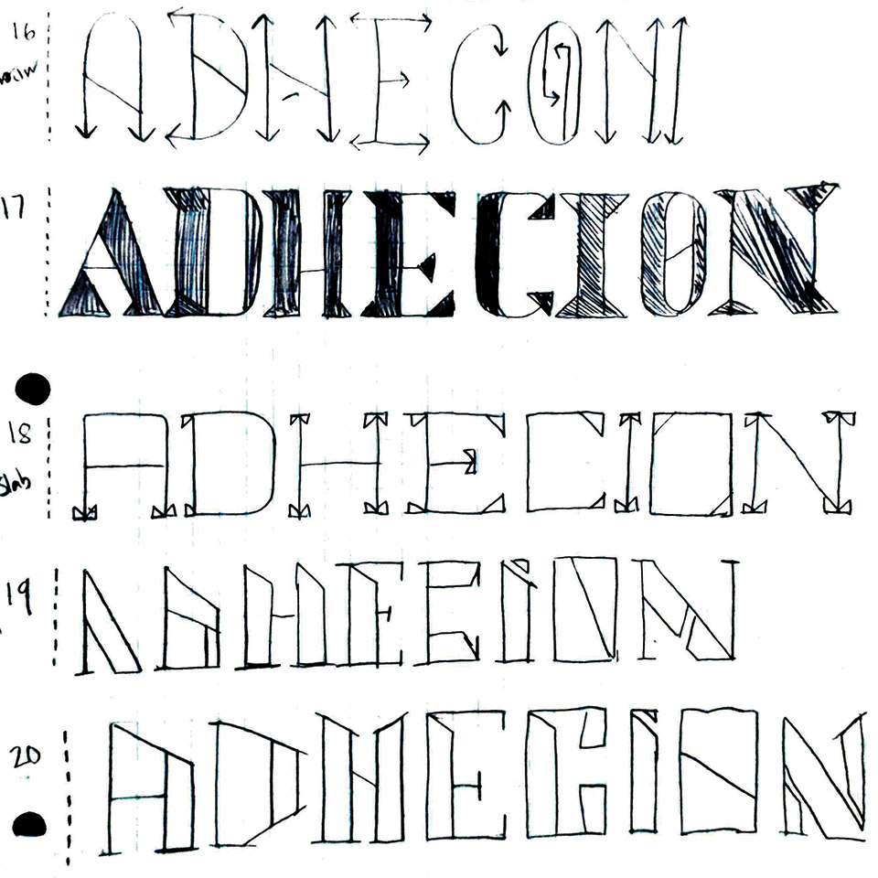
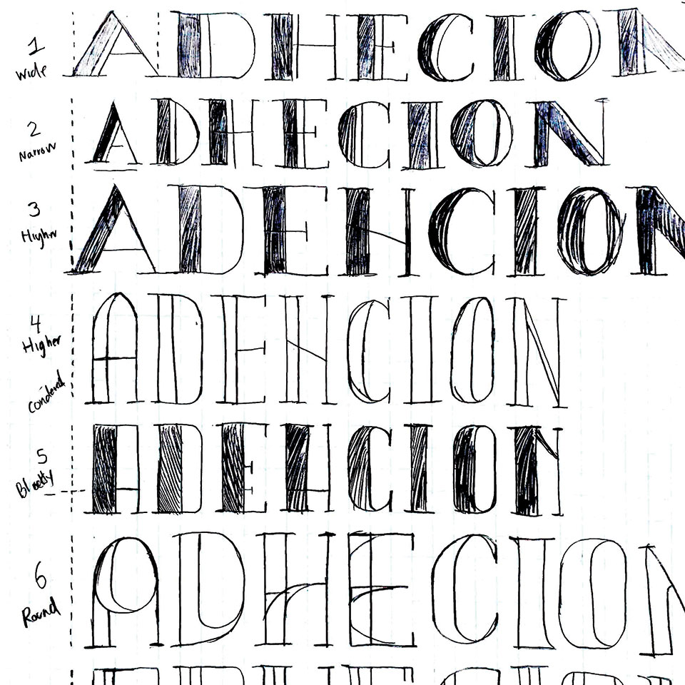
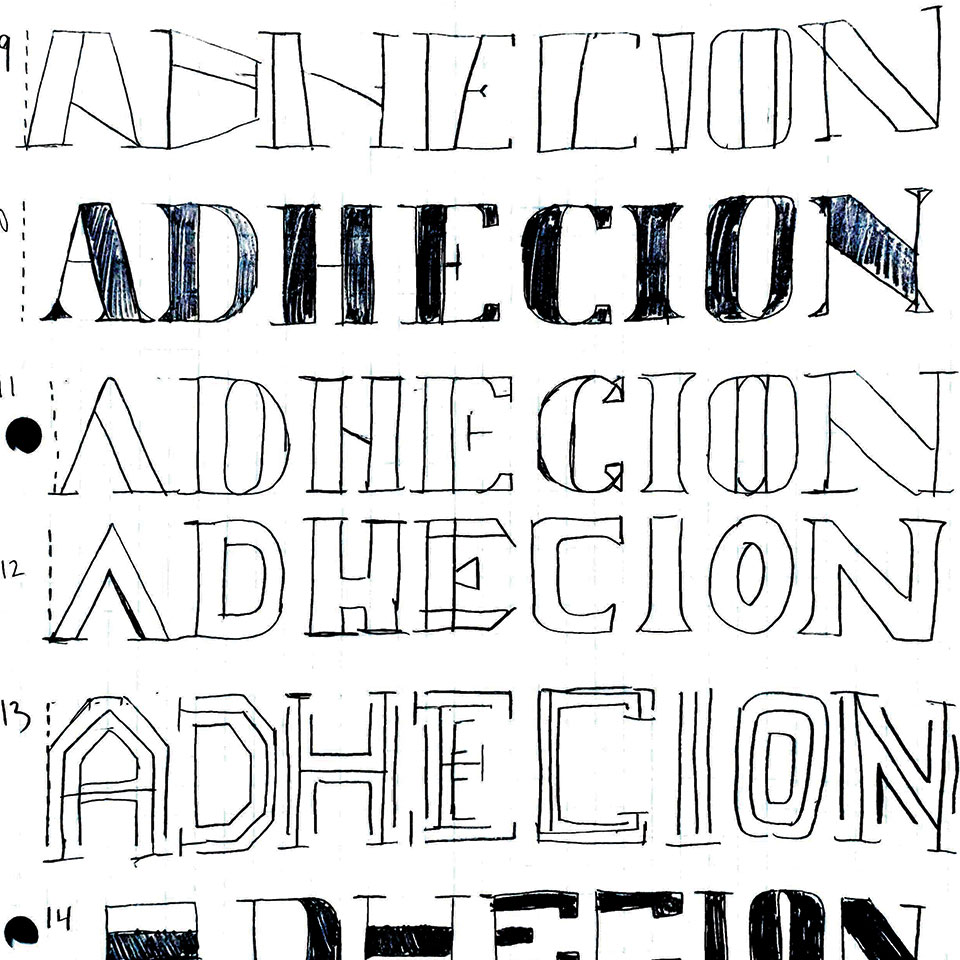
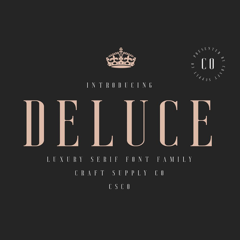
My main focus is making a modern and futuristic serif display font that can be used mostly on digital media. I sketched out the letters “A, D, H, E, C, I, O, N” from wide, to narrow, to condensed, to inline style. At the end of the process I decided to take the direction of concept #5 and #10 sketches. All of the sketches have been done using grid paper utilizing the number of squares.
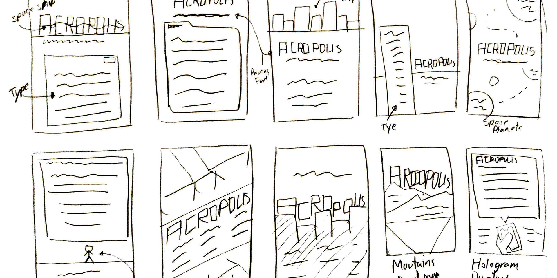
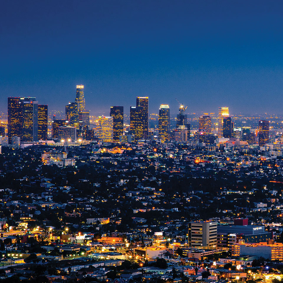
For the type specimen poster, I want to emphasize the poster with High Buildings and futuristic visuals. Thus creating most of these sketches on a skyscraper futuristic setting. I went in the direction of having layers of cities and having the letterforms as windows and antennas for the skyscrapers. Blue and Yellow are a color I thought of for modern and futuristic.