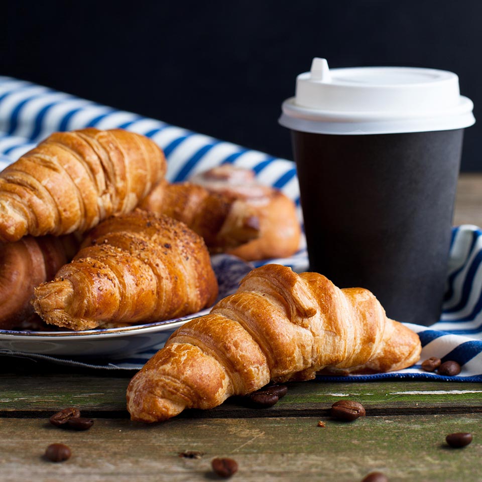
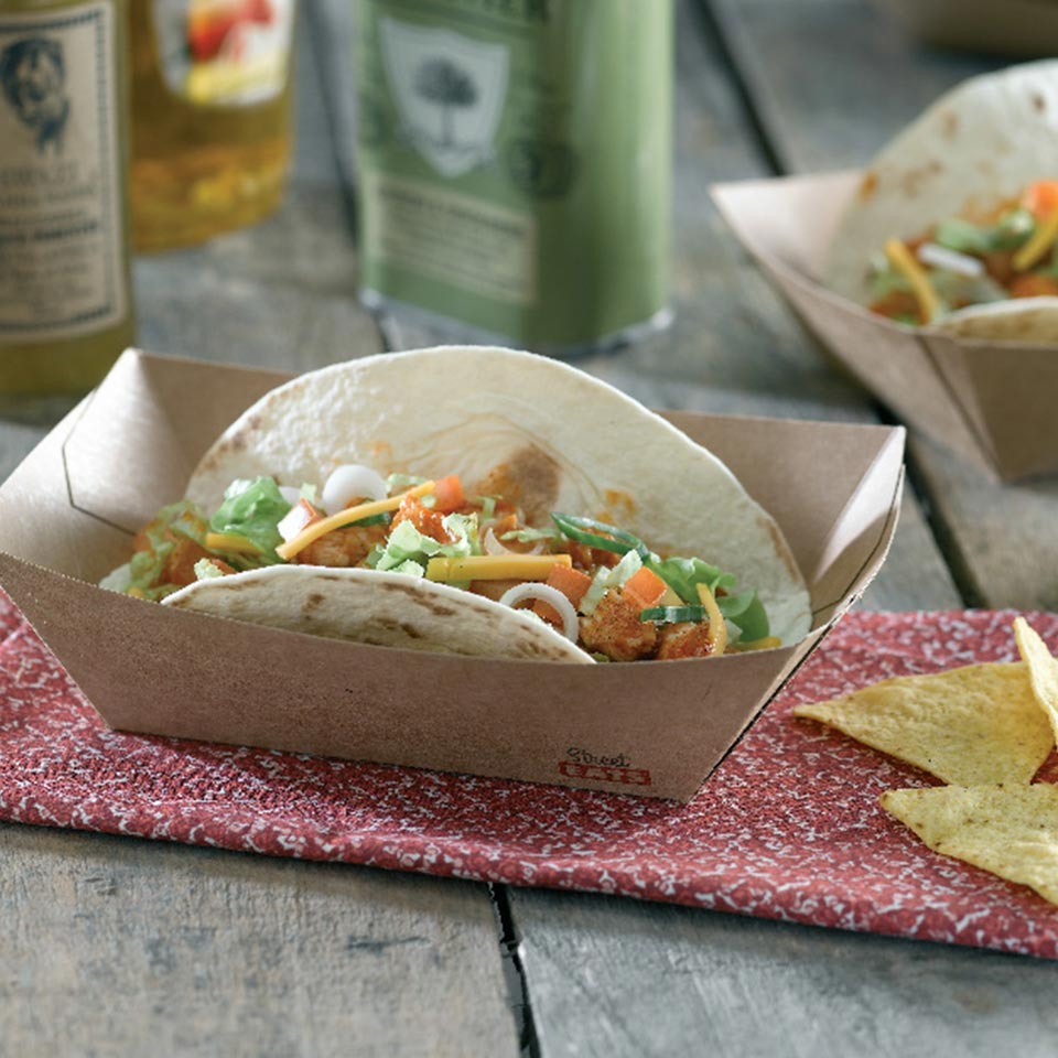
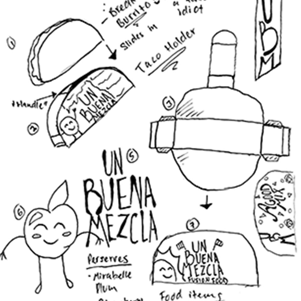
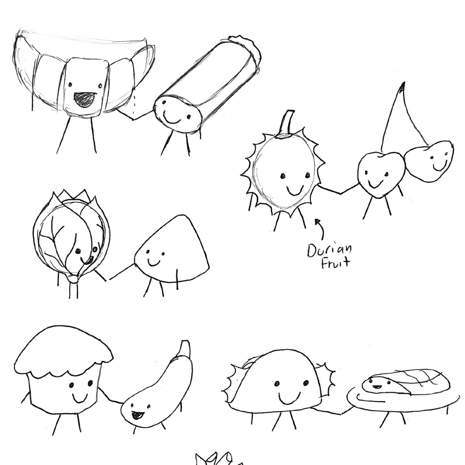
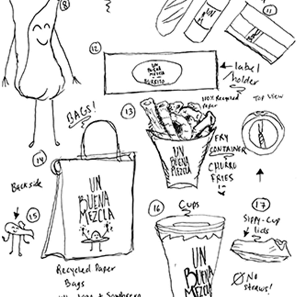
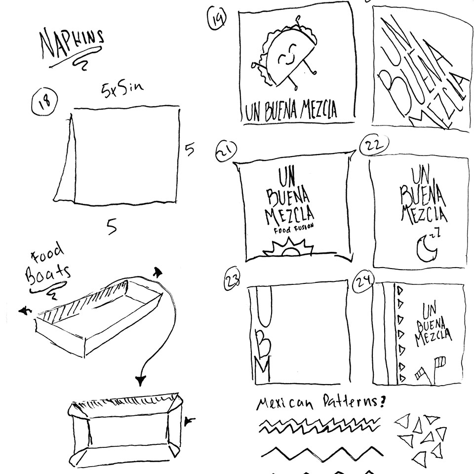
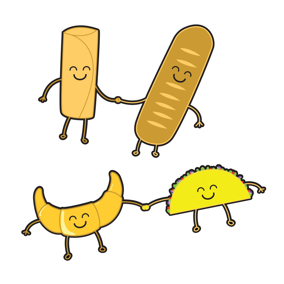
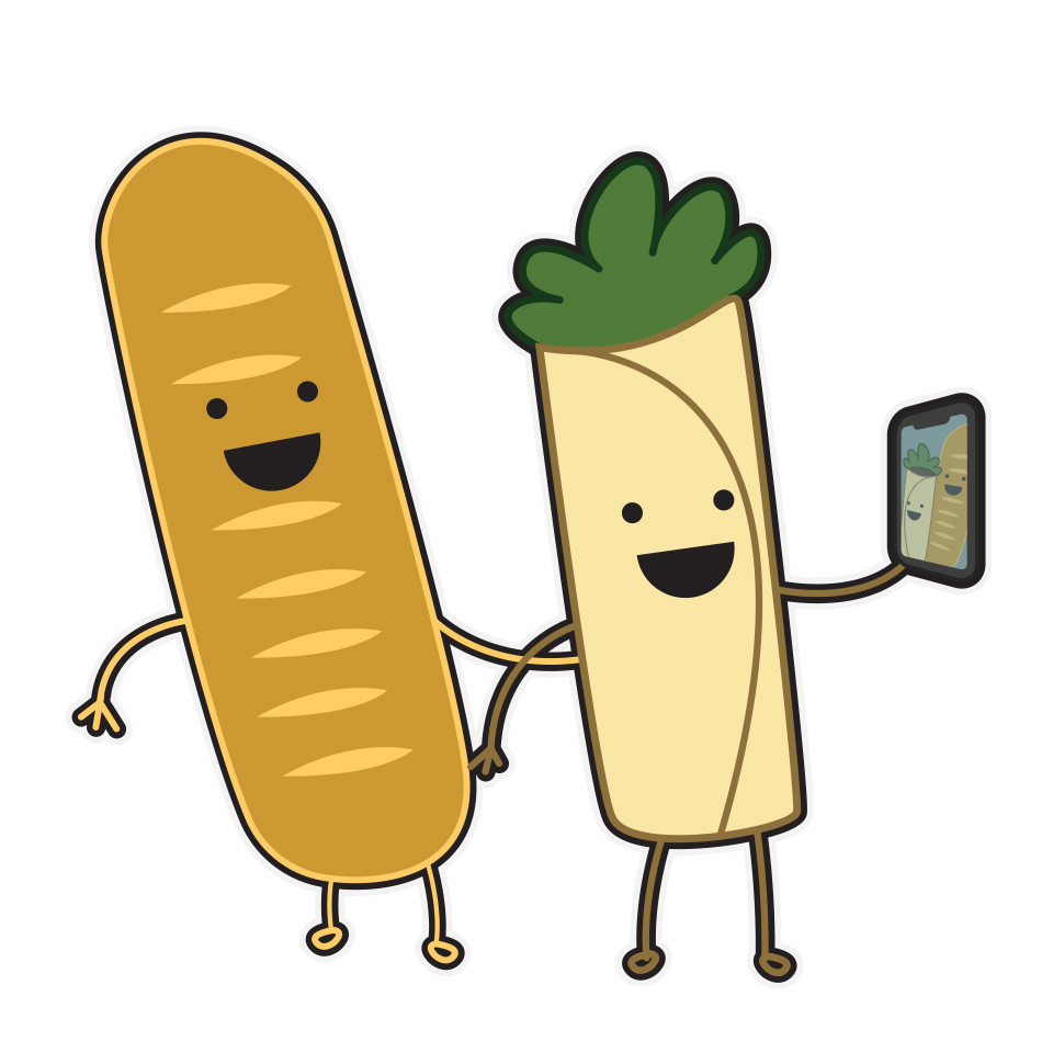
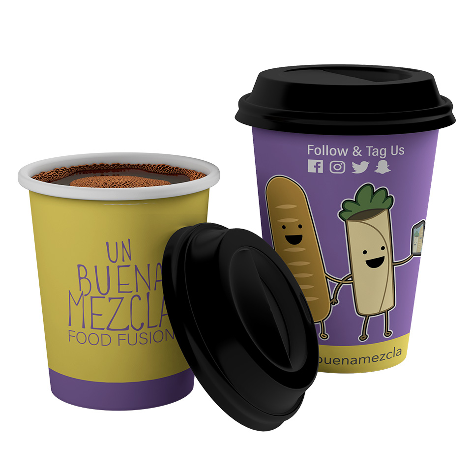
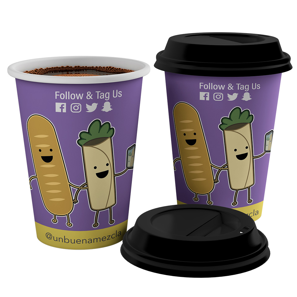
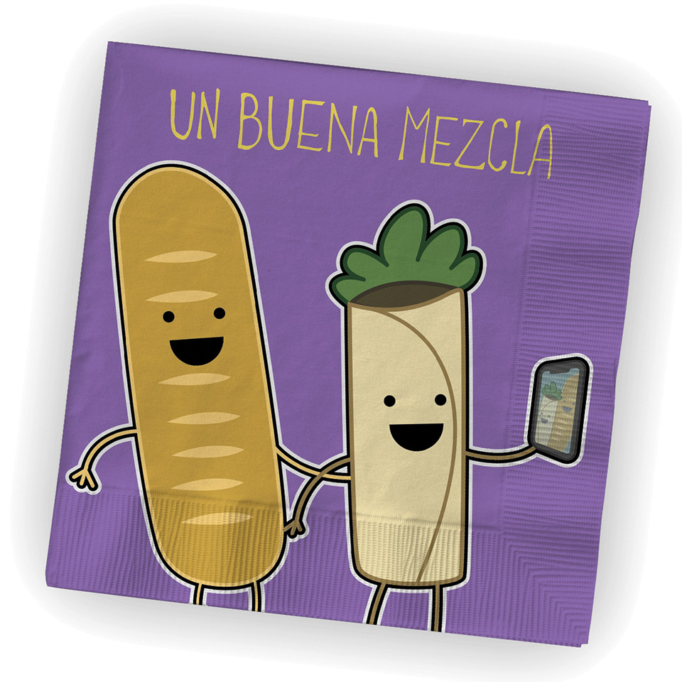
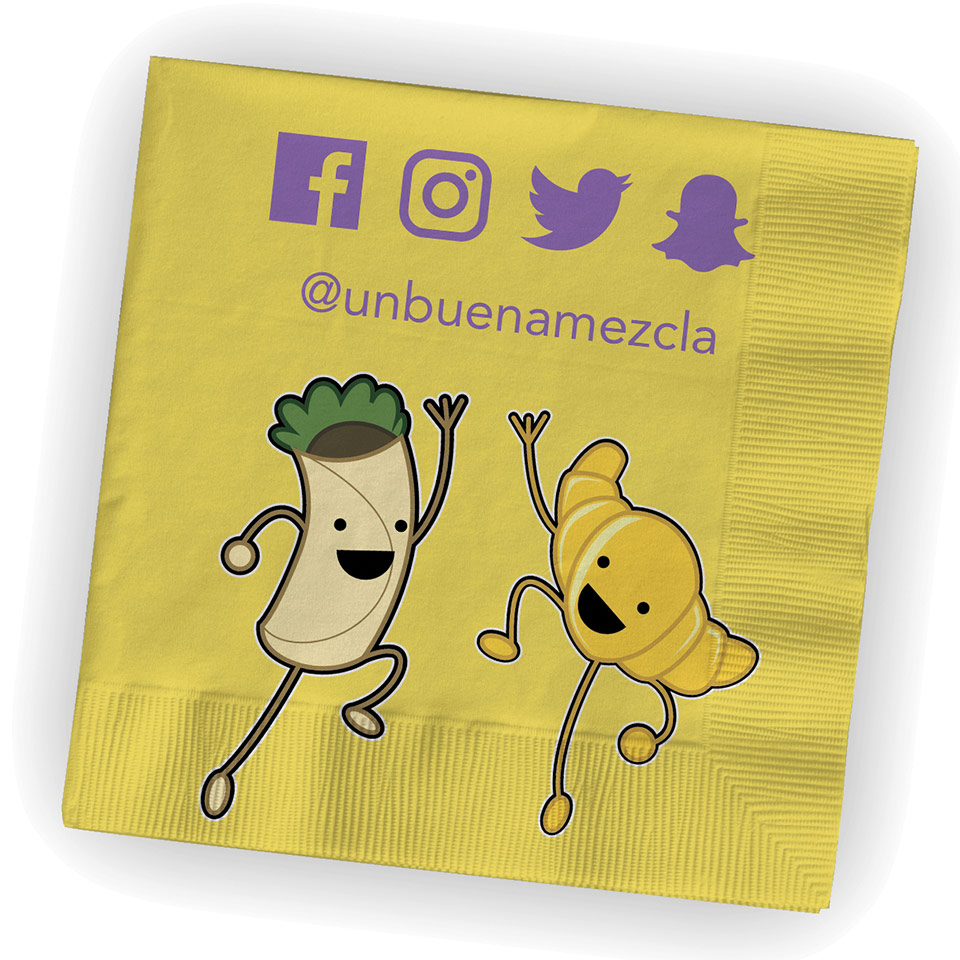
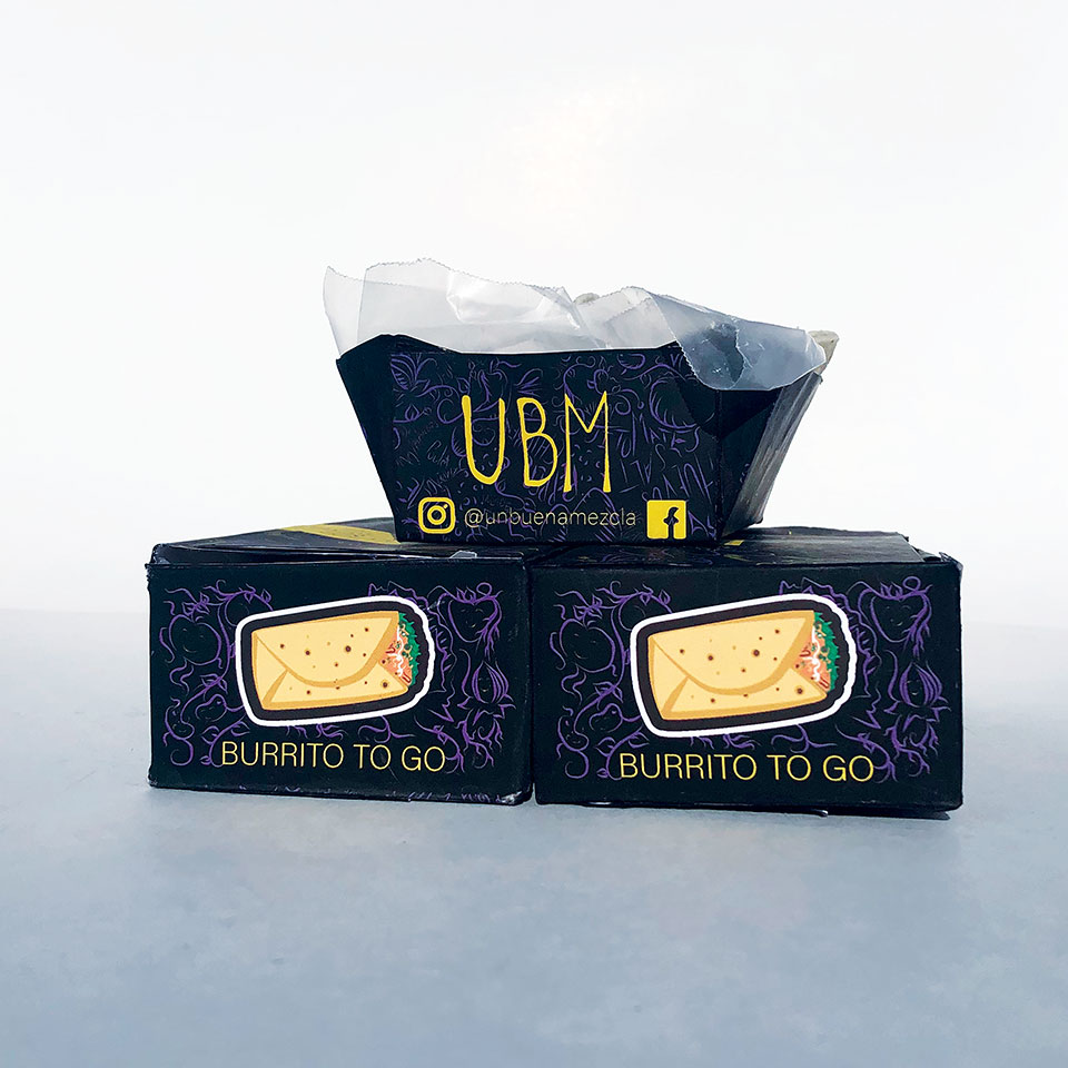
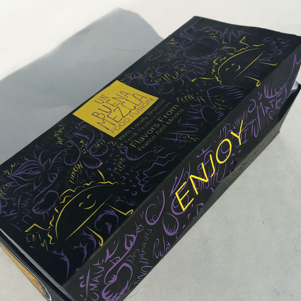
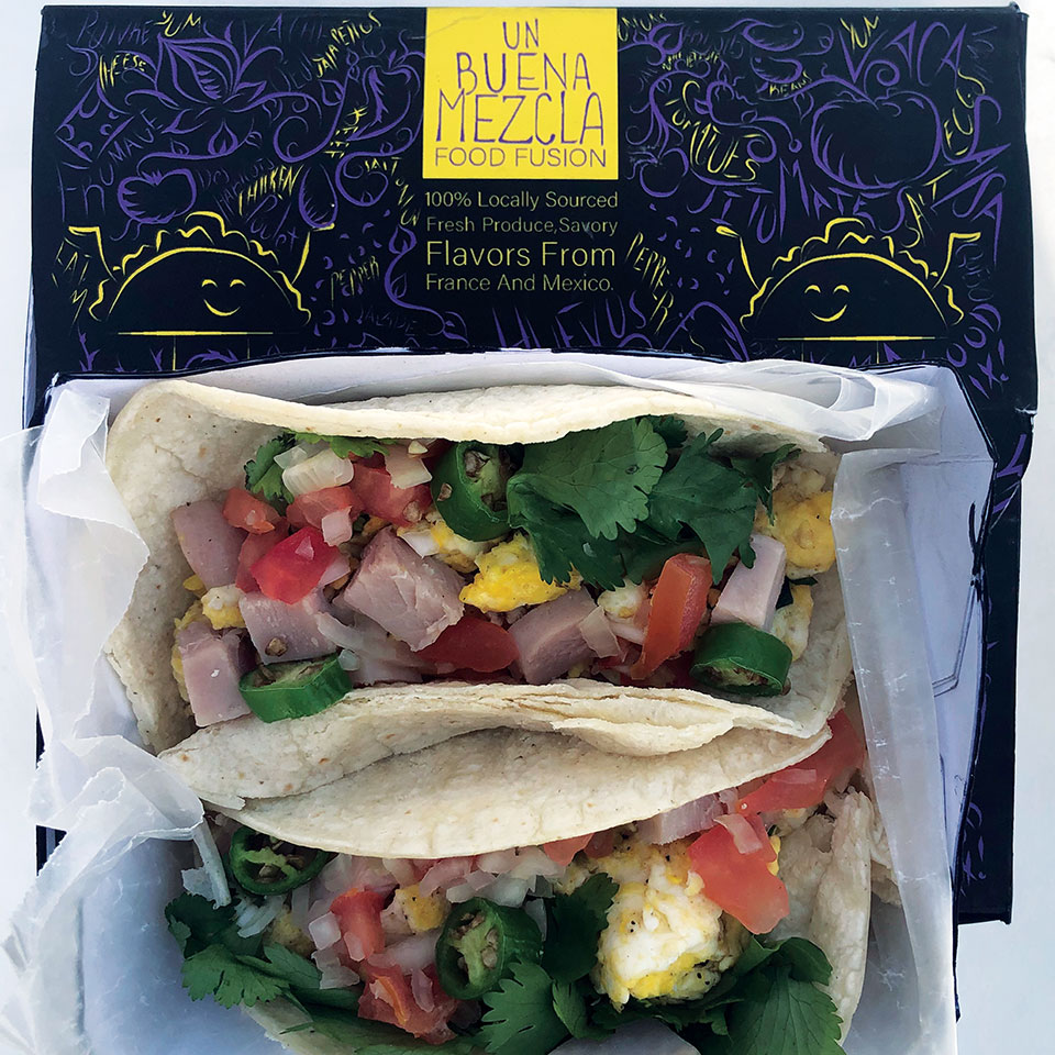
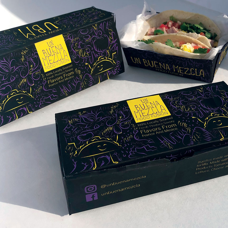
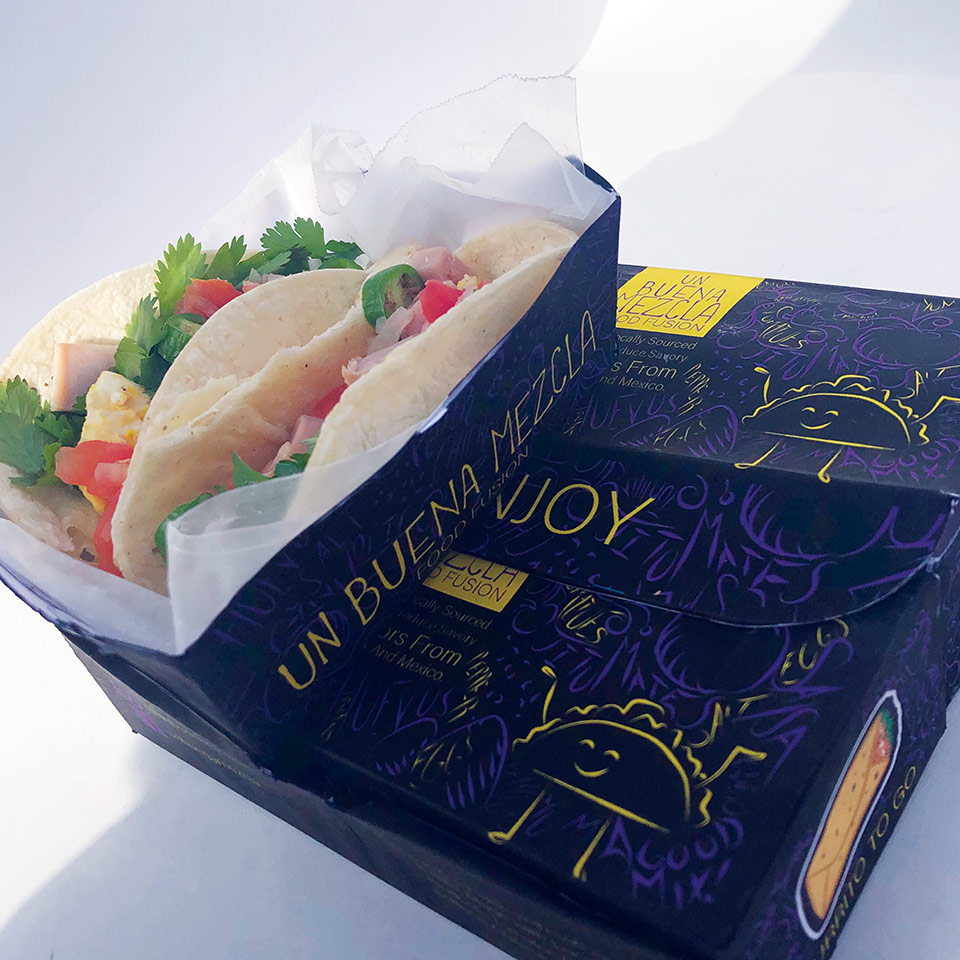
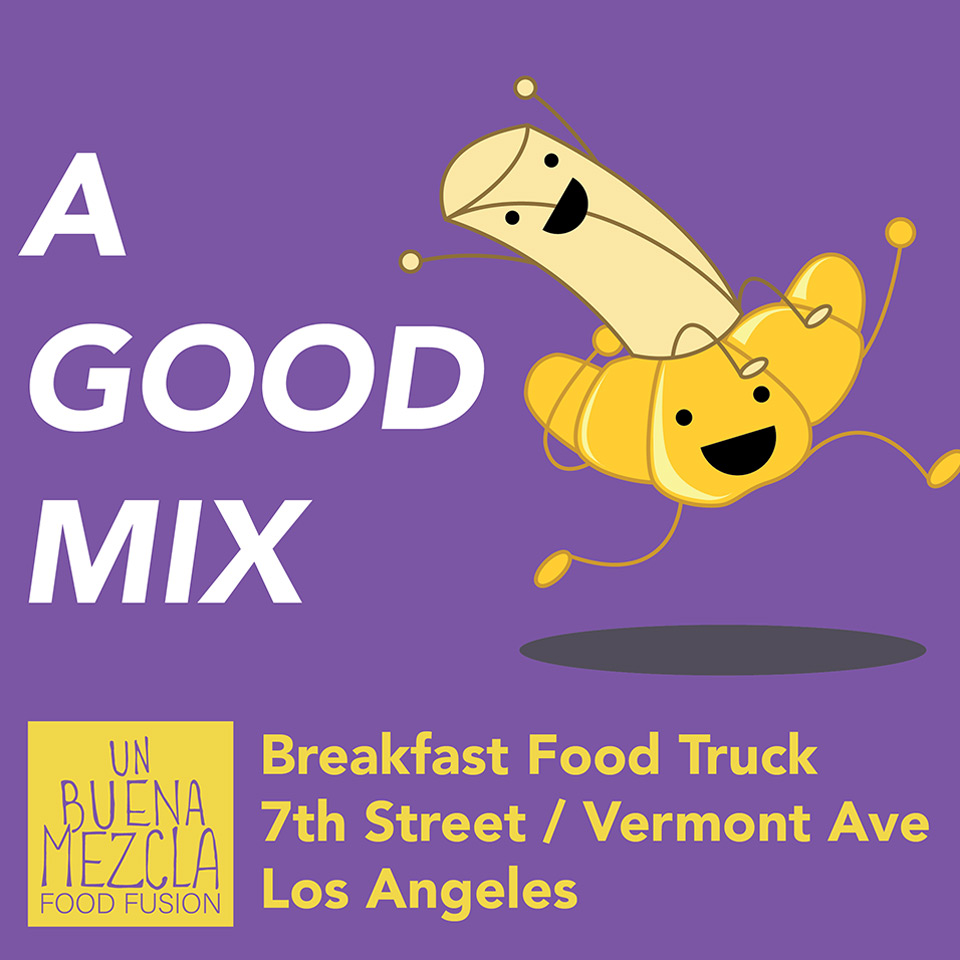
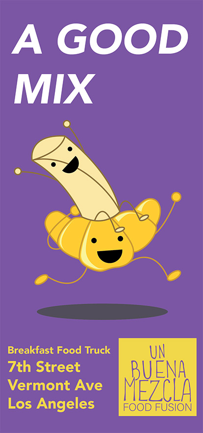
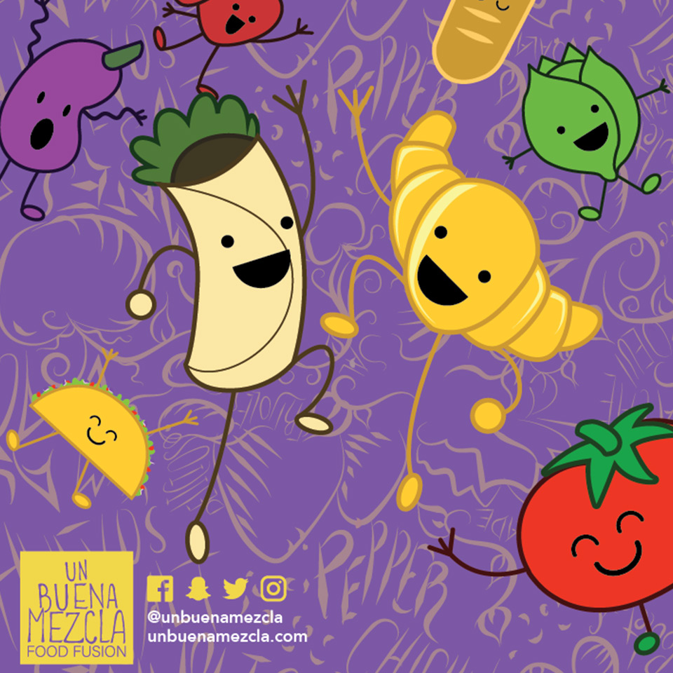
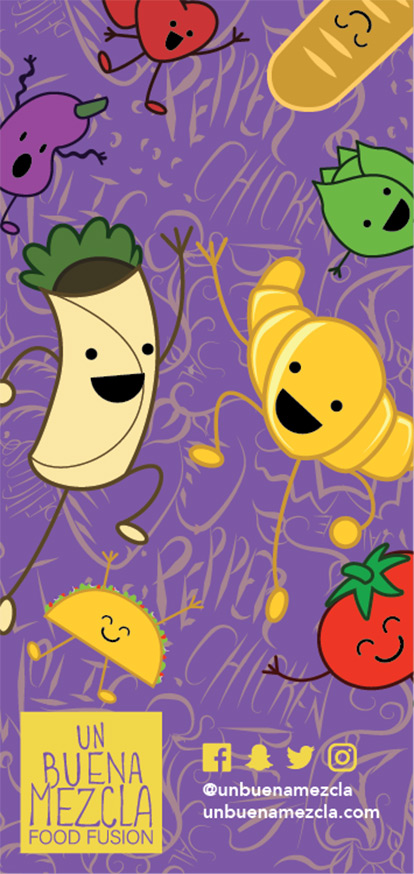
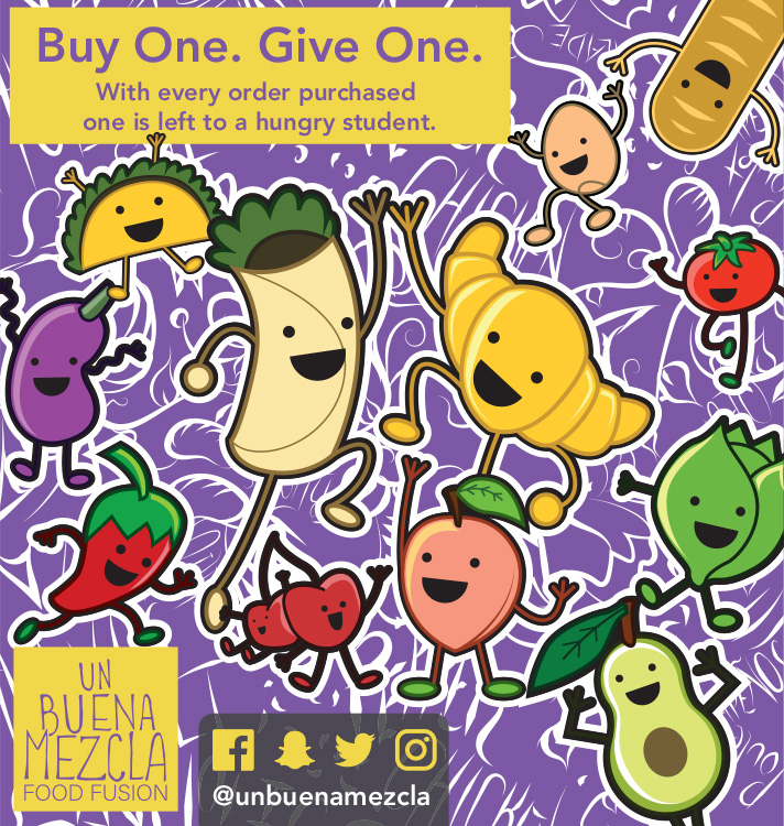
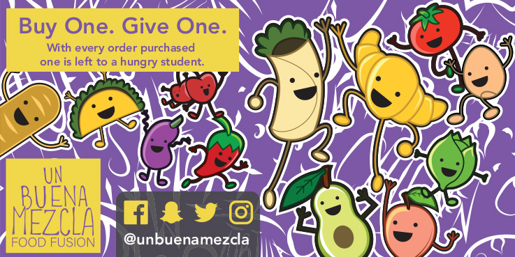
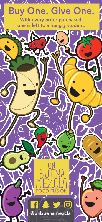
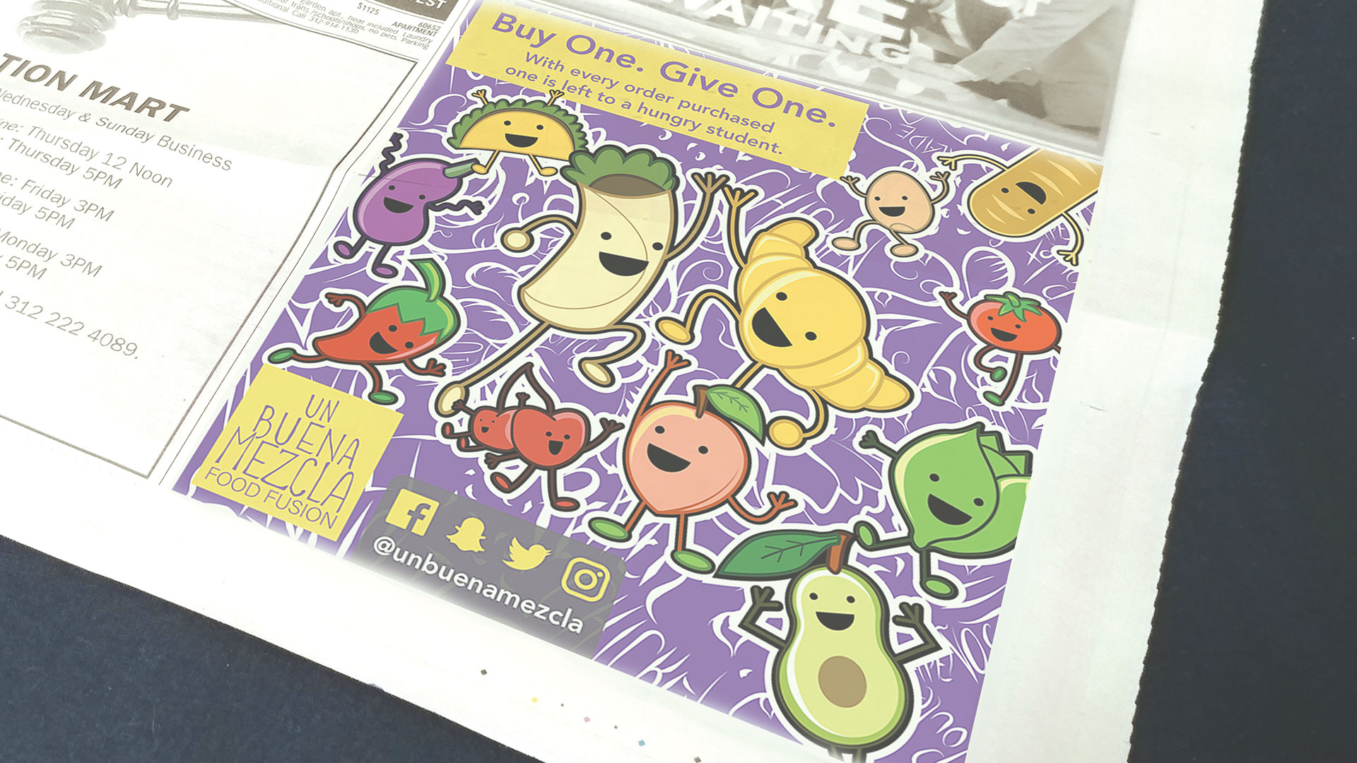
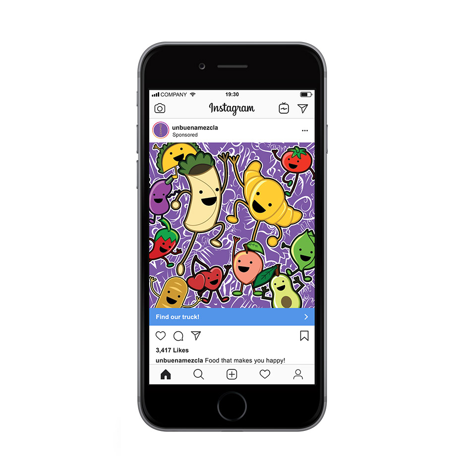
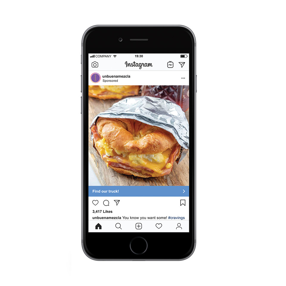
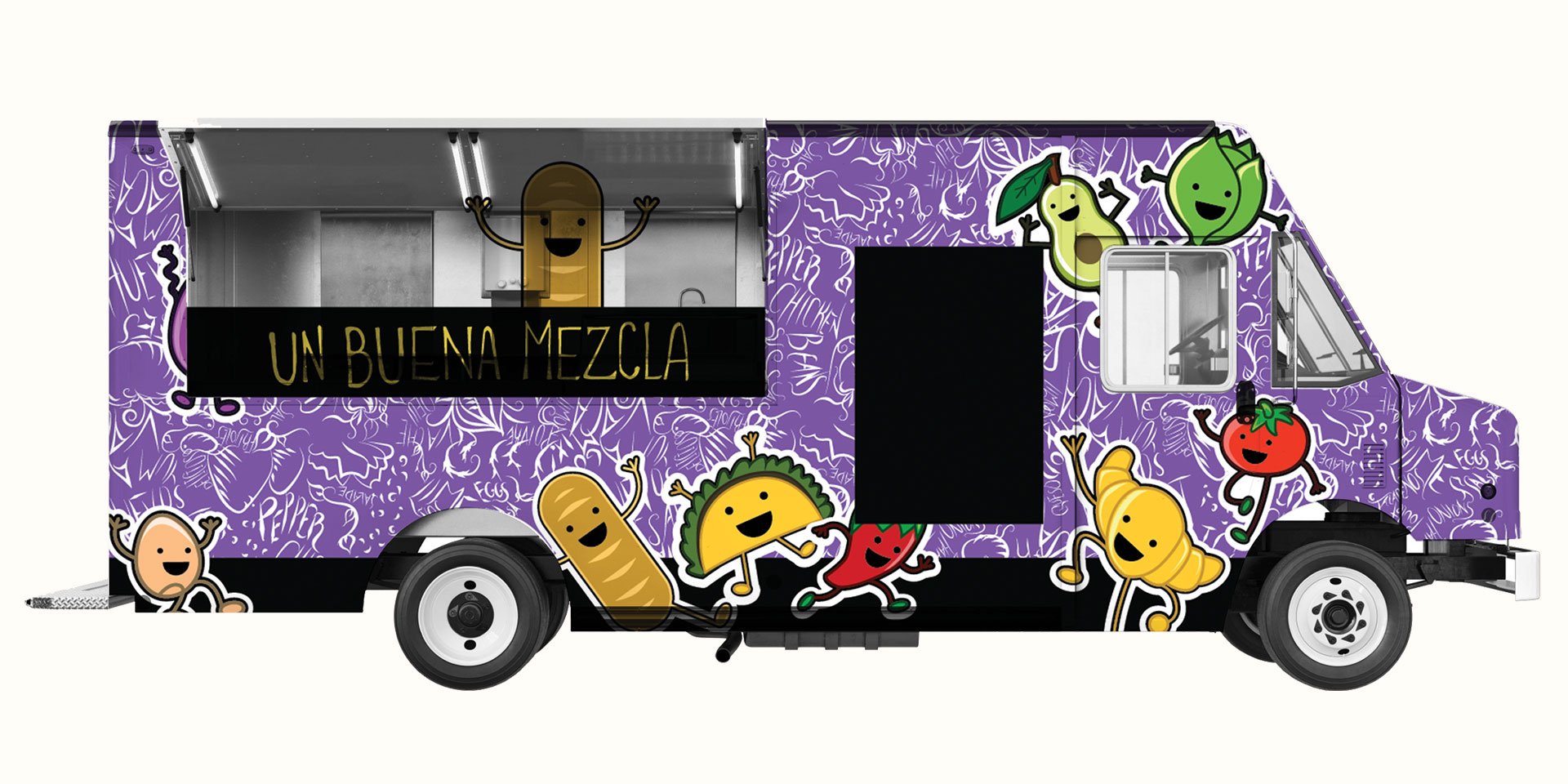
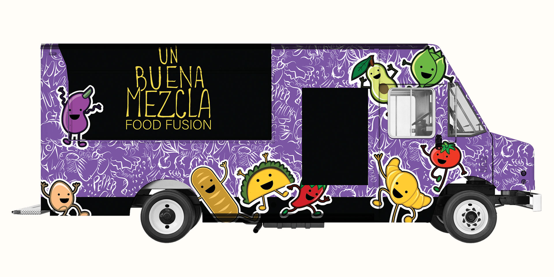
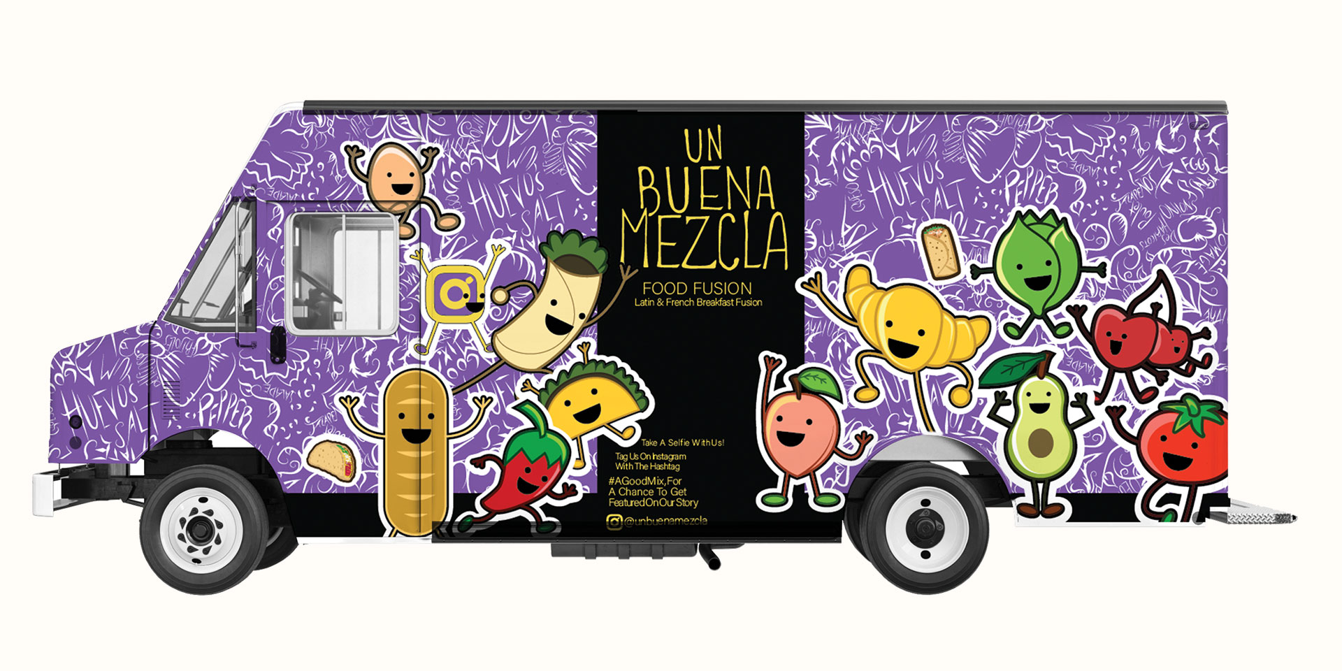
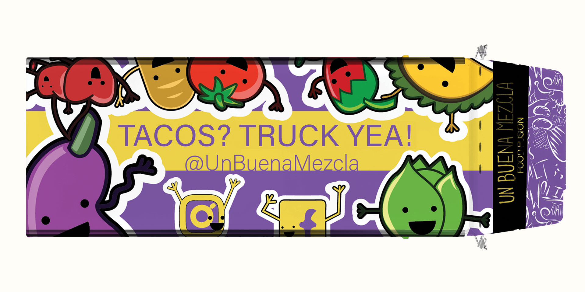
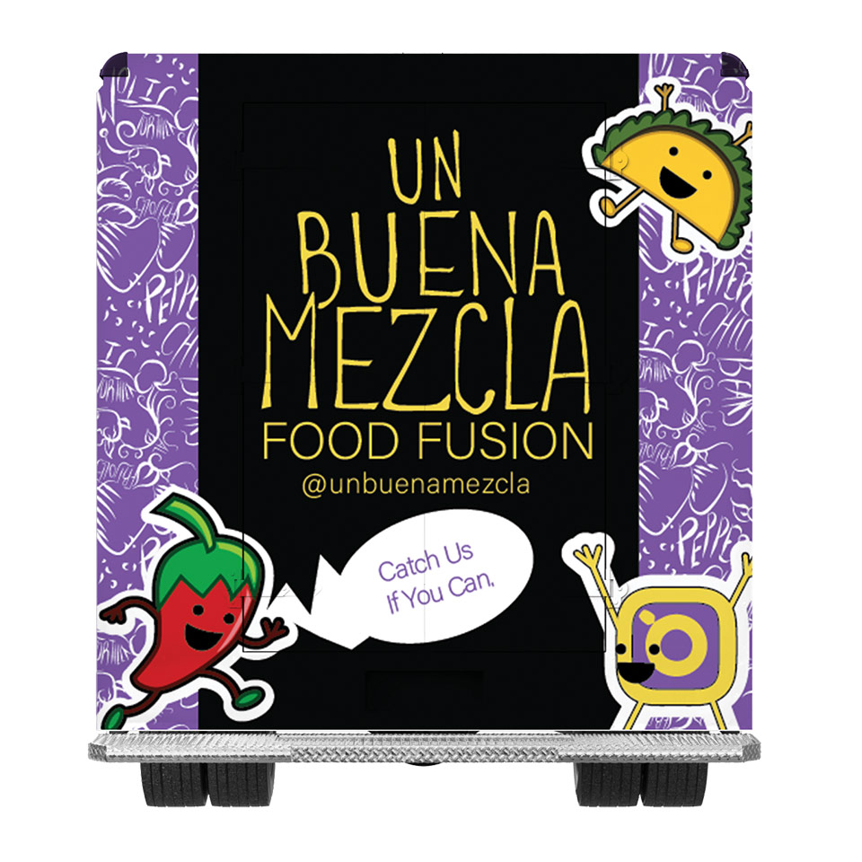
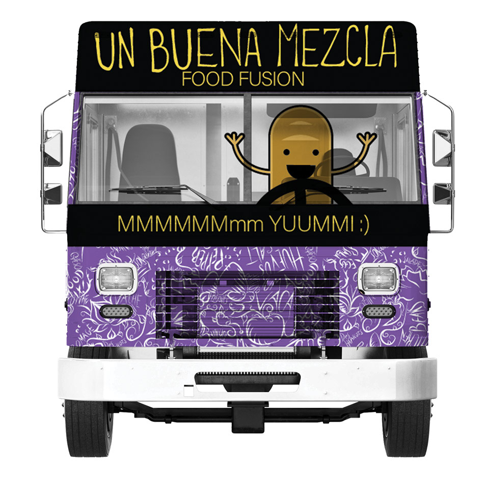
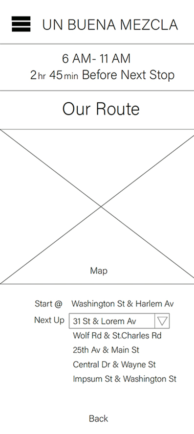
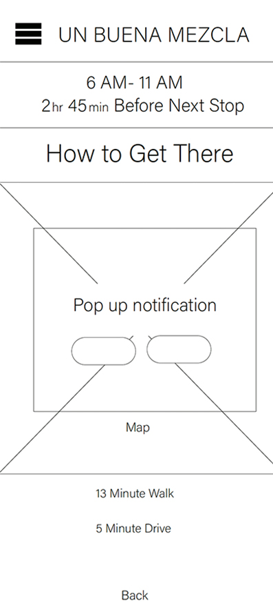
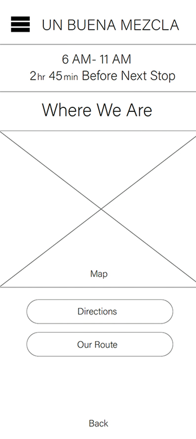
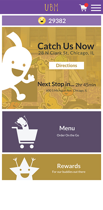
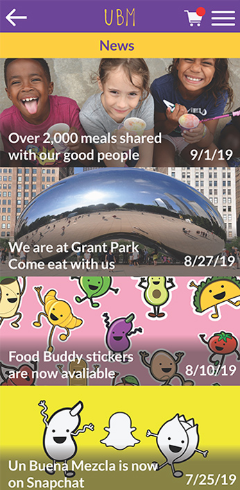
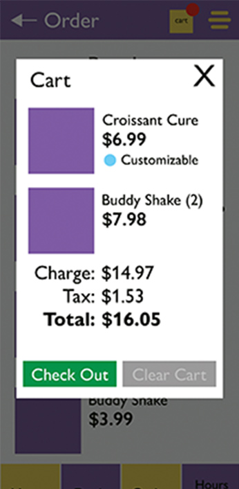
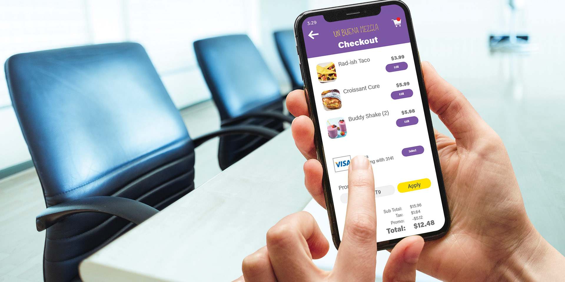
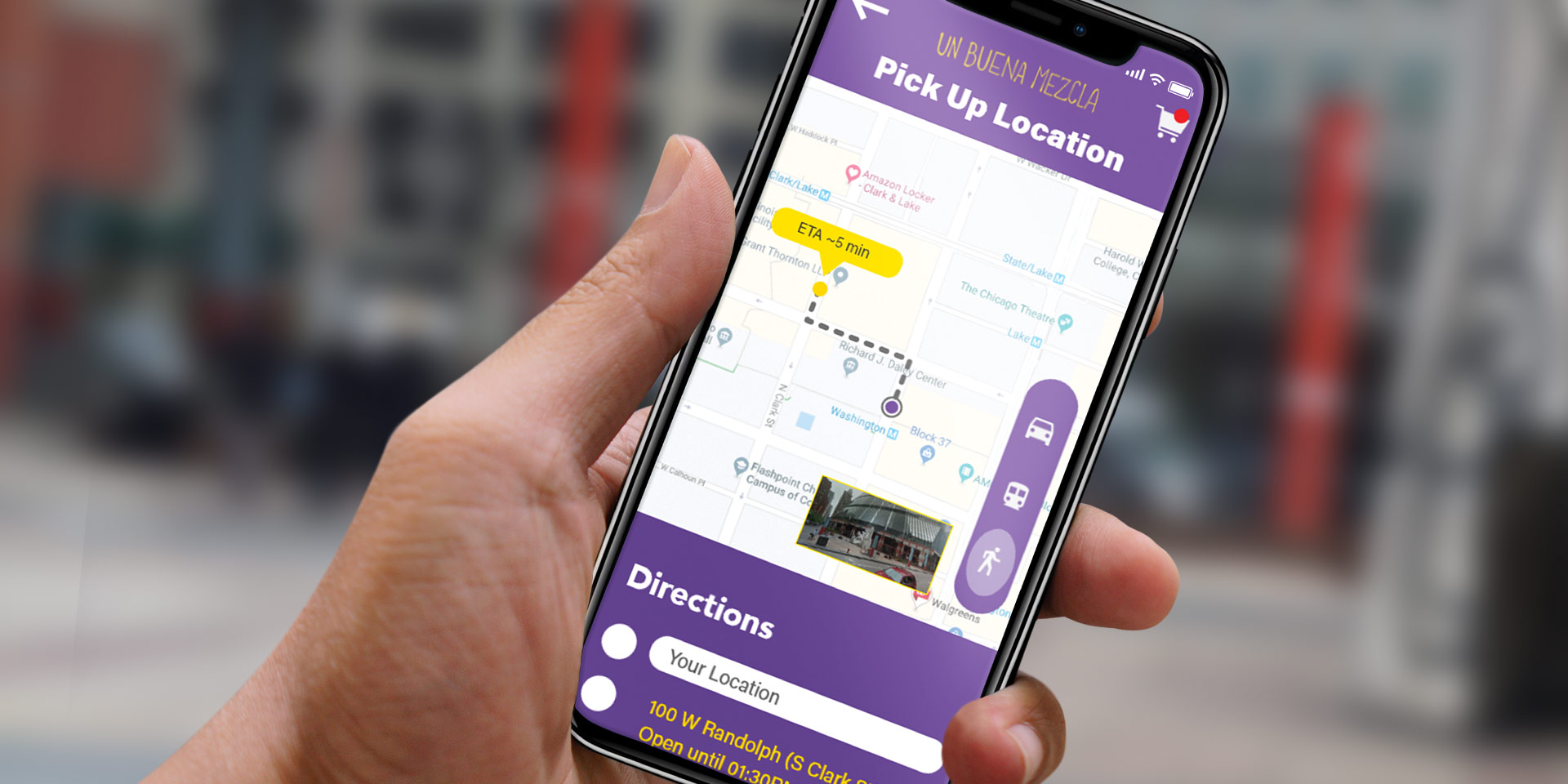
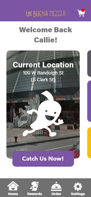
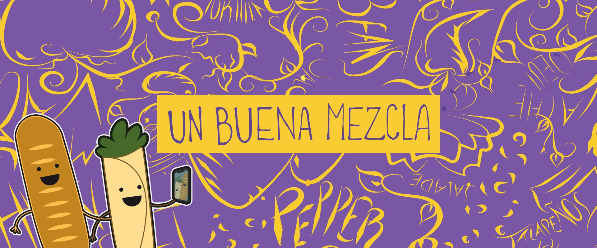
Breakfast Foodtruck

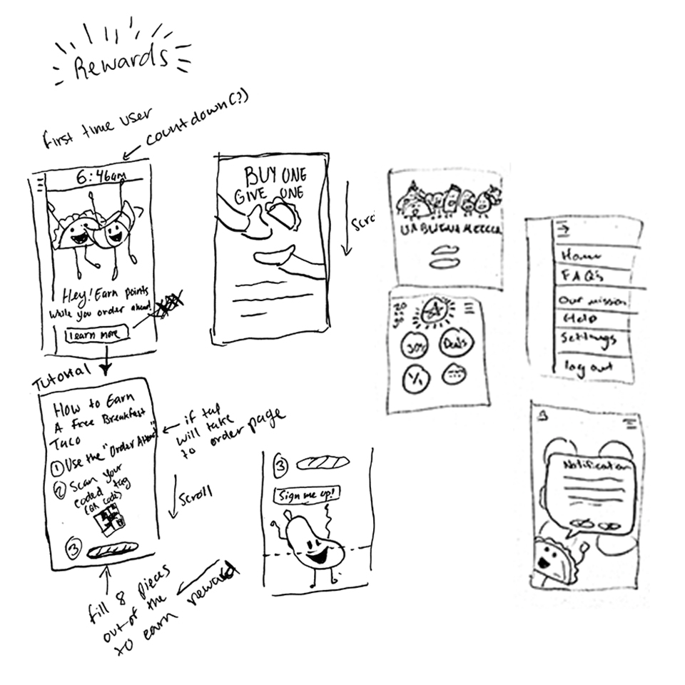
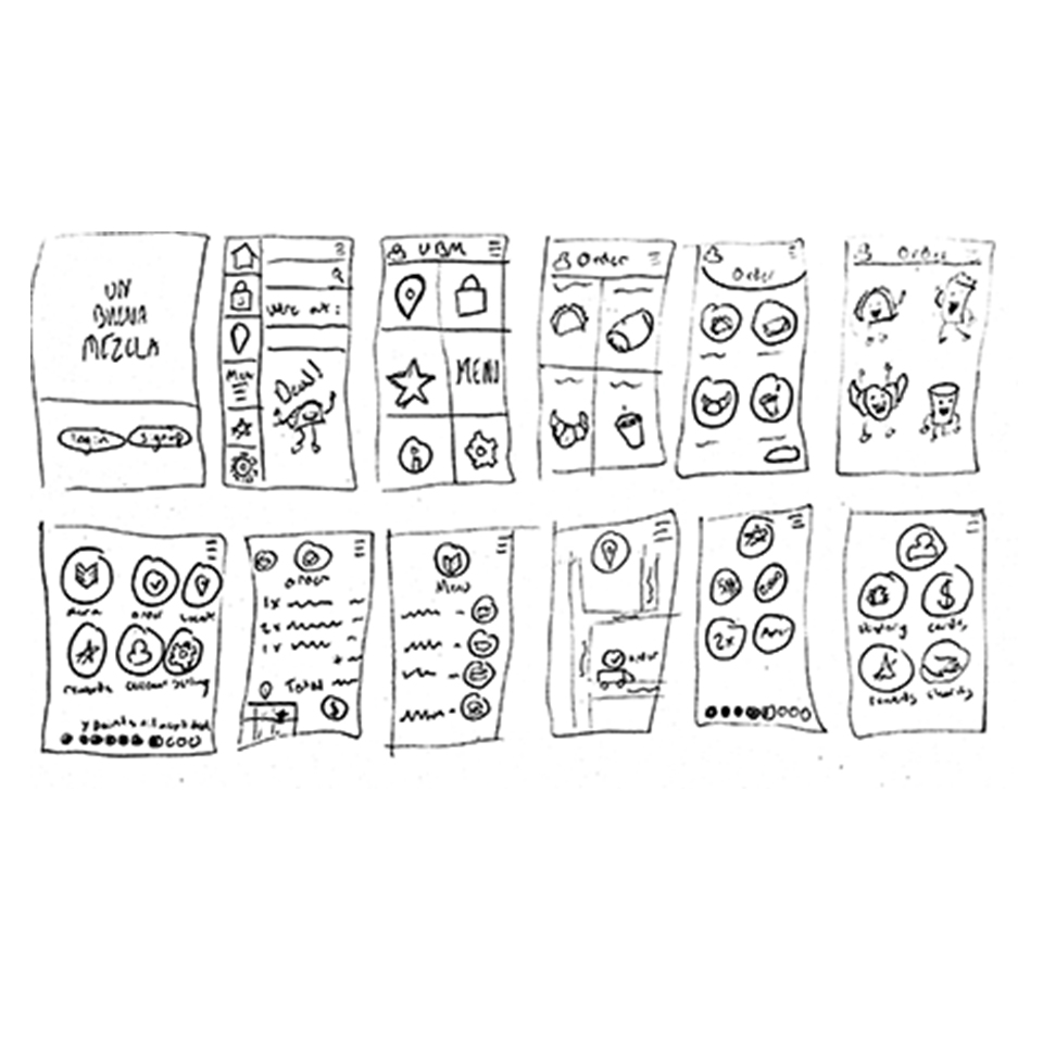
Un Buena Mezcla is a food truck company in Chicago serving Mexican and French fusion breakfast while providing free meals to the homeless. This is a design team project and each of us did our research, sketches, and concepts for each deliverable while giving each other feedback and input. Then our final design was presented by one of us.

A Good Mix


More than 50% of Americans skip breakfast at least once a week. This is not because we don’t have time to spend on making breakfast. The large portion of those who skipped breakfast are school kids and they cannot afford a good healthy meal. Introducing Un Buena Mezcla, a food truck that combines the menus of French and Mexican style food providing hearty breakfast meals with healthy ingredients every day. Our mission is to help our community to prevent homelessness and to prevent people from going hungry as much as possible. Although our crowd is not specific, we are planning on targeting the working-class including office workers and students from ages 18 to 40 who don’t have the time to make food. Un Buena Mezcla is friendly and fun for all regardless of age.

Programs Used

Adobe Photoshop
Adobe Illustrator
Adobe XD
Figma

Design Team

Salvador Castanon
Ronan Cunningham
Justin Amponin

Brand Standards

Brand Identity

The logo and brand standards is created by Salvador Castanon. The story behind the name is that Un Buena Mezcla is a translation of “A Good Mix” where Un means “A” in both French and Spanish, Buena means Good in Spanish, and Mezcla means Mixture (or Mix). Purple symbolised the culinary excellence of France and the color comes from their national flower, an Iris And yellow came from the corn tortillas made in Mexico


Main Vertical Logo

Live Area = x/4, when x= Height of the Vertical Logo
min usage = 0.5” width


Horizontal Logo

Live Area = x/2, when x = Height of the Horizontal Logo
min usage = 0.3” width


Horizontal Acronym Logo

Live Area = x/2, when x = Height of the Logo
min usage = 0.6” width


Vertical Acronym Logo

Live Area = x, when x = Width of the Logo
min usage = 0.15” width

Color Usage

Typeface & Colors

Iris Purple

cmyk: 0/0/0/90
rgb: 65/64/66
hex web safe: #333333
pms (solid coated): 2081 C

Tortillas Yellow

cmyk: 60/0/10/0
rgb: 114/191/68
hex web safe: #66cc33
pms (solid coated): 128 C

Acumin Concept Variable

Primary

Avenir

Secondary

Acumin Pro

Alternative Primary

Packaging & Mascot

Concept Iterations

Another asset of the brand identity is having a mascot for our food truck. Having a mascot is a great symbol and also brings the audience together. Throughout our design process, we made the mascots of food with faces, legs, hands and called it “Food Buddies”. After designing the final design, we continued to create more food buddies including egg, pepper, taco, and tomato. We create them to bright people’s mornings. Something that is fun and has a smiling expression can make people's day. The packaging is by Salvador Castanon where he creates his die template, map out the graphics, print it, trim it and take photos of it in a real-life setting

Final Design

Food Buddies Illustrations

Package Design

Food Packaging Tray

Print & Digital Campaign

Sketches

We chose to design the print advertising more specifically to the RedEye Chicago newspaper to reach both students and workers since RedEye newspaper is typically free from the vending box in Chicago. Our idea of our print advertising design is to have the food buddies interact together. The 1st draft is having one buddy on the other buddy’s head. However, we felt that it was off. Then, we designed a lot of our food buddies gathered all together in one picture. We continued with this idea and made it more playful.

Digital Iterations

Final Design

Print & Digital Campaign


RedEye Print - 2 Columns

4.915” x 5.25”


RedEye Print - 1/2 Horizontal

4” x 5.25”


RedEye Print - 1/2 Vertical

2” x 10.5”

Digital Campaign

When we market on social media, we decided to use Facebook and Instagram since those are the platforms that millions of our audience are on. Our advertising posting is showing off our food creation and the food buddies. Our call to action is to find where our current location of our food truck is on our landing page or website. Social media strategy and design by Ronan Cunningham

Foodtruck Design


We bring every food buddy to the food truck. Sometimes, we had food buddies interacting with the truck such as the steering wheel, and the background of the kitchen. We also want the food buddies to communicate with the audience and get their attention. On top of the truck, there is a little message saying “TACOS? TRUCK YEA!” with our contact information and the social media page. Our truck also features a black chalkboard where we can add and change our menu with ease.

Mobile App Prototype

Sketches


When it comes to interactive media, we chose Un Buena Mezcla to have a mobile app for our active audience and customers. The team and I have all done the sketches and the wireframe concepts. Then, it was my task to design the digital UI flats of the mobile app. My goal is to help our users navigate with one hand or use their other hand as minimally as possible. So, we made our layouts big and wide, enough to reach in certain options. The first draft of the mobile app went okay. We felt it was too “In your face” especially on the main menu. I decided to redesign the whole UI of the app during my spare time (as seen on the next page) to make it balanced and even more friendly to the user.

Digital Iterations

Mobile App Prototype

Final Design

Mobile App Prototype

Interactive Prototype

Design & Powered By Adobe XD


Congratulations!

You Made it!