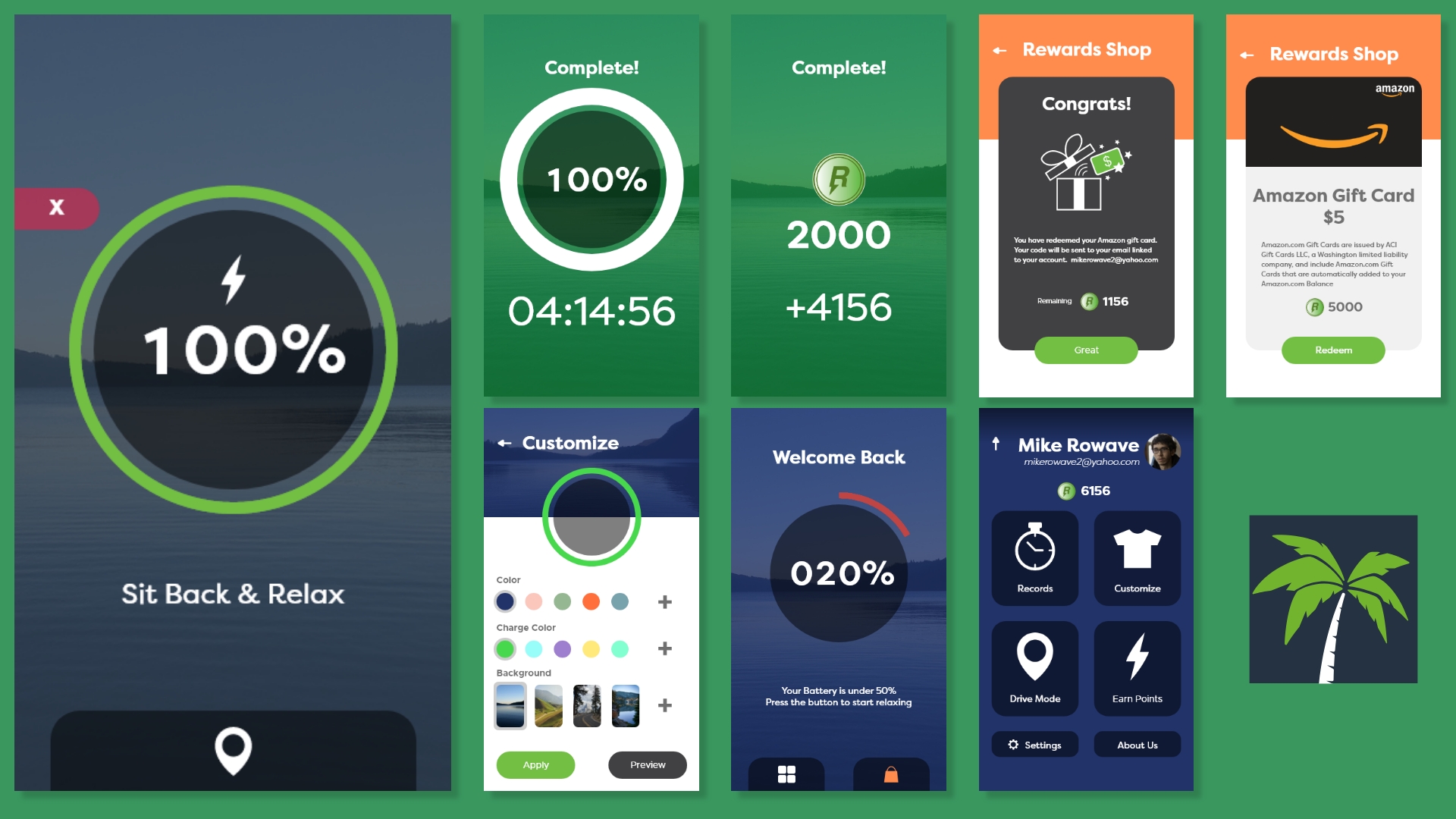

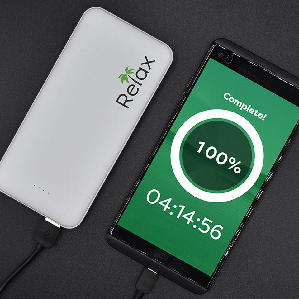
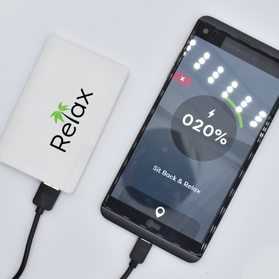
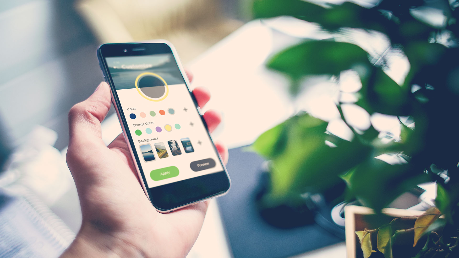
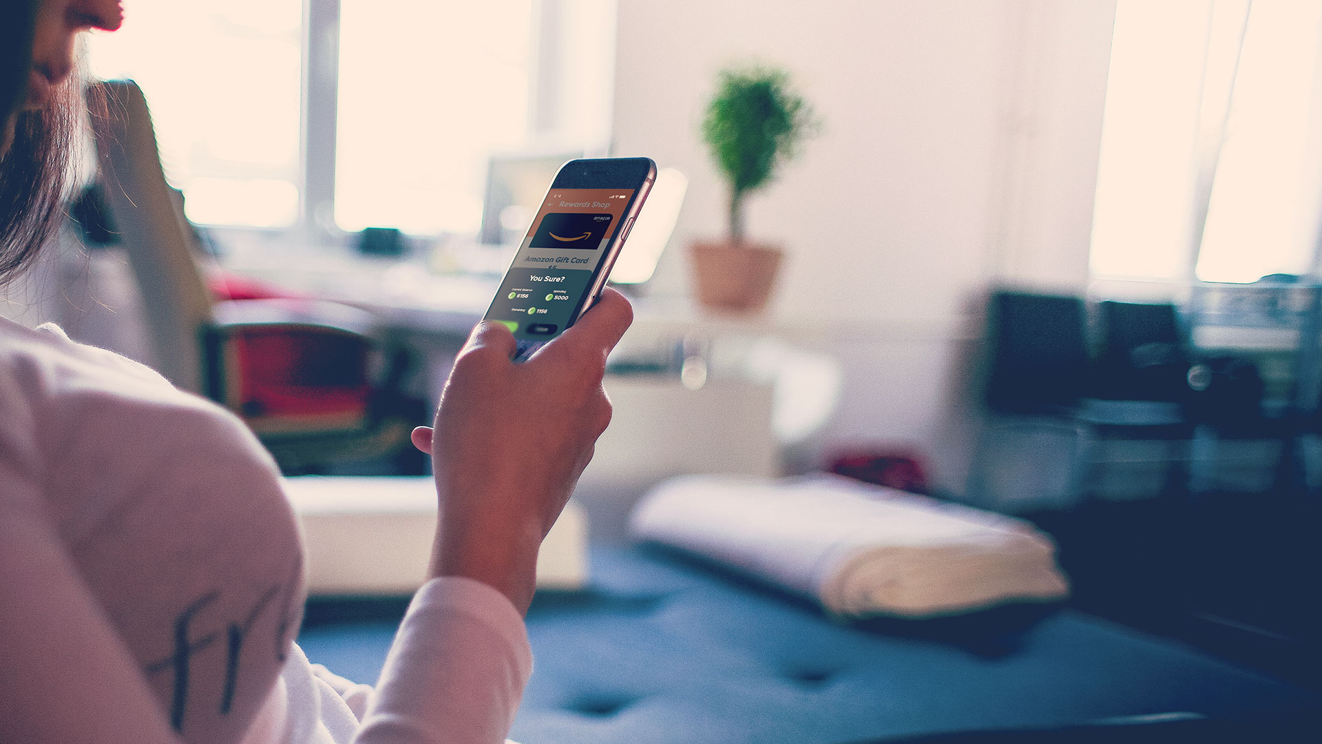
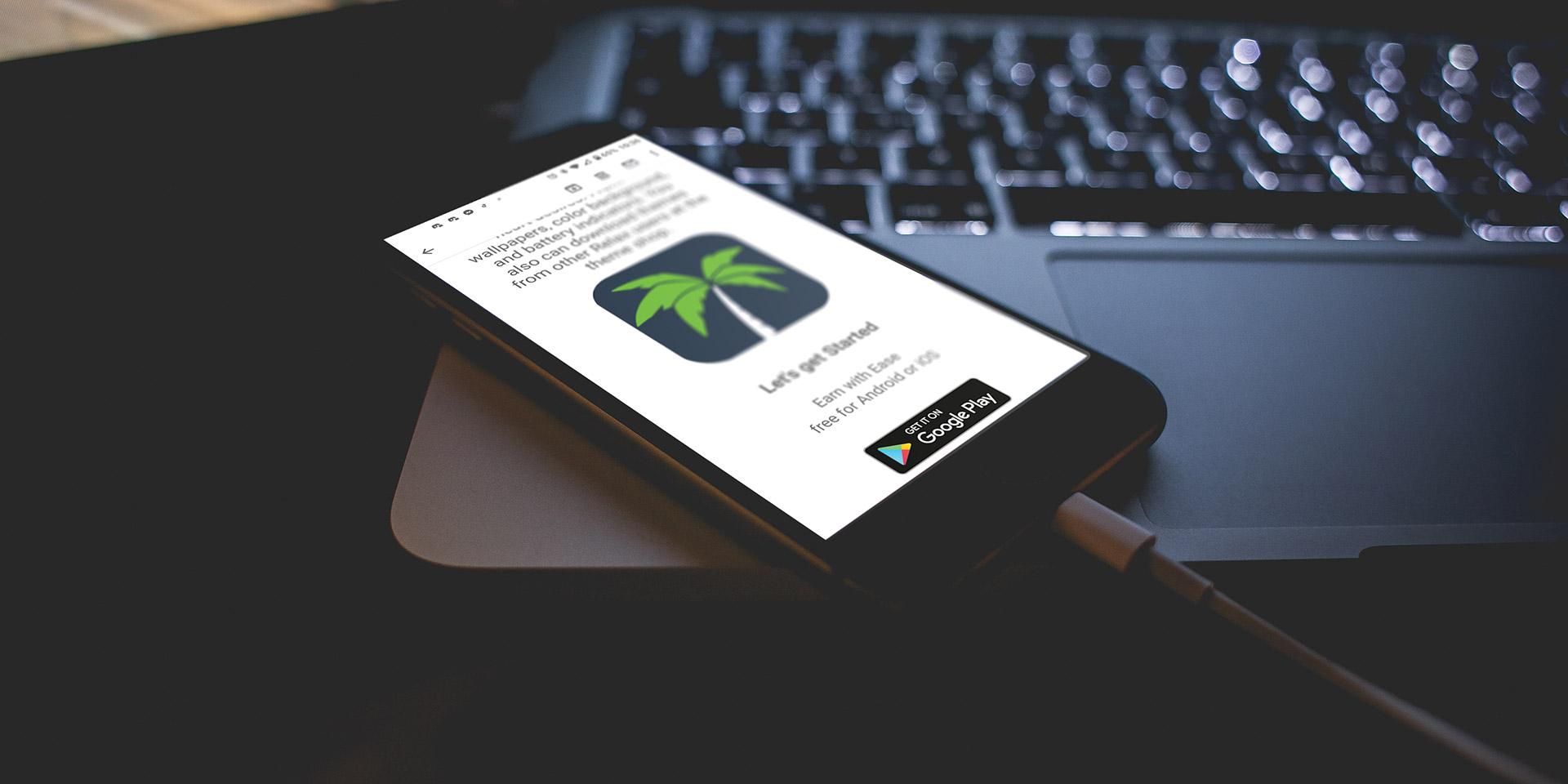
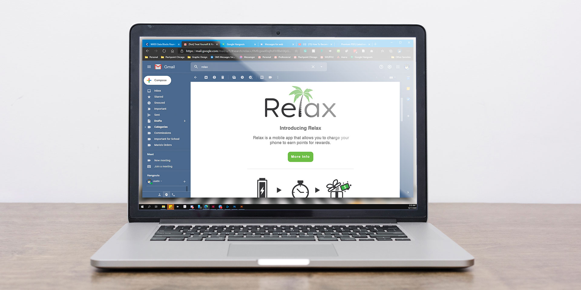
Relax is a mobile app that gamifies the way you charge your phone. Charging gets the user points and then they redeem those points into prizes. Make it yours by customizing the main menus including color background, battery indicator, and wallpapers. You receive points depending on how long it will fully charge uninterrupted. You redeem those points towards prizes, gift cards, etc. Relax will also allow you to customize the user interface menus including color background, battery indicator, and wallpaper. The money comes from the ads that are displayed on the User Interface.
The primary target audience are people aged 14 to 24 who are from high school to college who spend too much time on their phones, as well as young adult workers who do not charge their phones often due to the busyness of life. Our objective is to have the audience have less screen time on their phone and more time off doing something else such as meditation and social activity.
Adobe Photoshop
Adobe Illustrator
Adobe After Effects
Adobe Xd
Figma
Mailchimp
~11 Weeks
Marketing
Print & Digital Assets
Data Visualization
Motion Graphics
UI/UX
Email Newsletter
Photography by Rob Carpentier
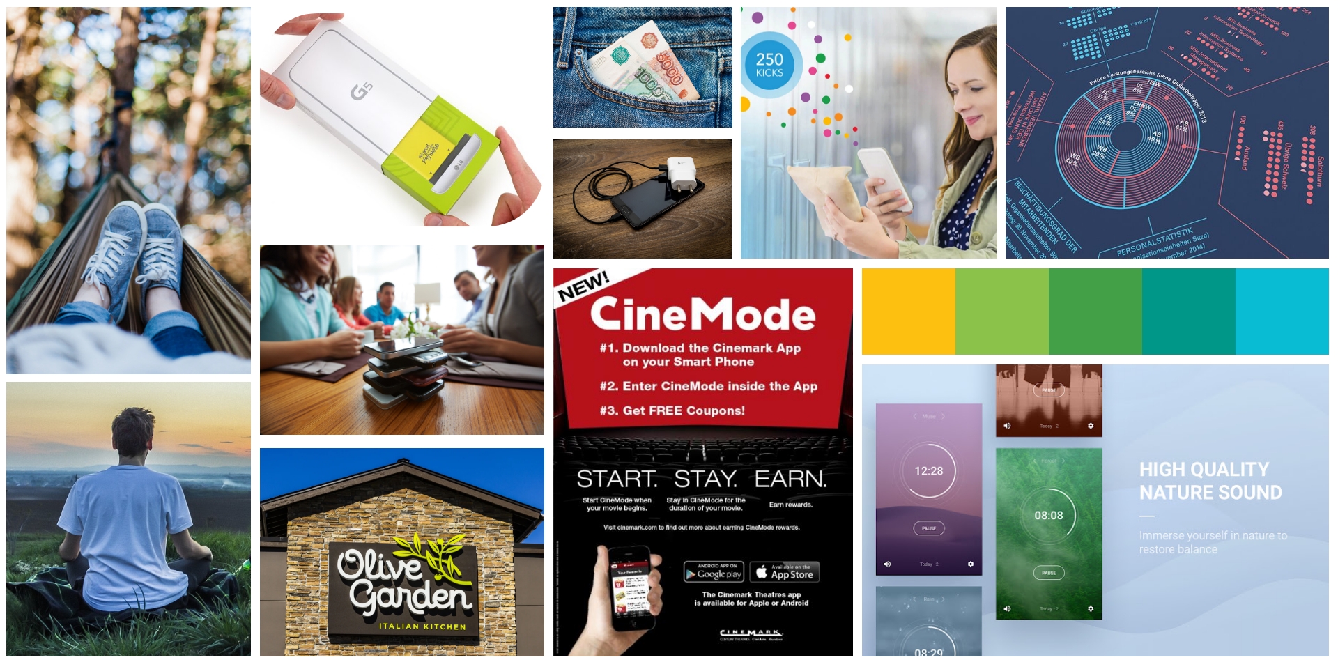
As I research through the word "Relax" the overall feel and atmosphere should be a quiet, calm, and friendly feel to it. Thus showing pictures of meditation, nature, and relaxation. Looked through its competitors like Cinemark's and Shopkick's points system. The olive garden logo is the kind of type I want on the branding of Relax.
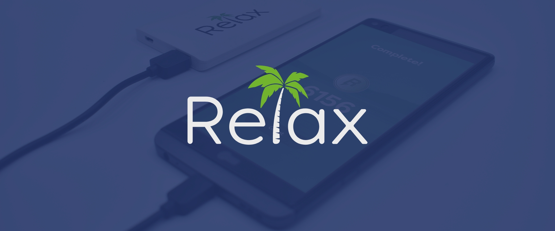
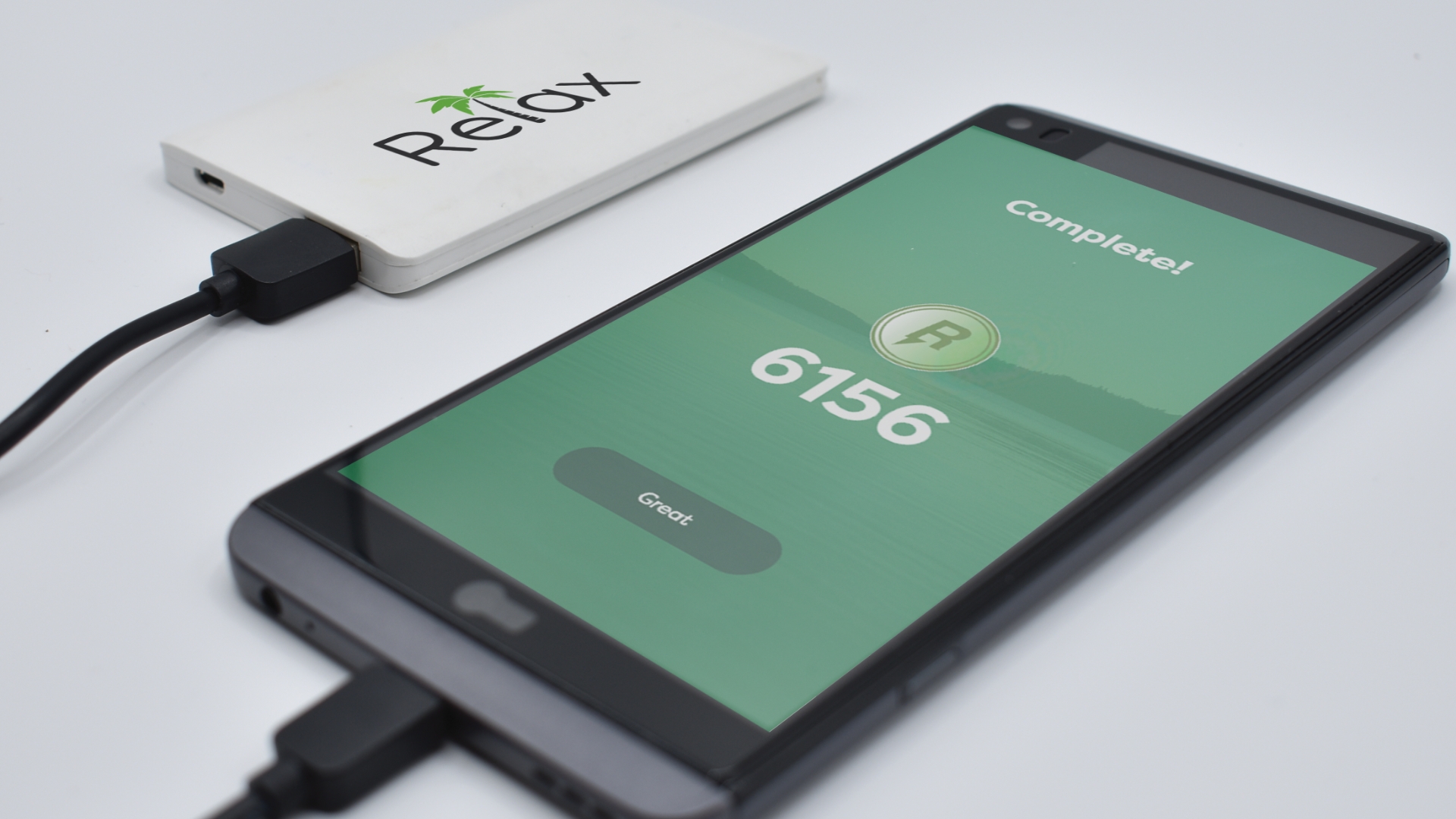
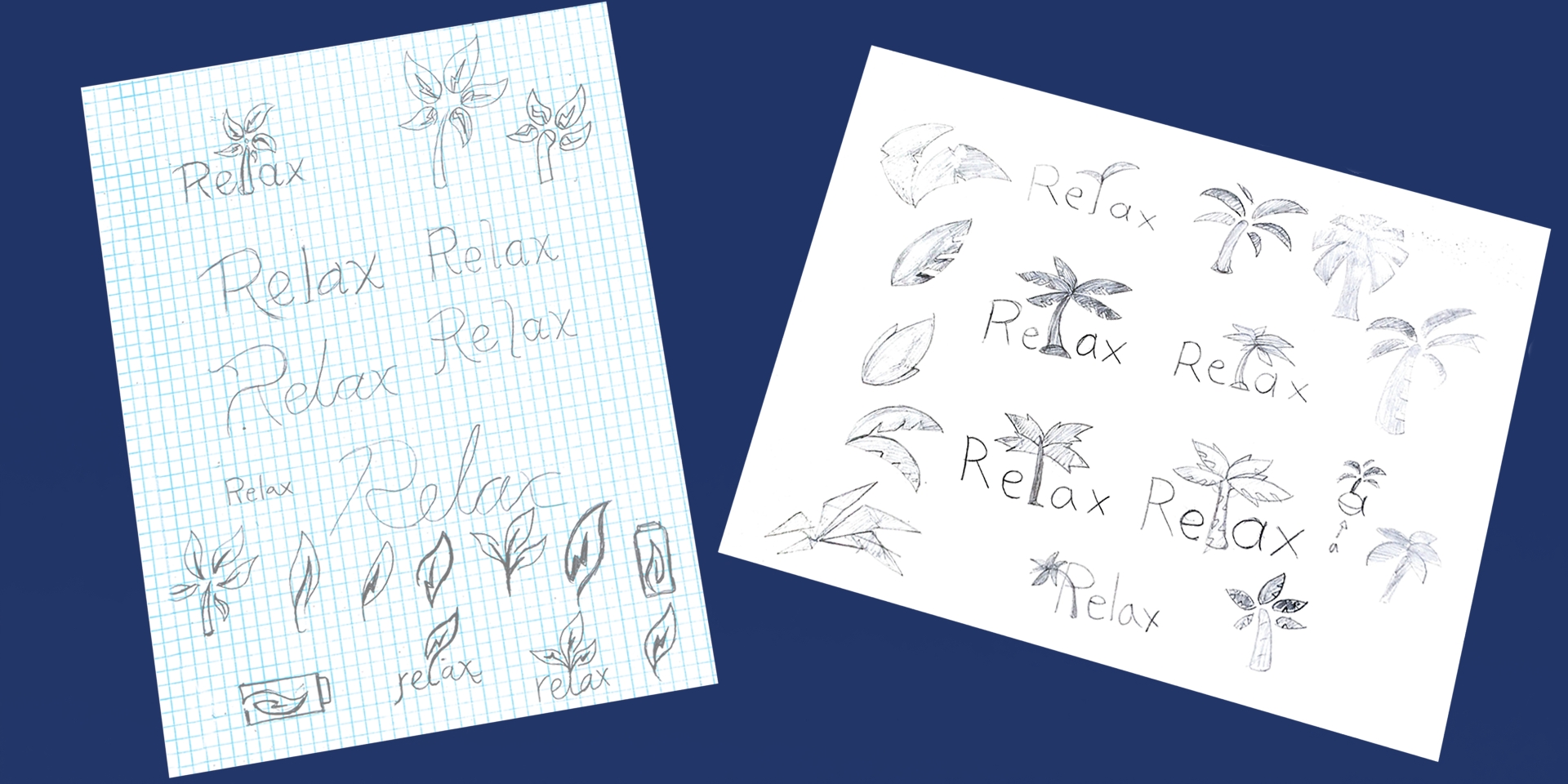
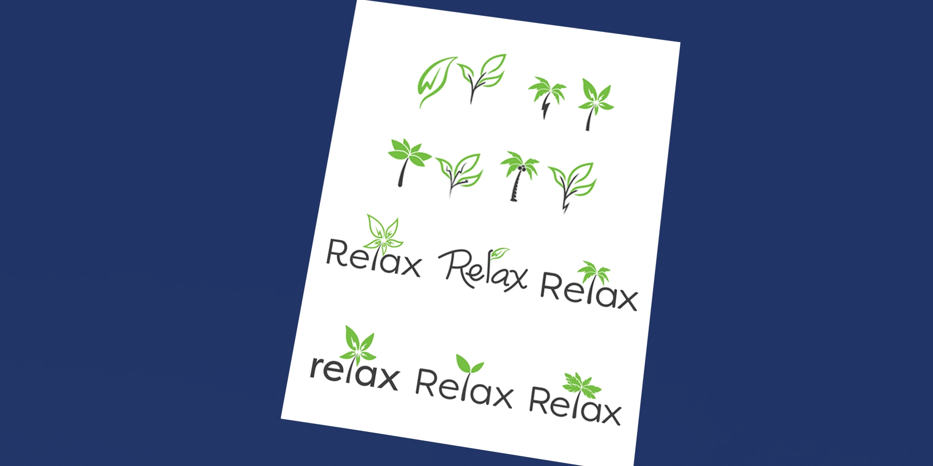
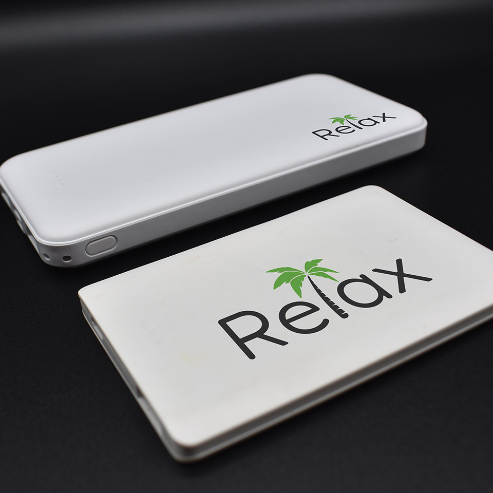
During the logo process, I thought of having the plant as the motif for the brand to make it calm and lightweight. From the leaves to stems to trees, I decided to go with the palm tree as the best representation of relaxing like vacations.
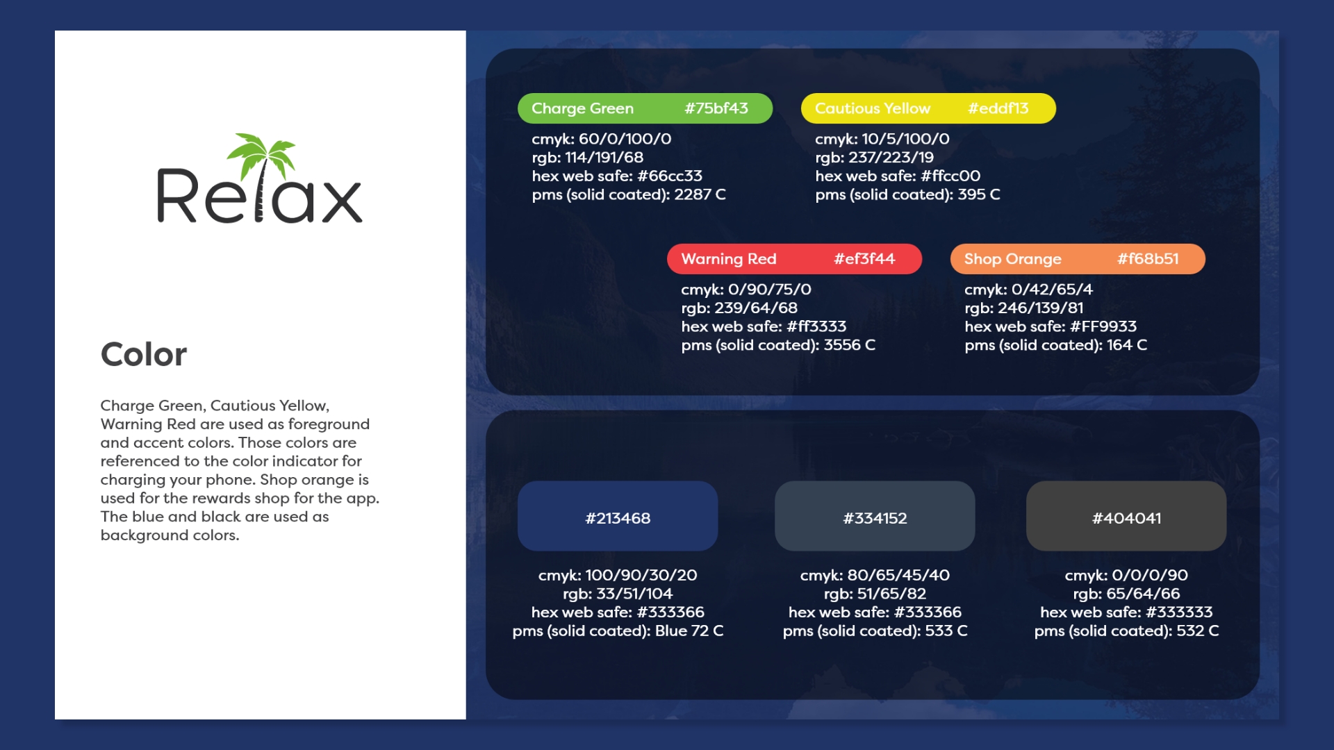
The color green represents the health of both trees and the battery of the phone since it associates with relaxing, safety and health.
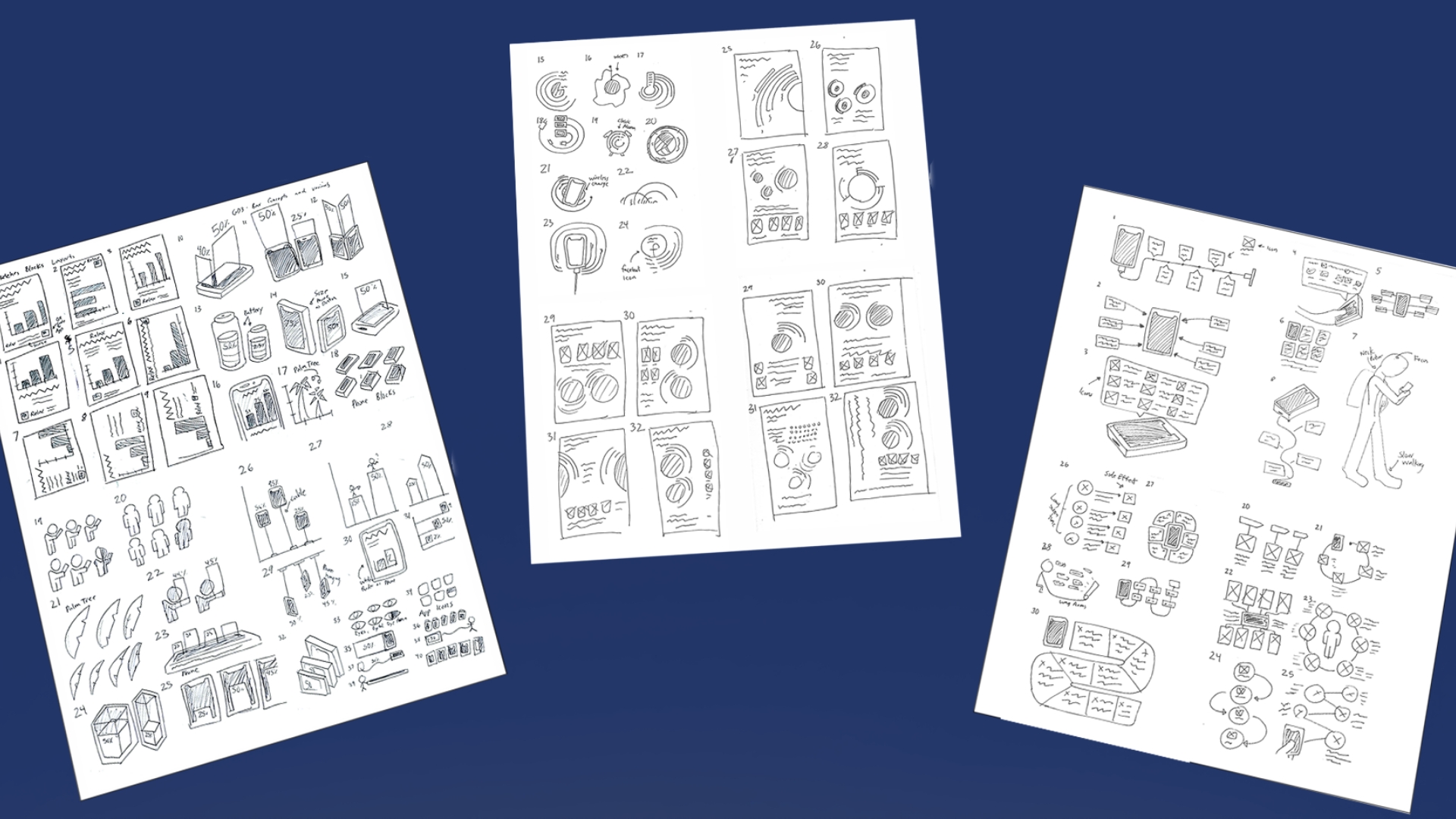
How I do sketches is creating a flow chart. Each sketch contains a certain element on what it can do. From going to a different slide or encounter an micro-animation. Also created other elements such as the customization of the battery indicator for the settings menu.
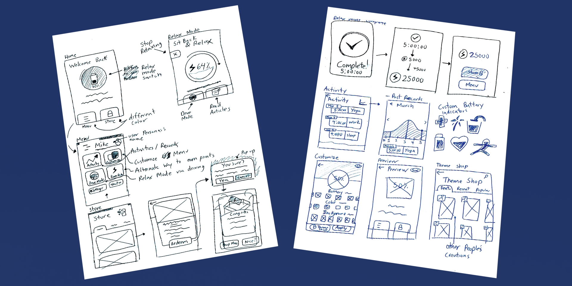
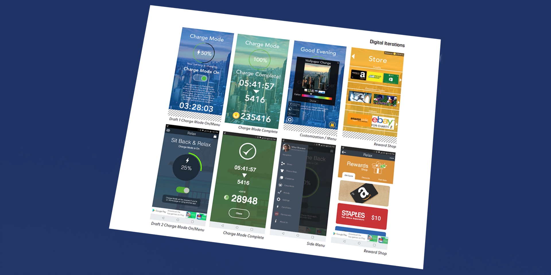
Started out with wireframing the overall layout of the app. Next is creating rough iterations of the UI of the app. A lot of trial and error.
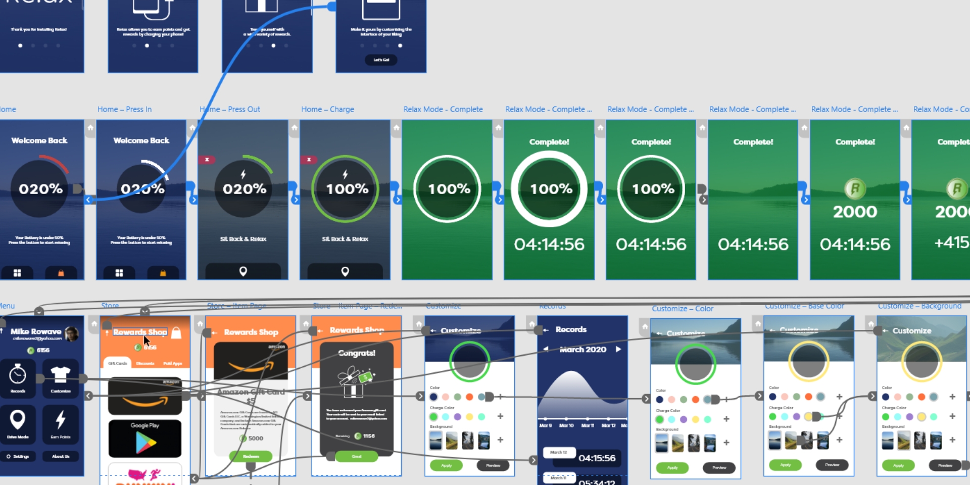
Once the iteration is set in stone for the brand, it is time for connecting the paths for each design flat to create a functioning Prototype.
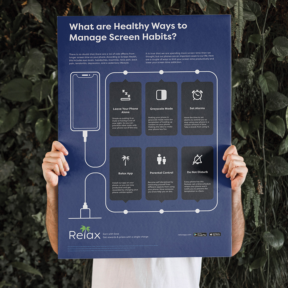
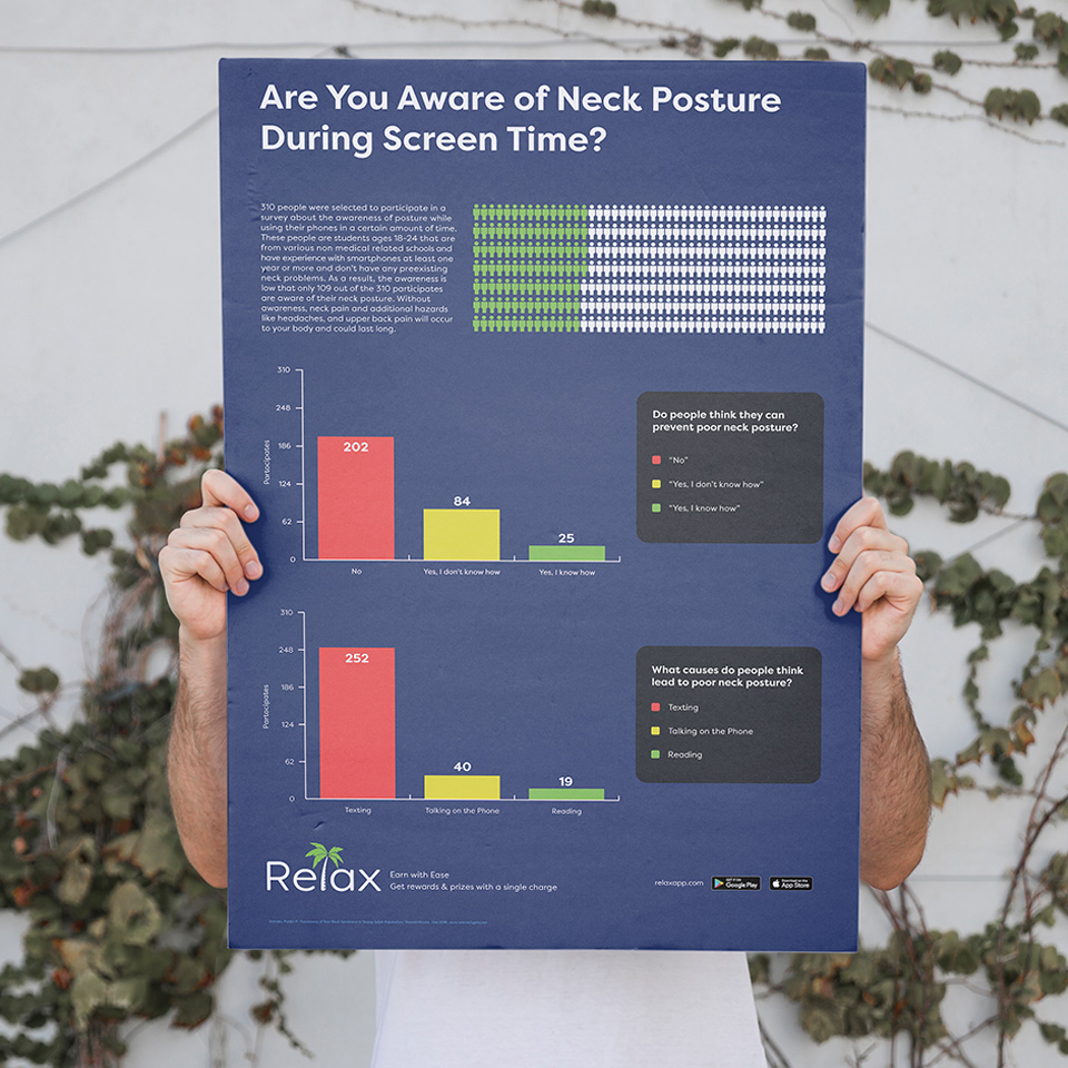
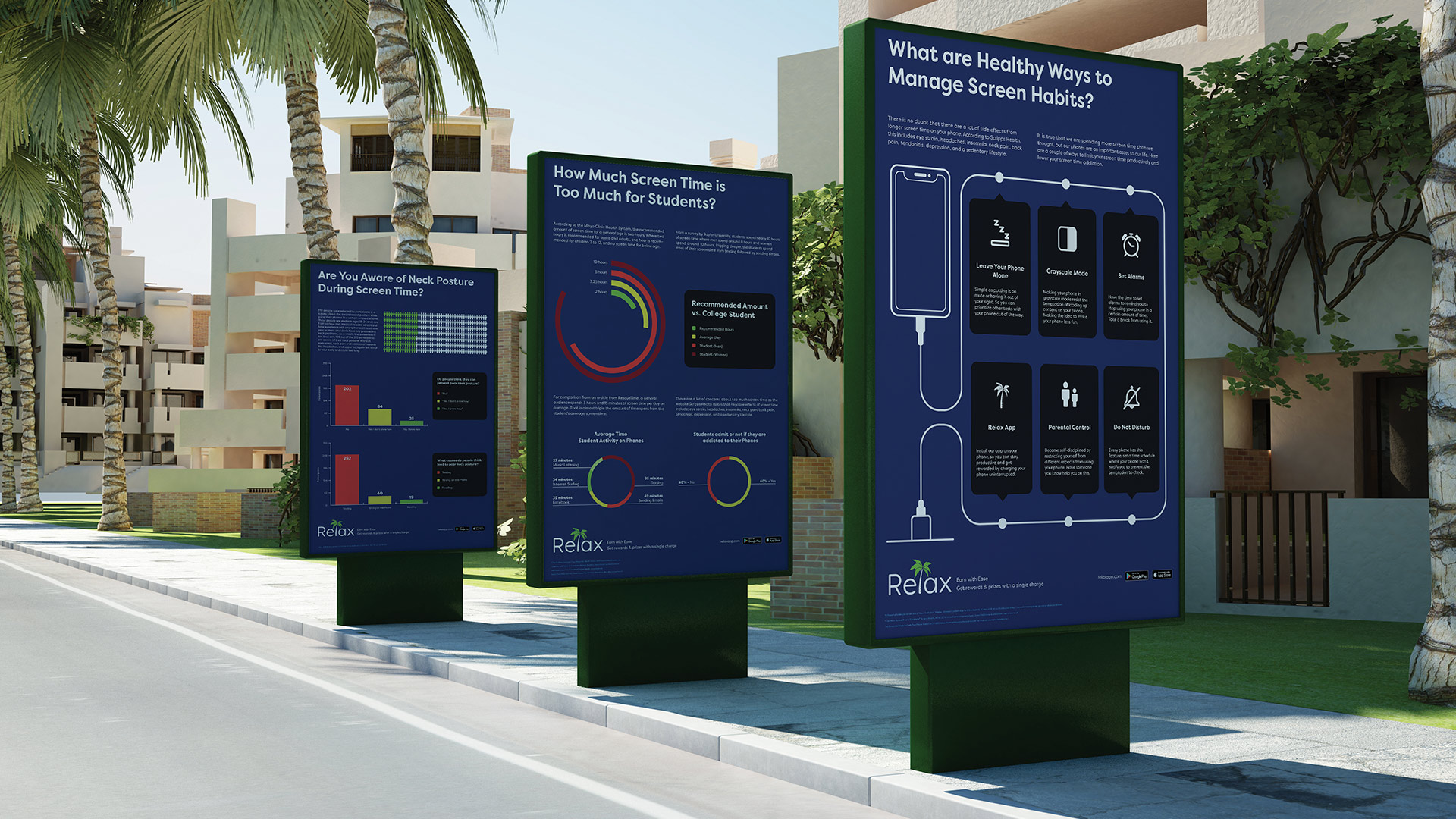
Relax wanted to spread more awareness to people, especially students who are having too much screen time on their mobile devices. So as a response, I created data visuals about the consequences of having too much screen time. As I start my process with data visualization with Relax, I created three data assets dubbing "Data Blocks, Data Circles, and a Data Map" that talks about the possibilities of the danger of screen time. The topic goes from the awareness of a student's neck posture to the time spent on mobile as an average student vs the recommended amount. Each poster stays aligned with the Relax brand as well as a link to the landing page so users can download the app.
The motion graphic video that acts as a video advertisement on Youtube or mobile free apps. Adobe After Effects was used in this video. This motion graphics video was made prior to the final design, so the font and logo are different to the current style guide of Relax.
Voiceovers by Isabelle Amponin
I researched on other design data posters and find out how they express data alongside the sources to use for the poster
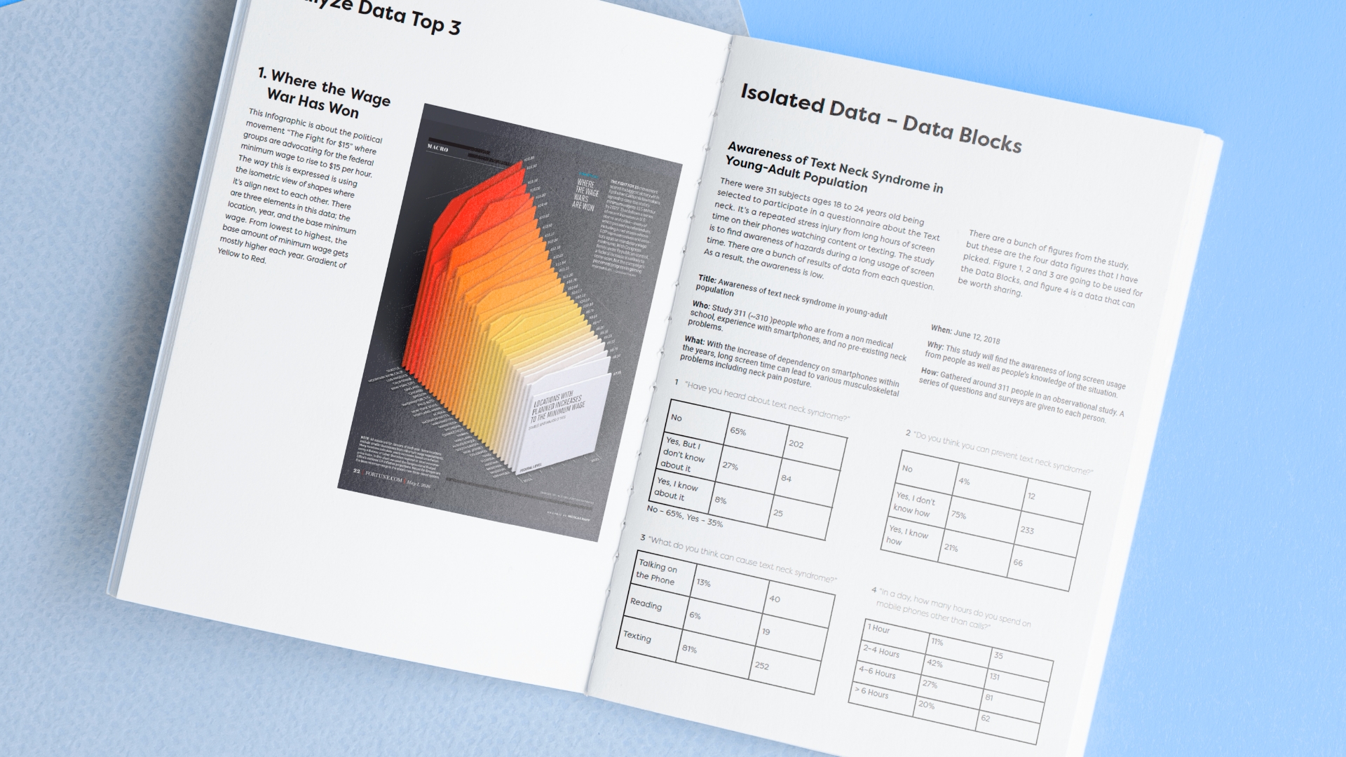
The concept sketches are how I can express data to the audience. Ideas from making it more illustrated or more straight to the point.
Nailing it down to the few best concepts and then digitalizing it with Adobe Illustrator as a poster.
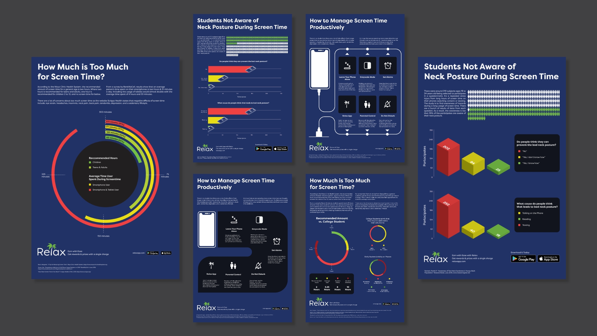
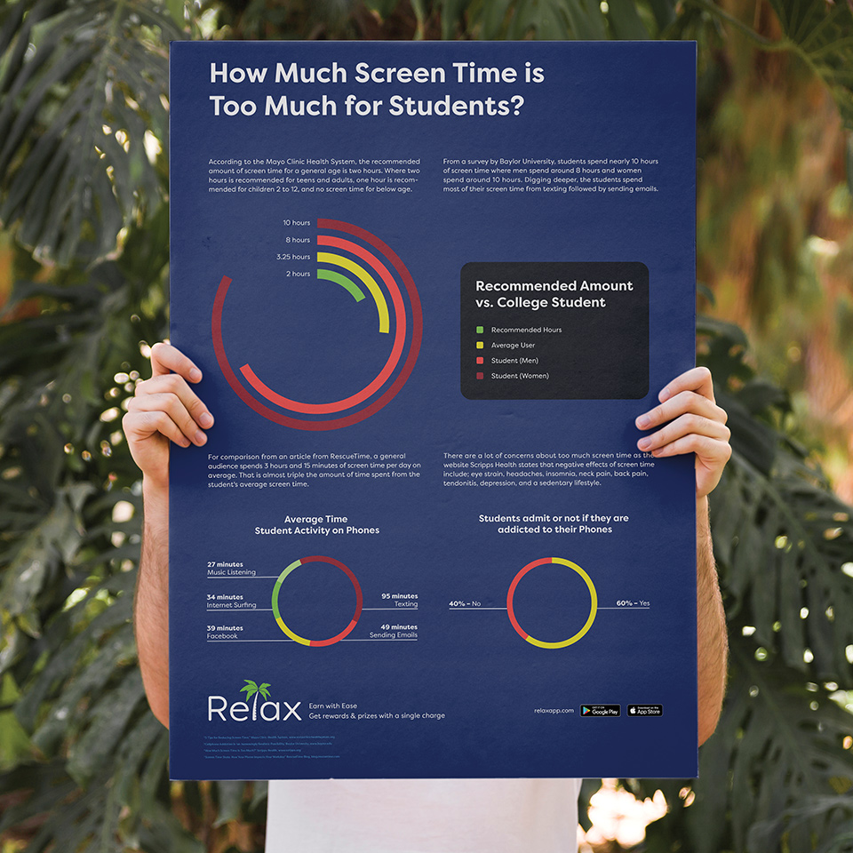
ResearchGate (Data Blocks) | Mayo Clinic Health System, Baylor University, Scripps Health, RescueTime (Data Circles) | Kidslox, RescueTime, Scripps, WIRED (Data Map)
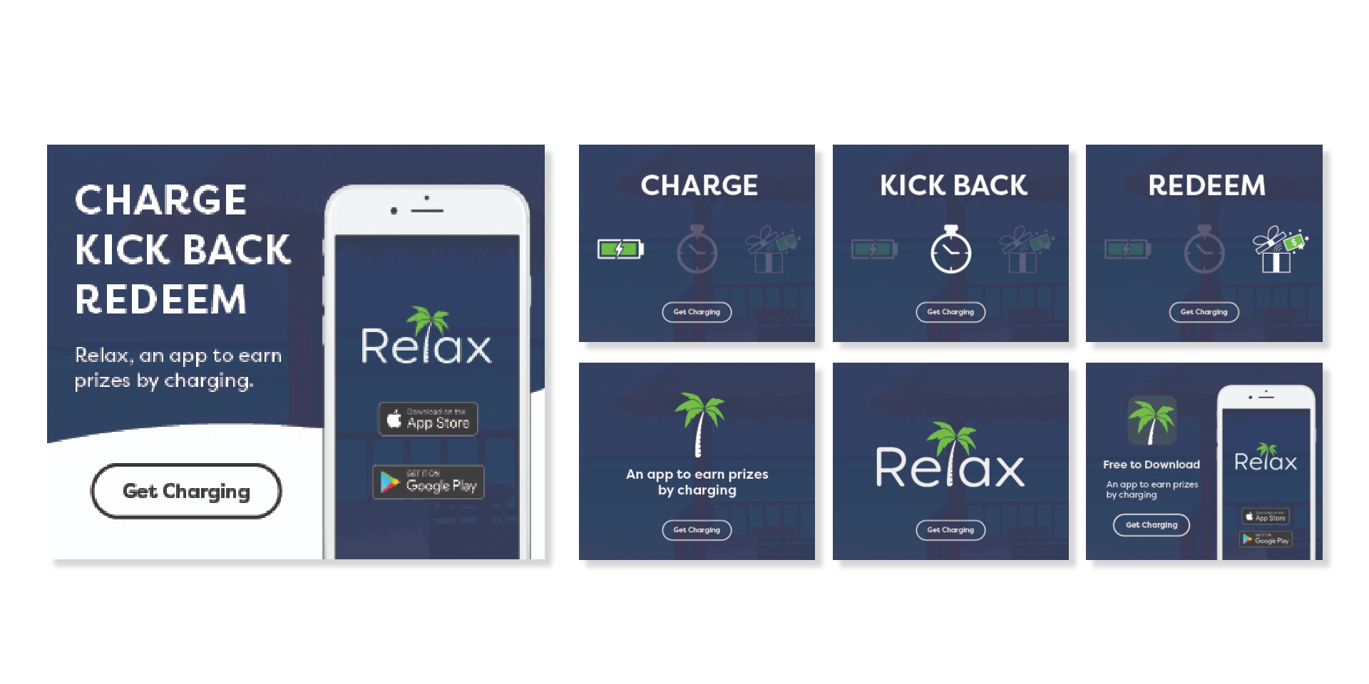
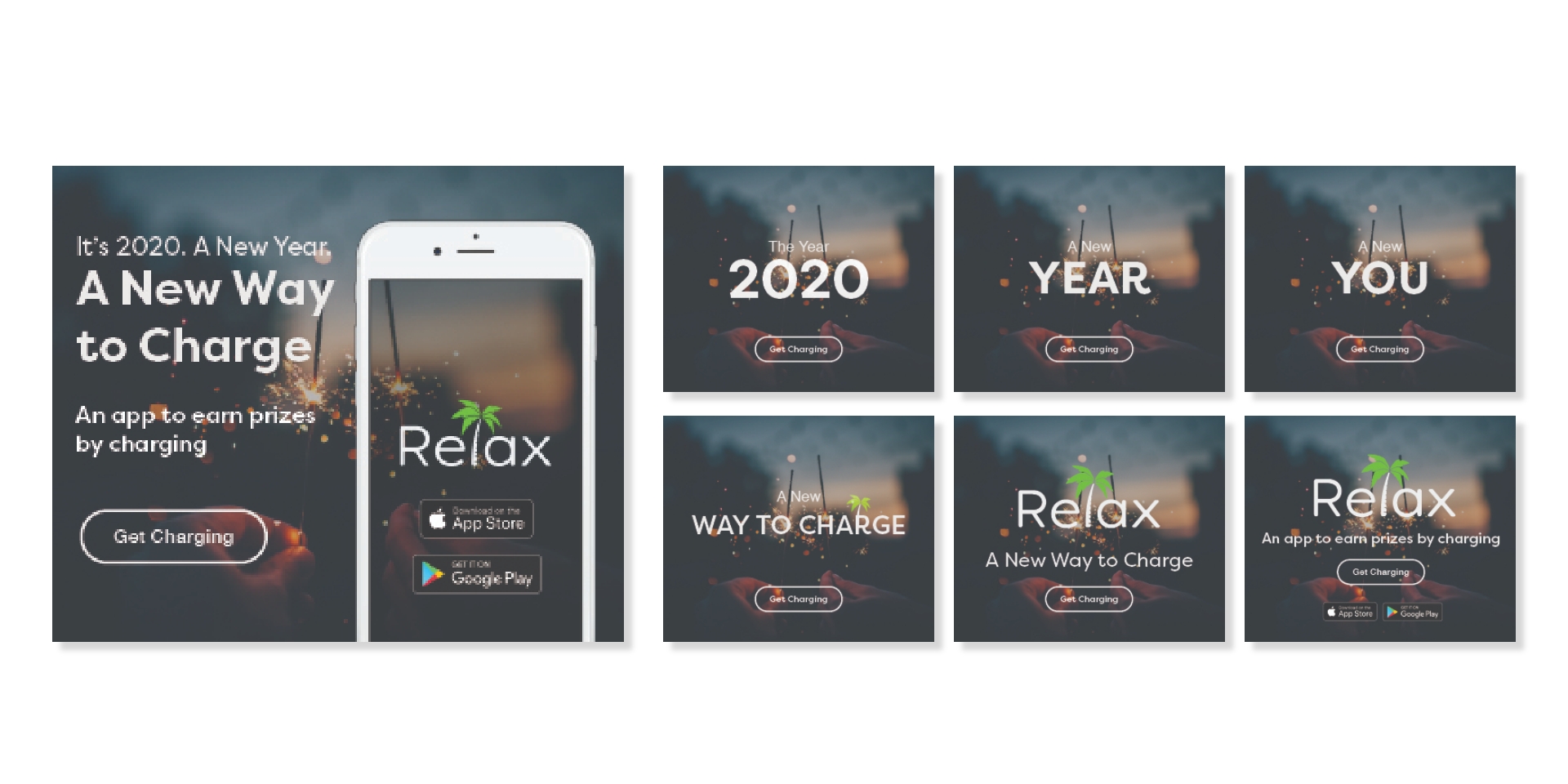
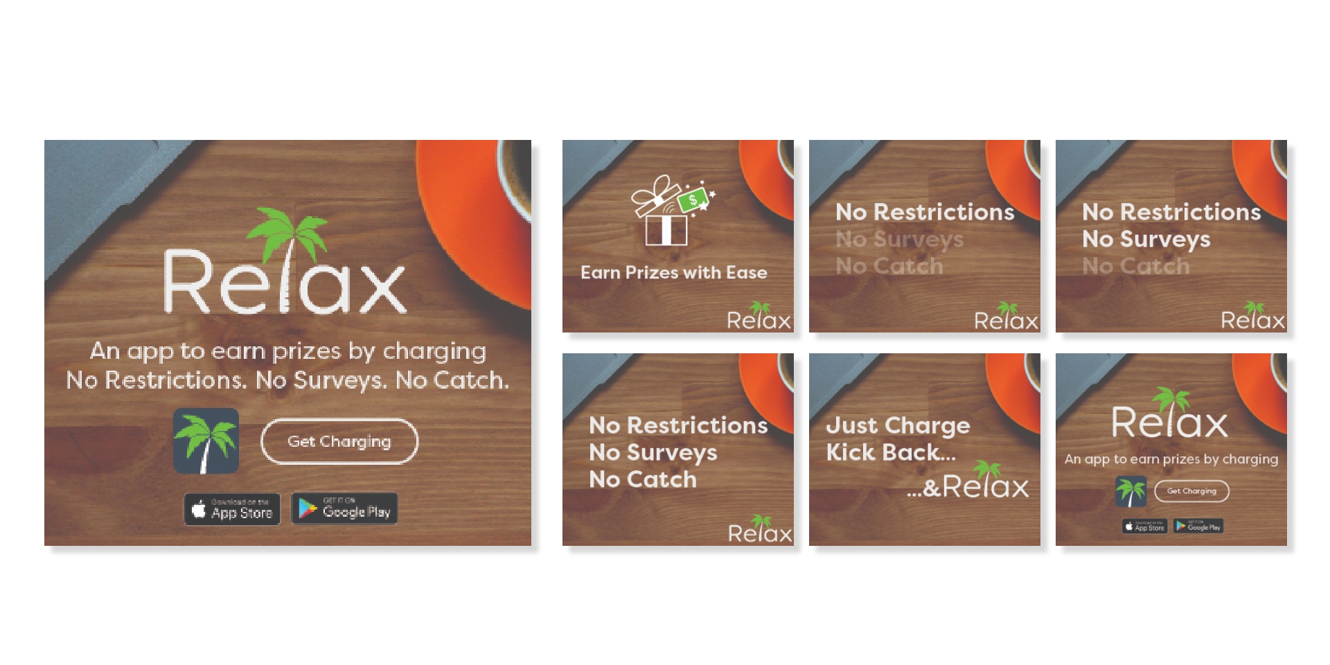
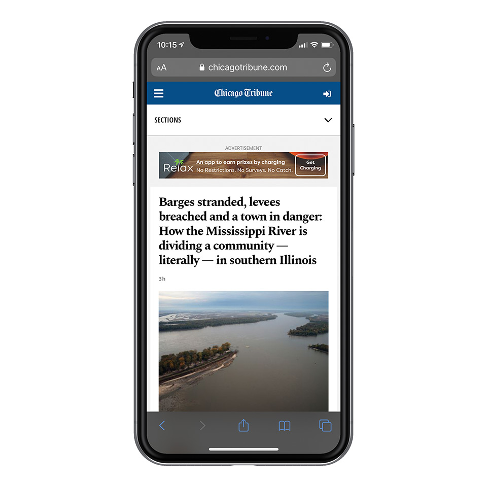
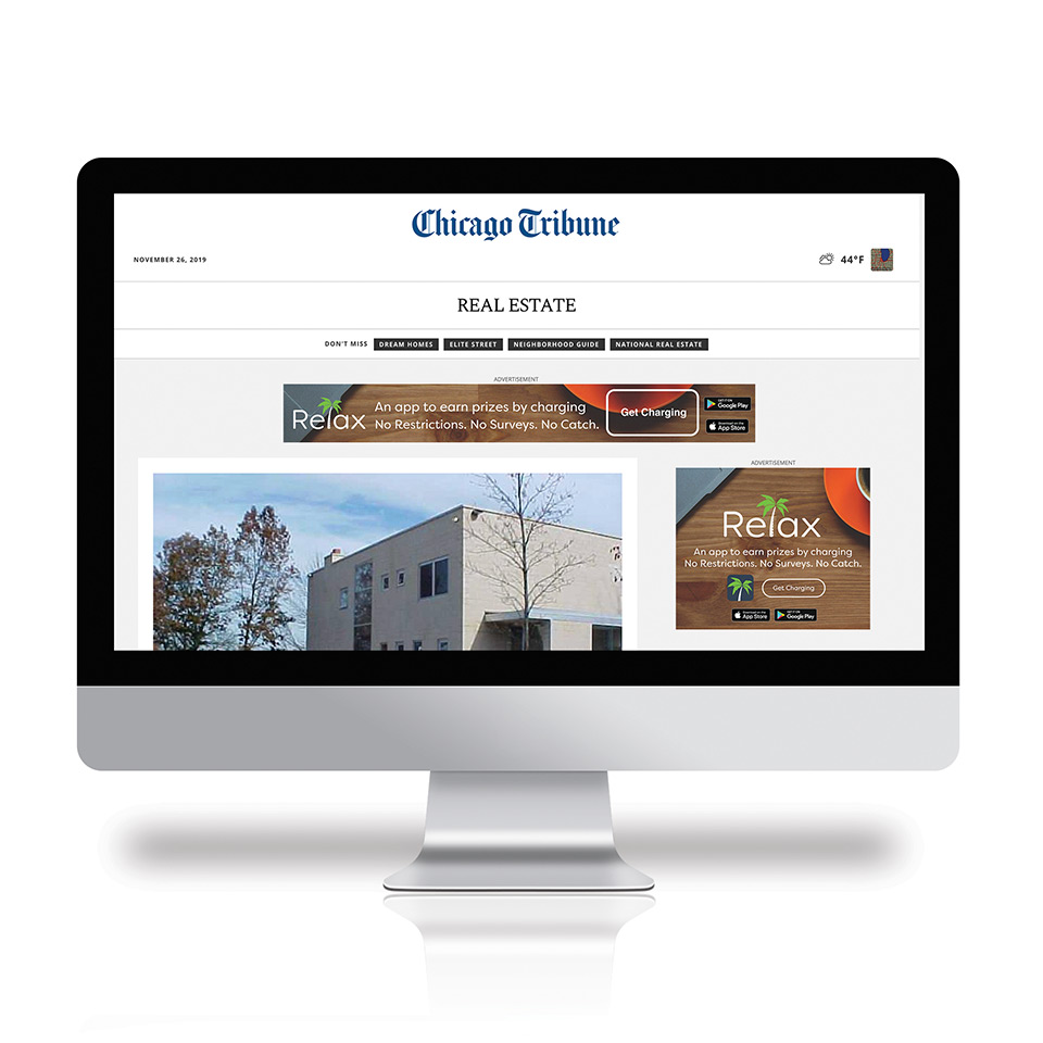
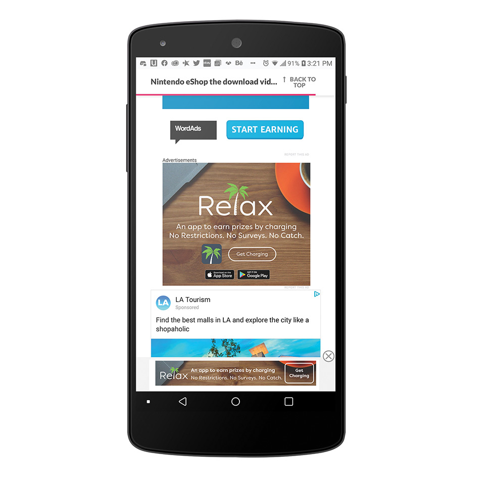
Before we started designing our web banners for mobile devices and desktop, we first researched what publisher or digital news website was the best fit for Relax. Next, was creating three design variations of our web banner ads based on our monthly strategy campaigns. We first created a static frame and then a storyboard of six animation frames. The designs were nailed down to the third concept storyboard based on the feedback and votes from peers and other people stating that the design has a relaxing-feel and tone. The selected design is produced in different sizes including microbanners and leaderboards both static frame and six animation frame storyboard.
Web Banner Cube
Design 1 is more informative on how it works with icons. This is targeted towards an audience who are tech-savvy and knows about smartphones and mobile apps
Design 2 is more seasonal with New Years Day and is targeted towards a more casual audience specifically the community that is more focused on meditation, and a healthy & youthful lifestyle.
Design 3 is calling out the competitors that we don’t have any “side-effects” on getting points and rewards. This design is targeted at a casual audience as well.
Web Banner Leaderboard

Web Banner Microbanner
The goal of the design of the eBlast is to increase the number of downloads for the app. If the number of downloads increases, then there will be more users using our app for a long time. Whether they are newcomers or existing users, we are sending this email towards our user audience that is signed up for our Relax newsletter that doesn’t have the app on their phones to remind them to install the app. I'm are using Mailchimp as our customer relationship management (CRM).
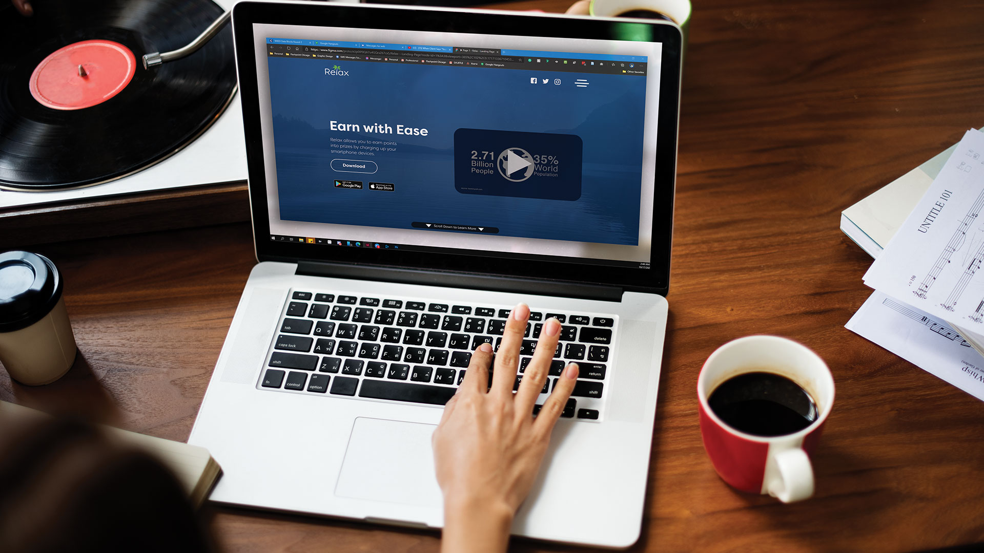
When someone clicks from our eBlast or web banners, it will direct them to our landing page. The page on top shows a YouTube video of an overview of the app. The sections of the page show the app’s features, app recognition, a newsletter sign up, and a download link for the app including inserting your phone number to get the link from your text if you are viewing it on a desktop browser. The landing page uses the persuasion principle of authority since mobile apps need recognition from influencers and well-known websites to make the audience believe that the app is legit. Social proof was considered, but having recognition from groups of experts and influencers is more trustworthy. The layout of the landing page prototype is used via Figma