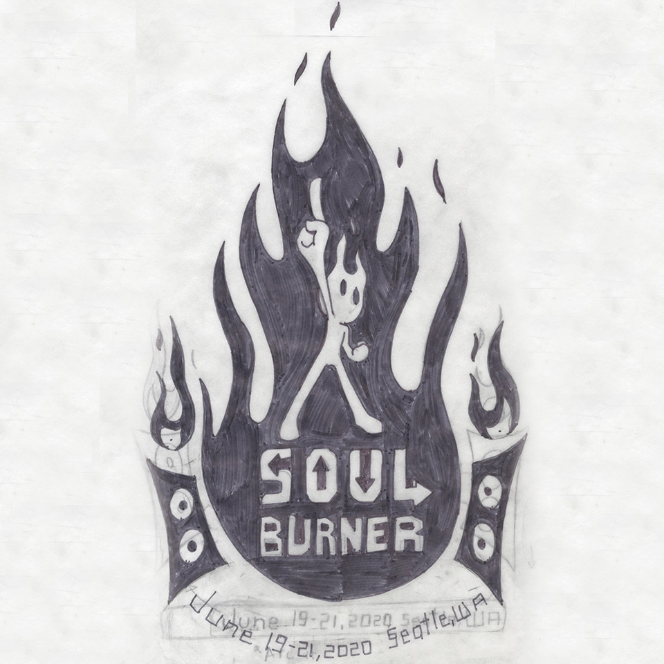
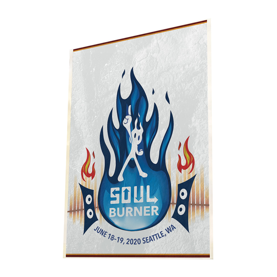
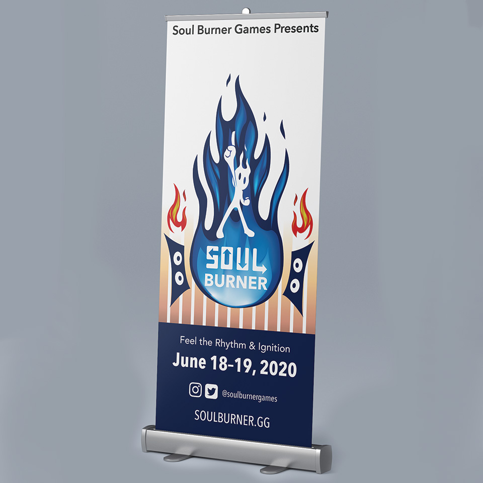
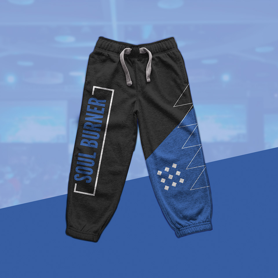
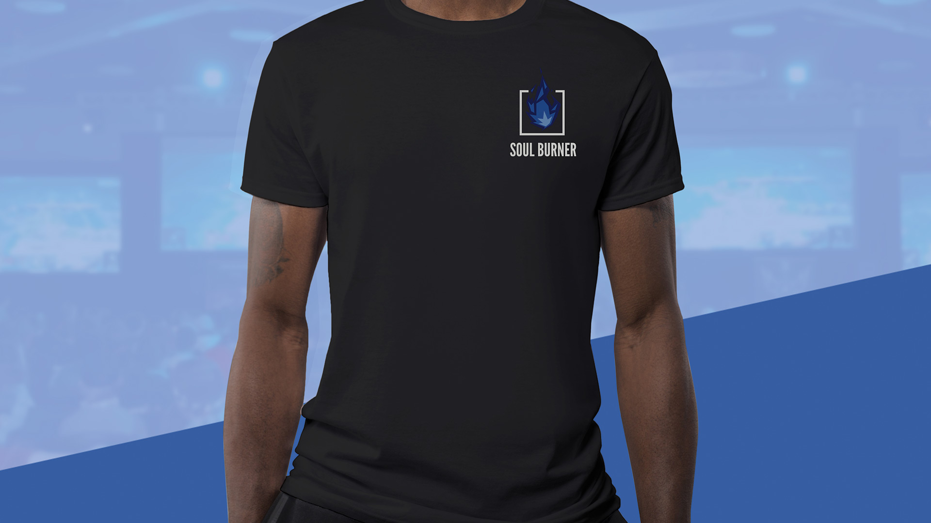
Esports Team

LA-based esport organization in 2021 that holds the team roster for popular games like VALORANT and Super Smash Bros. with great results and performance. They help their team players to be physically and mentally ready for their matches so they can be in peak performance. They also have a packaging suite of apparel and accessories to enhance their awareness for the brand and esports.

IGNITION WITHIN

Soul Burner currently holds their roster for team-based shooters such as VALORANT and fighting games like Super Smash Bros and Tekken 7. Even though we aim for great performance from our team roster, our top priority is supporting our team roster to forge their own ways to peak performance whether it’s getting prepared physically, mentally, or both. Unleash their ignition. Our primary target audience would be our fan base who are around the age of 15-21 who are gamers that are familiar with the games Soul Burner has in their team roster or esports. Those audiences are the passionate fans. Soul Burner does want to appeal to an older demographic who also plays games whether it’s on a daily basis or to an extent but also have little to no familiarity with esports. Those audiences are the people who don’t think esports are not as legit and viable as regular sports.

Programs Used

Adobe Photoshop
Adobe Illustrator
Adobe Dimension
Adobe Xd

Brand Identity

Sketches

From the early stages of SOUL BURNER, it was going to be a rhythm games arcade esports team. From time to time, it becomes a more multi-genre video game esports team. Having the logo from a blue fire mascot to a story of a flame/soul/spirit about to burst out of the box. Just like when players are in the zone.

Digital Iterations

Brand Identity

On how the visuals and graphics should look especially on a poster, package, and layout design. The early stages were visual motifs of flames and the audio spectrum. Another direction was photos of players (or fans) with flames sticking out with the video game character they primarily play. The visuals were later changed for the final design while sticking with their character next to them as their “soul” direction of the brand.

Final Design

Brand Identity

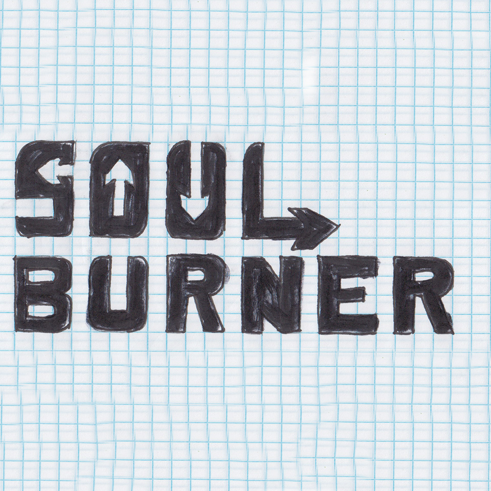
The serif lettering represents the precision of being handmade along and high quality with the tail being wavy like noodle soup. The single letter logo is used for very small spaces like social media and mobile app icon. The sticks on the “R” are chopsticks. The colors are represent as homemade and oraganic. The green, brown, and black are made for background colors. Yellow, Orange, and gray are for foreground colors and accents.


Horizontal Logo

Live Area = x/2, when x = width of the Horizontal Logo
min usage = 0.5” width


Vertical Logo

Live Area = x, when x = width of the Vertical Logo
min usage = 0.3” width


Symbol

Live Area = x/2, when x = Height of the Symbol
min usage = 0.15” width


Vertical Wordmark

Live Area = x, when x = width of the Vertical Wordmark
min usage = 0.35” width


Horizontal Wordmark

Live Area = x, when x = Height of the Horizontal Wordmark
min usage = 0.35” width

Color Usage

Typeface & Colors

cmyk: 80/60/0/0
rgb: 66/106/179
hex web safe: #3366cc
pms (solid coated): 668 C

cmyk: 70/60/60/50
rgb: 58/62/61
web safe: #333333
pms (solid coated): Black 7 C

cmyk: 0/80/100/0
rgb: 241/90/34
web safe: #ff6633
pms (solid coated): 1585 C

cmyk: 10/50/100/0
rgb: 226/143/38
web safe: #cc9933
pms (solid coated): 7555 C

cmyk: 70/0/100/0
rgb: 80/184/72
web safe: #66cc33
pms (solid coated): 7738 C

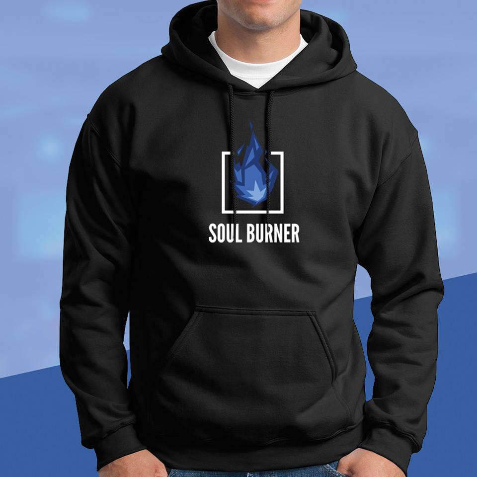
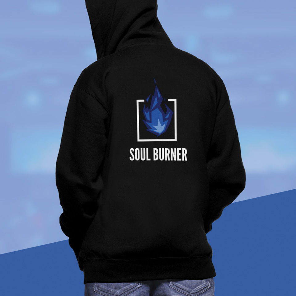
League Gothic – Regular, All Caps

Primary: Heading, Display, Page Titles

Objektiv Mk1 – Regular

Secondary: Paragraphs

Objektiv Mk1 – Light Italic

Tertiary: Captions

Bebas Neus

Free Alternative Primary Typeface

Century Gothic

Free Alternative Secondary Typeface
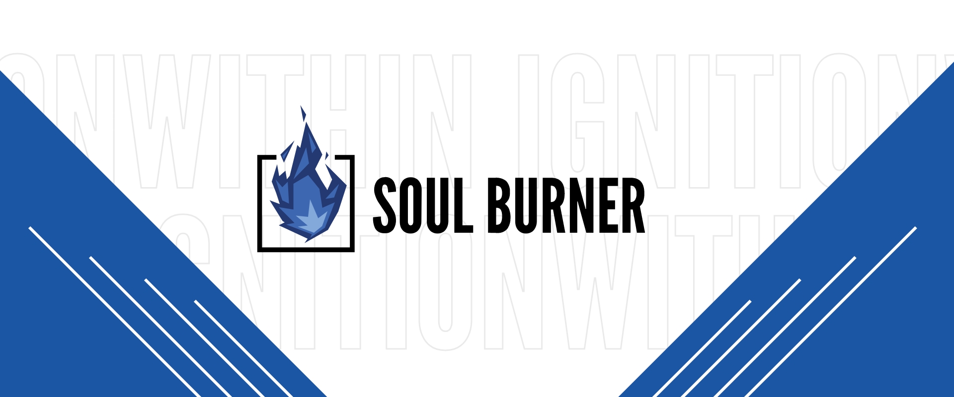
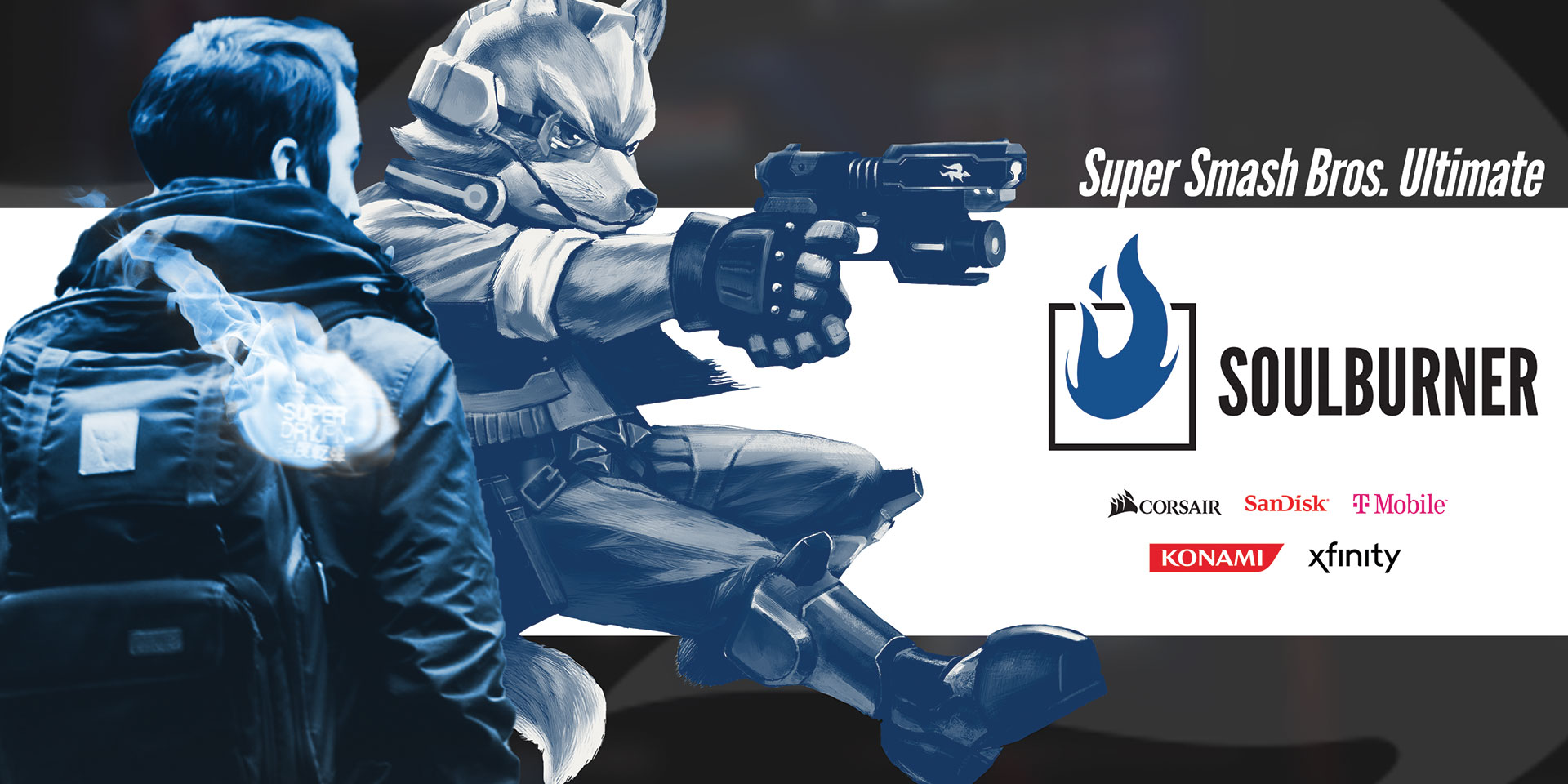
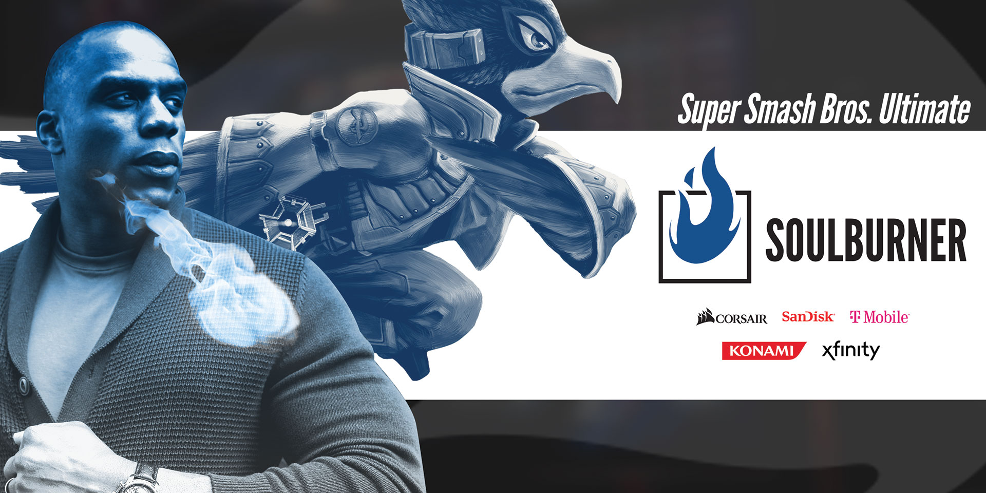
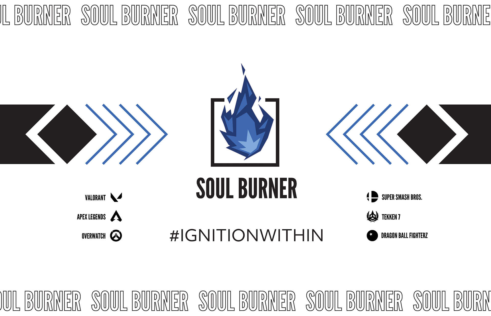
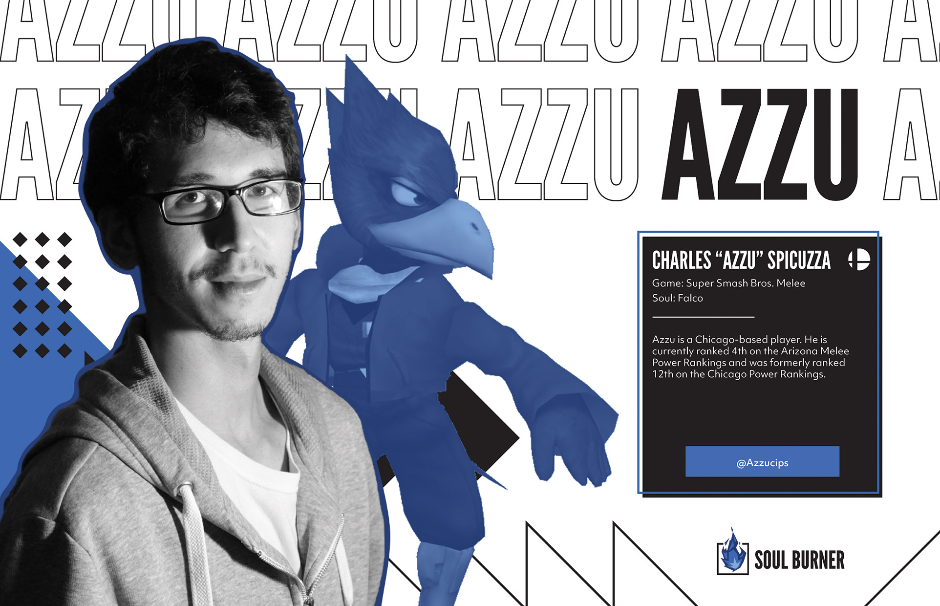
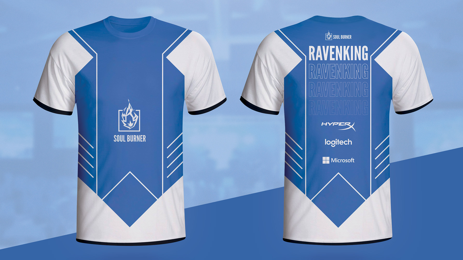
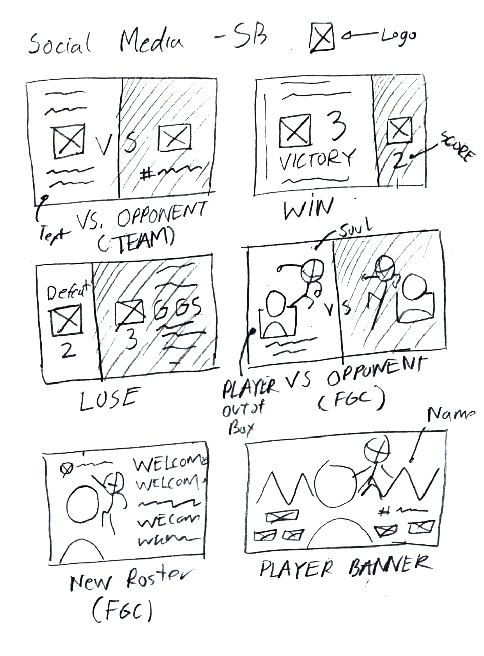
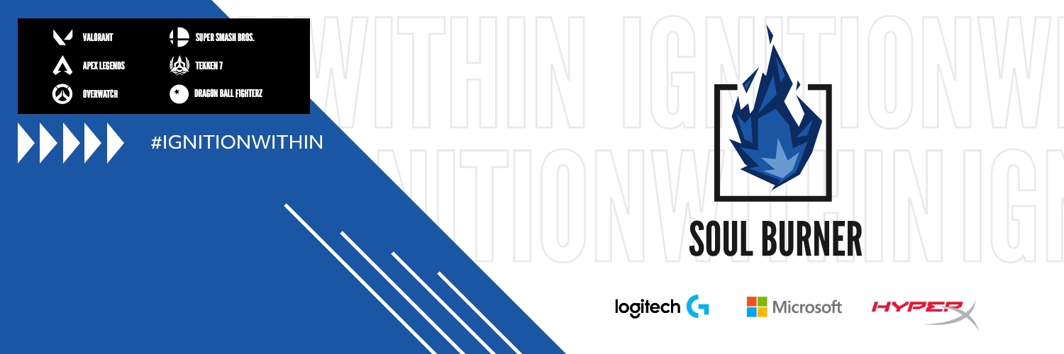
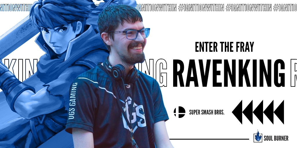
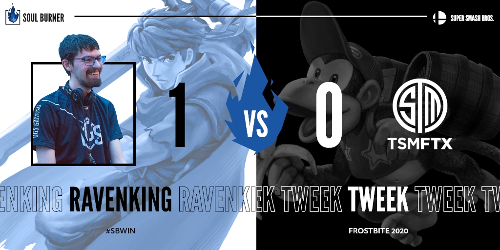
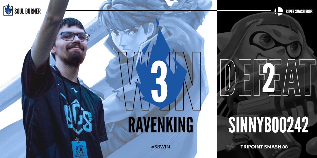
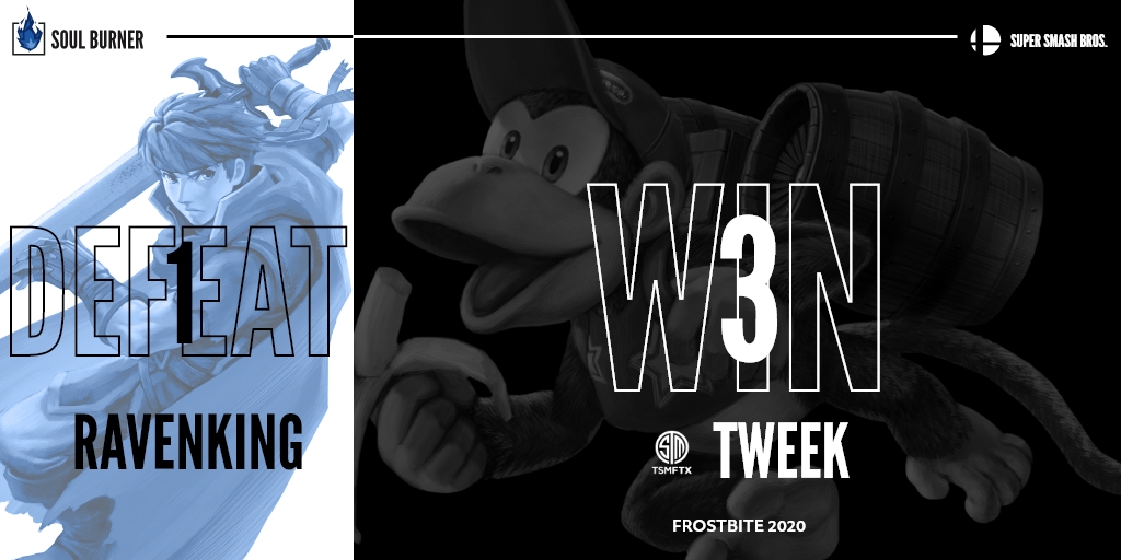
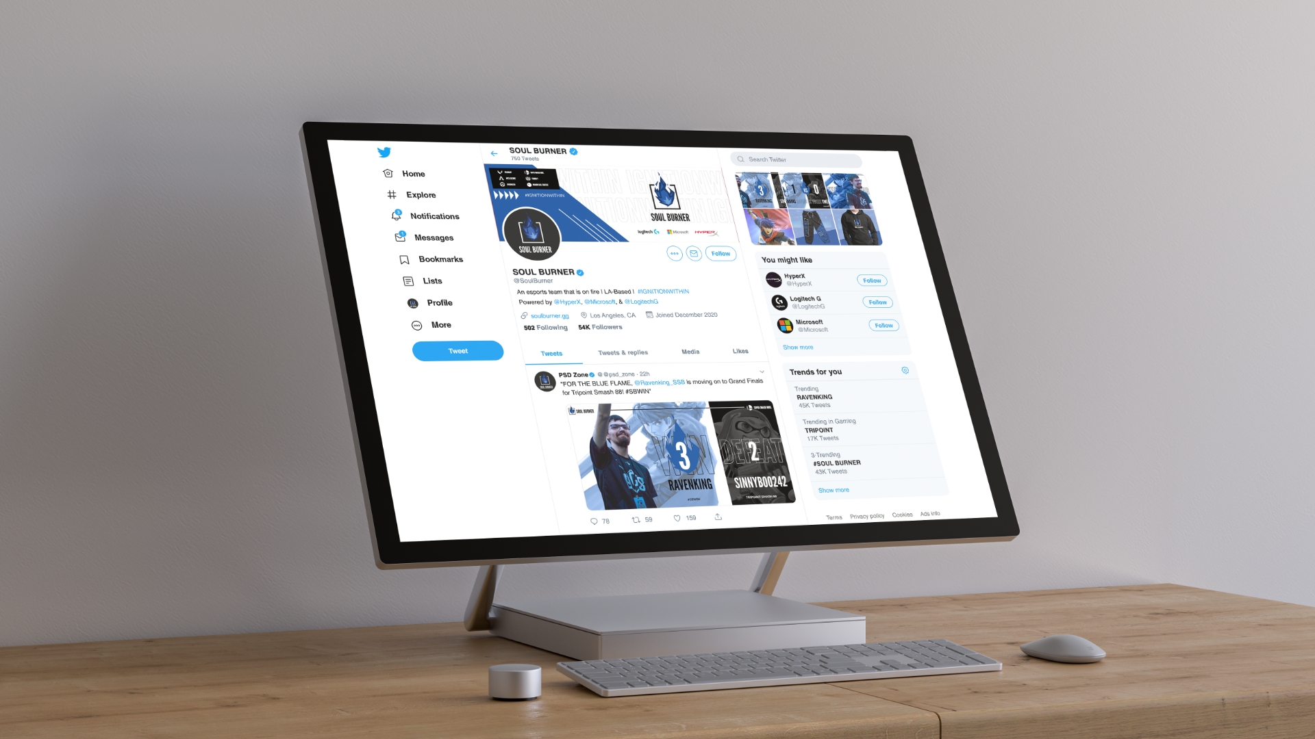
Visuals


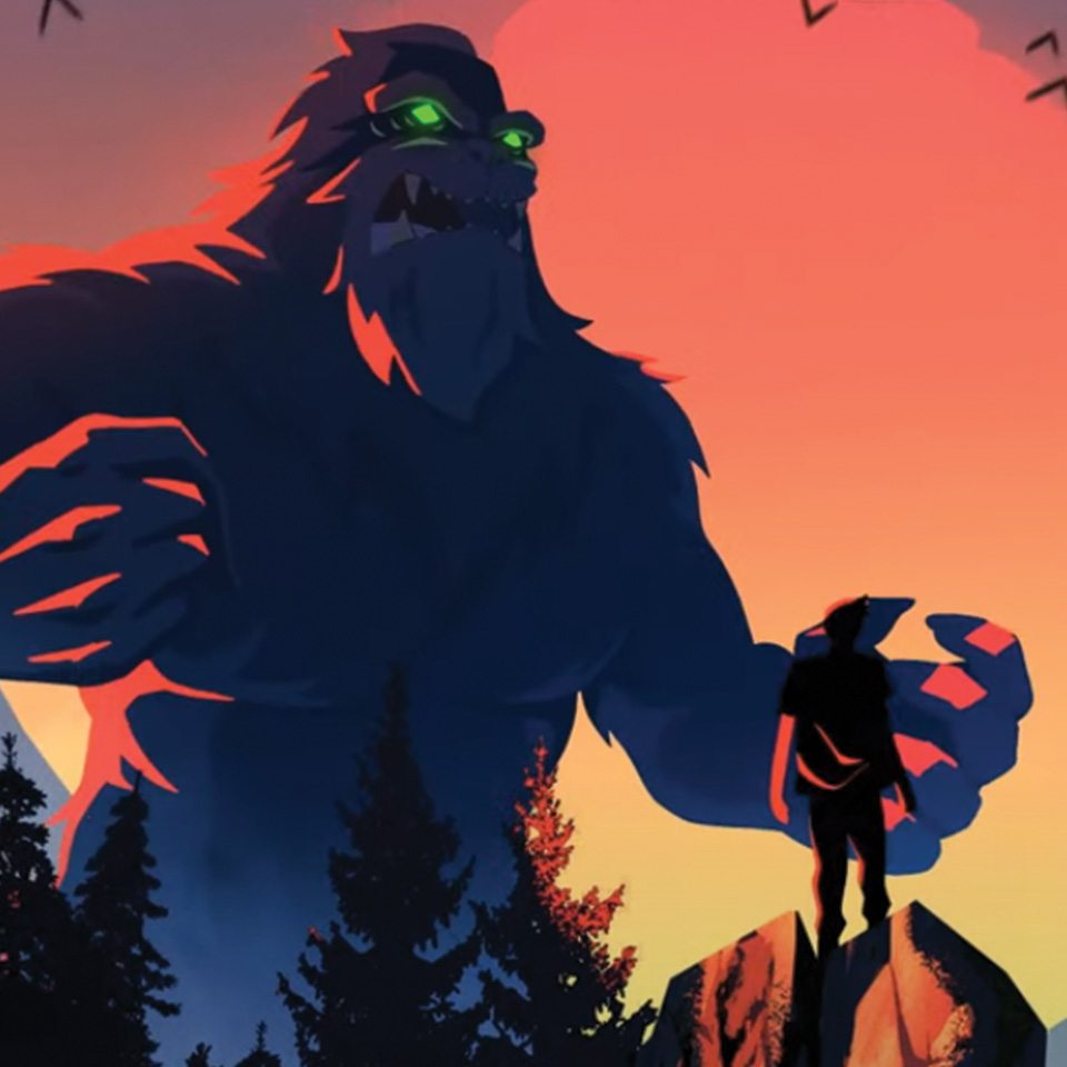
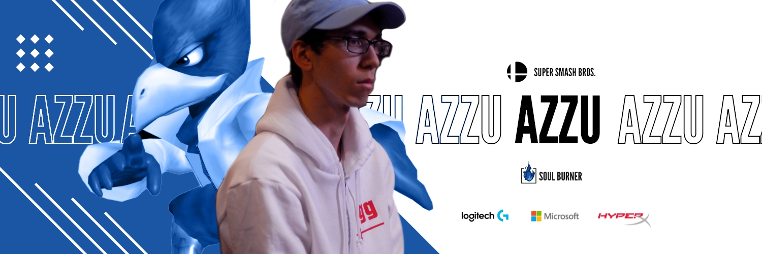
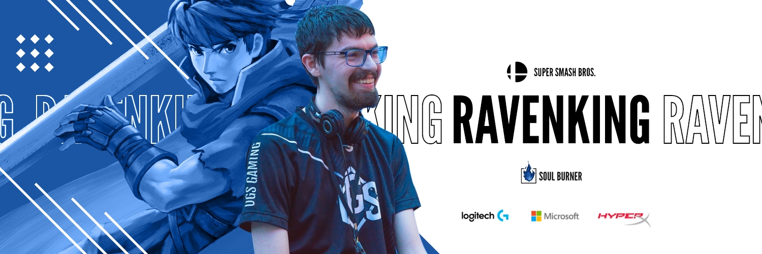
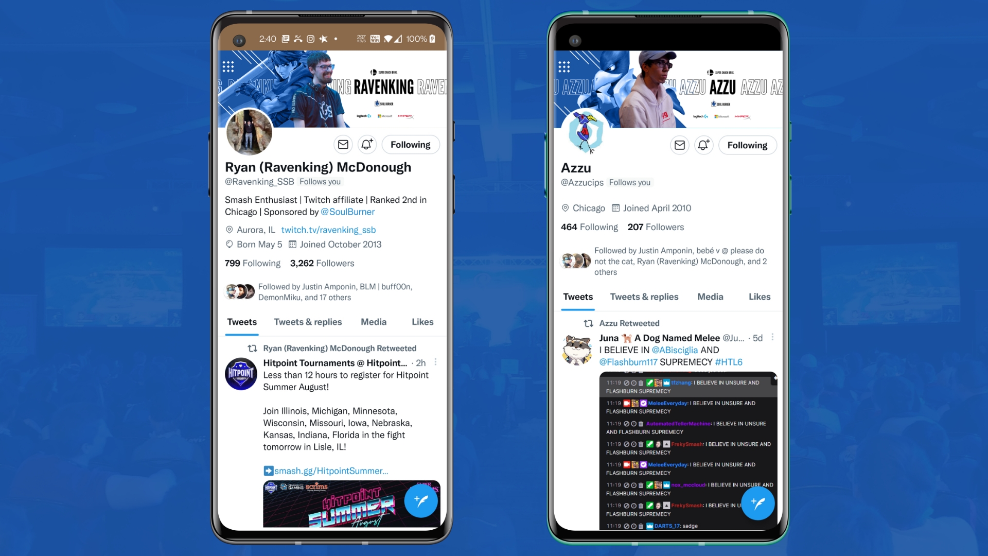
Here are some visual examples of what SOUL BURNER is all about. The image of the player should be in grayscale with Soul Blue stroke around along with their SOUL (usually a character/role they primarily play in their game of specialty) with the Soul Blue color filter tone.
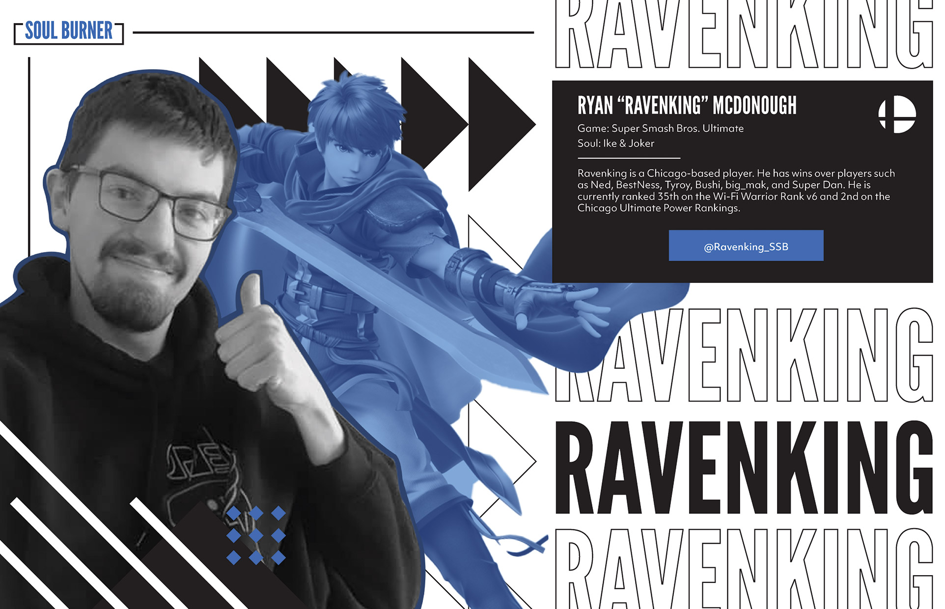
Fun Tidbits:

Azzu is my cousin, he is 4th of Arizona Melee Power Rankings & 12th of Chicago Melee Power Rankings in Winter 2019. RavenKing is a college friend of mine, he is currently 2nd of the Chicago Ultimate Power Rankings I received both their permission to use their photos of themselves as an example for Soul Burner

Brand Collateral

Social Media

Sketches

You can’t have an esports team without social media presence. Twitter is the best way to interact with the audience and also the best platform in the esports industry. Soul Burner highlights their team roster or player of their competitive progress for support. From winning, losing, match in progress, and even showing a video highlight of their performance. The team also promote their online monthly tournaments, merch, and updates of the company. Mockups is credited to Anthony Boyd Graphics , Free-mockup, & psdmockups.

Twitter Post

Social Media

Profile: @Azzucips

Profile: @Ravenking_SSB

Profile: Team

“You’ll get no sympathy from me. Welcome, @Ravenking_SSB ! #SBSMASH #SBFIGHT”

@Ravenking_SSB is just getting started! #SBFIGHT”

“FOR THE BLUE FLAME, @Ravenking_SSB is moving on to Grand Finals for Tripoint Smash 88! #SBWIN”

“GGs @TweekSsb, until next time Keep it up @Ravenking_SSB ! #reignite”

Packaging

Sketches

Sketched out the packaging on the shape and form for their attire and swag. I want to make the jersey specifically a special tier item for users who bought them with a pop-up display and a cut-in cover for the actual jersey.

Die Templates

Packaging

The jersey is a high-tier item to buy for users. It includes customization (ex. Azzu) and a luxary-like packaging with a pop-up display of the SOUL BURNER flame when users open the box

Inside

Outside

Support Tray, Cut-in, & Display Pop-up

Backpack

General Attire Box

Mouse Pad

Pin

3D Render Mockups

Packaging

Congratulations!

You Made it!