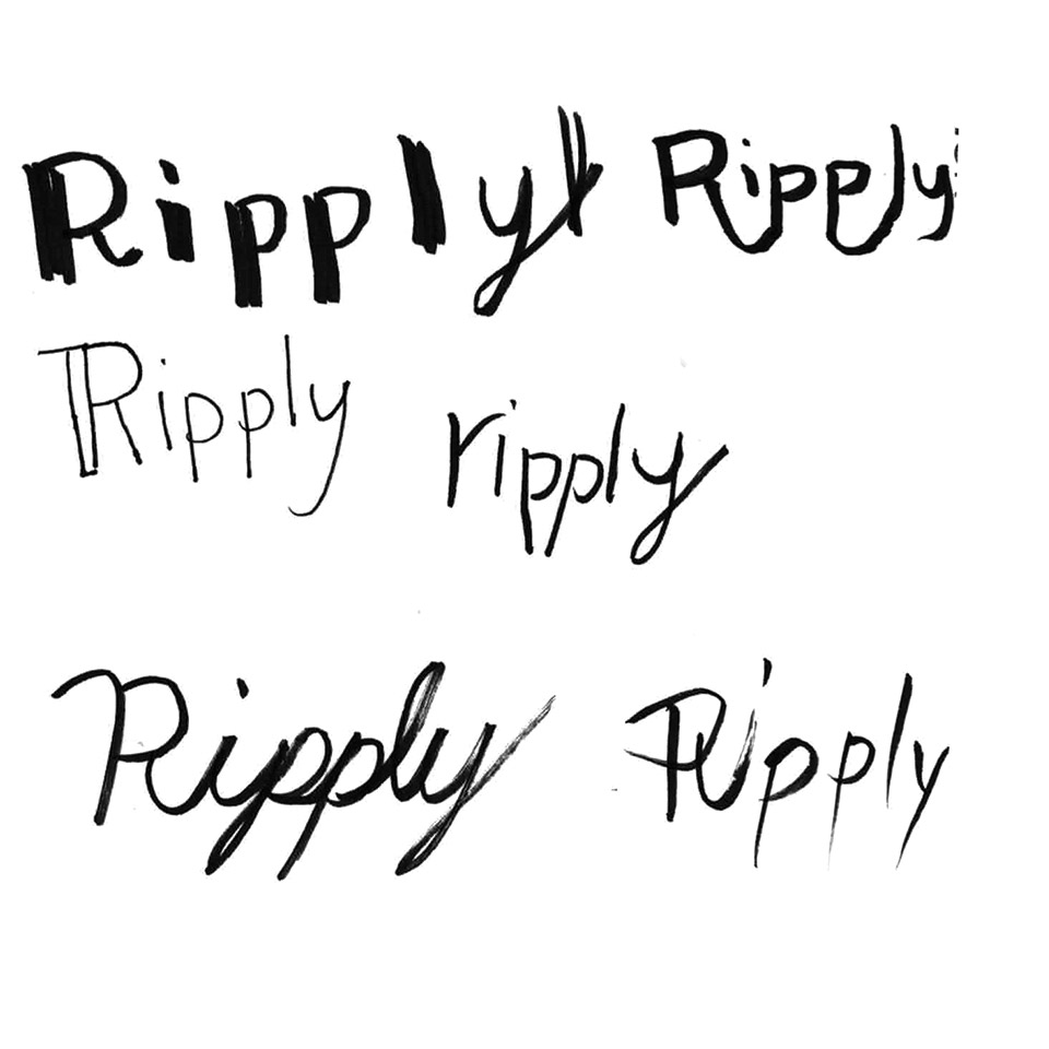
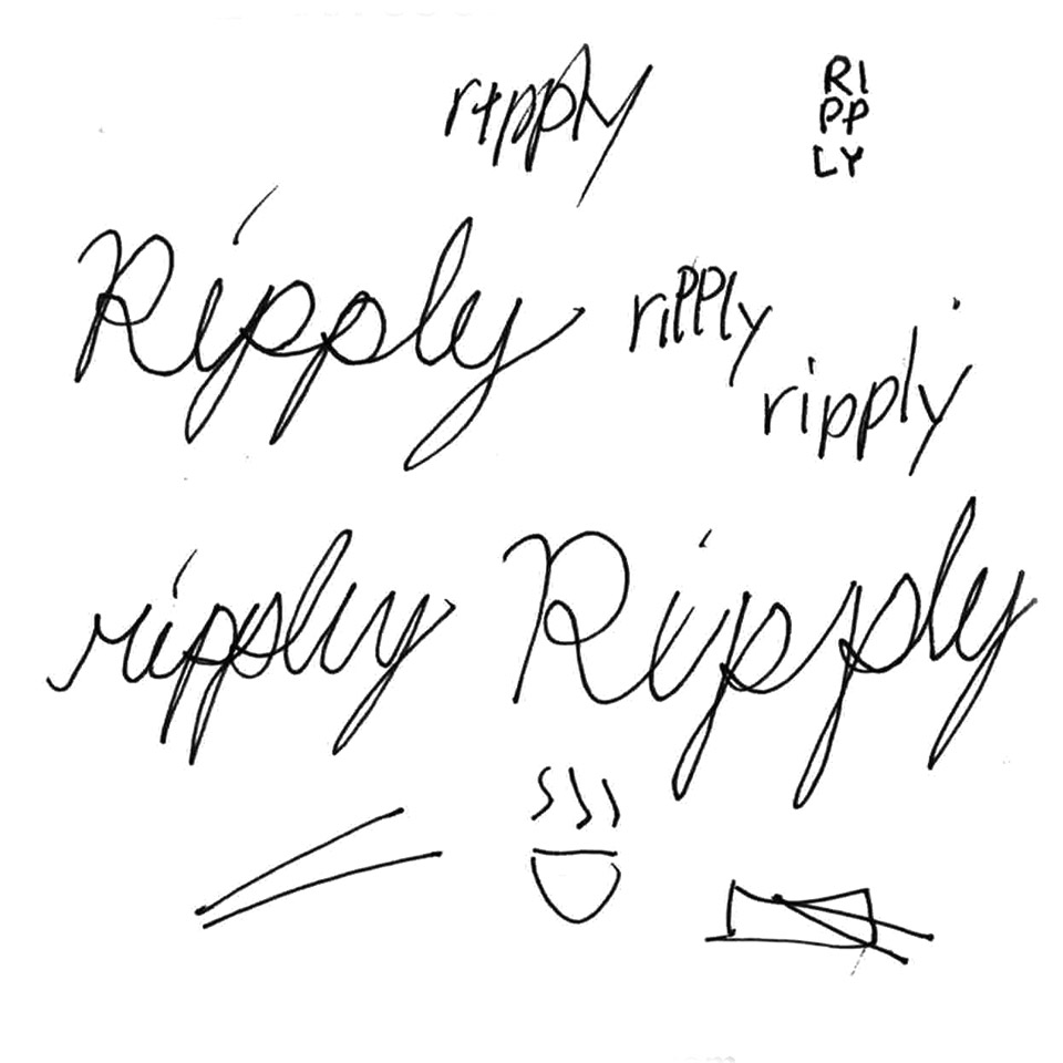
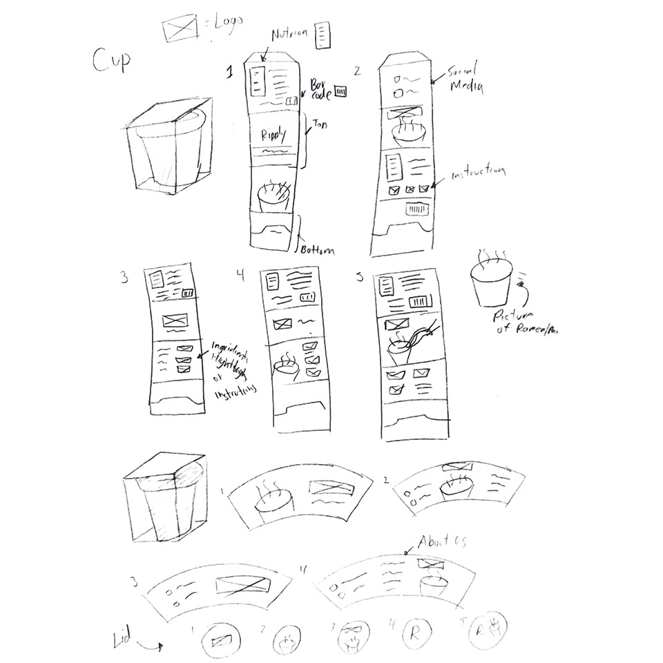
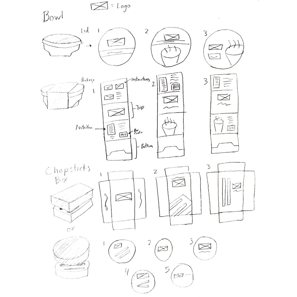
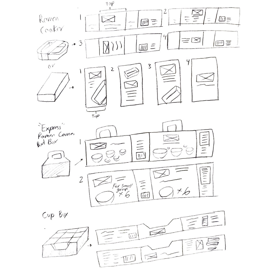
Instant Noodies

Instant food company that brings high-quality noodle soups to the world minus the hassle. They have a packaging lineup of instant noodles for retail stores and vending machines to enhance their brand and spread awareness for the diversity of high-quality noodle soups.

Thriving Taste

Instant noodle soup is good and convenient since it can be done by adding some hot water to the mix and you are ready to go. The problem is that most of the instant noodles out there are not filling because they are providing small portions for each pack and each of those packs contain low-quality ingredients. Ripley’s lineup of instant noodles offers high-quality ingredients that are handmade and enough to fill people’s stomachs. Ripply also allows users to taste different Asian cultures. Our primary target audience would be people who work a lot throughout their day whether they are teachers, construction workers, retail, designers, and more. Because after a long day of work, most people’s thoughts are relaxing and eating good food. The secondary target audience would be young students that enjoy instant soups but want to go for a new brand of instant foods since Ripply will also be in bookstores.

Programs Used

Adobe Photoshop
Adobe Illustrator
Adobe Dimension

Brand Identity

Sketches

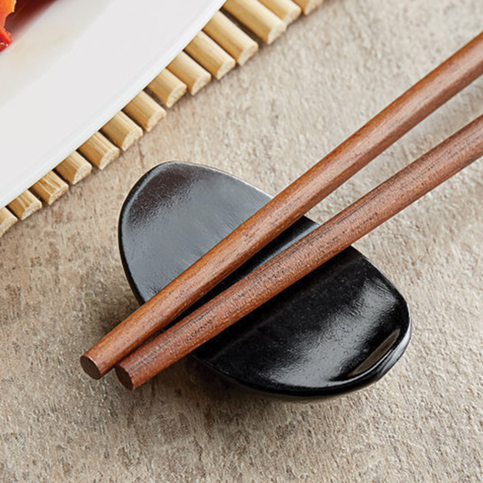
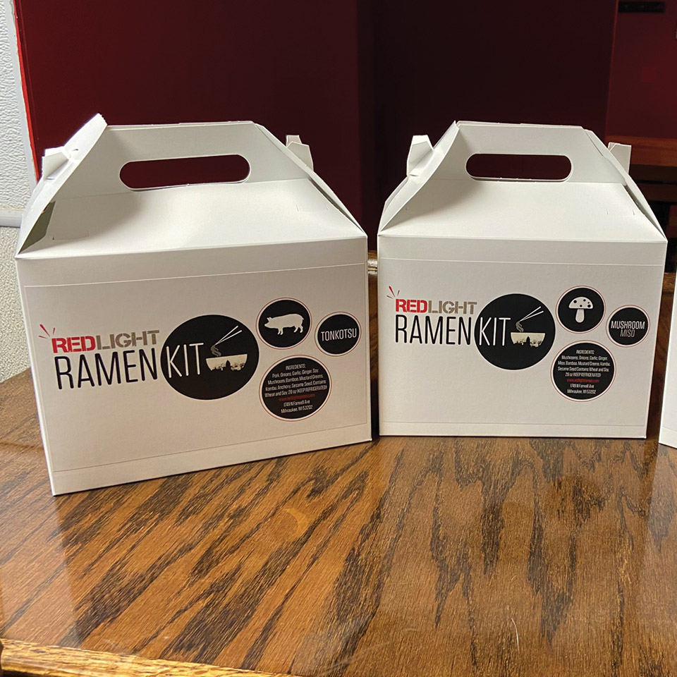
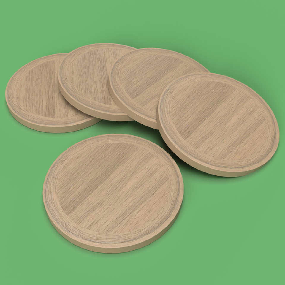
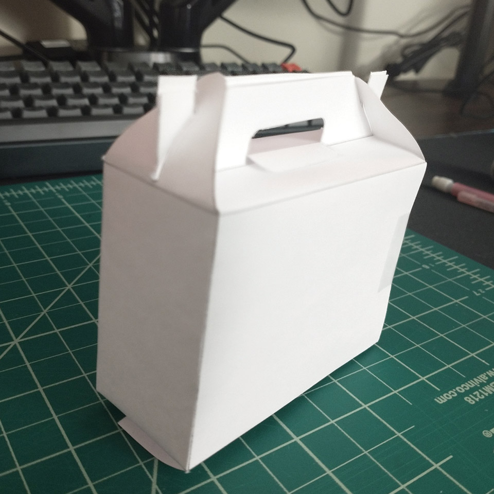
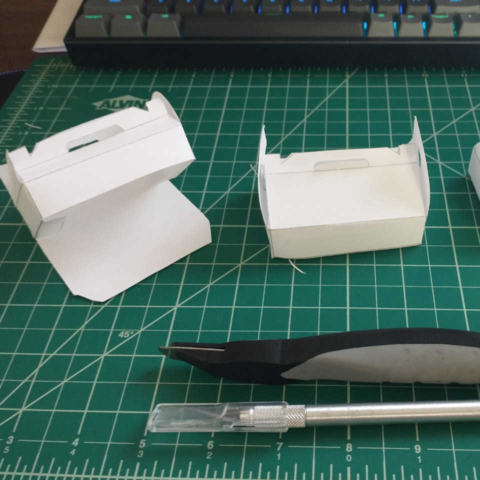
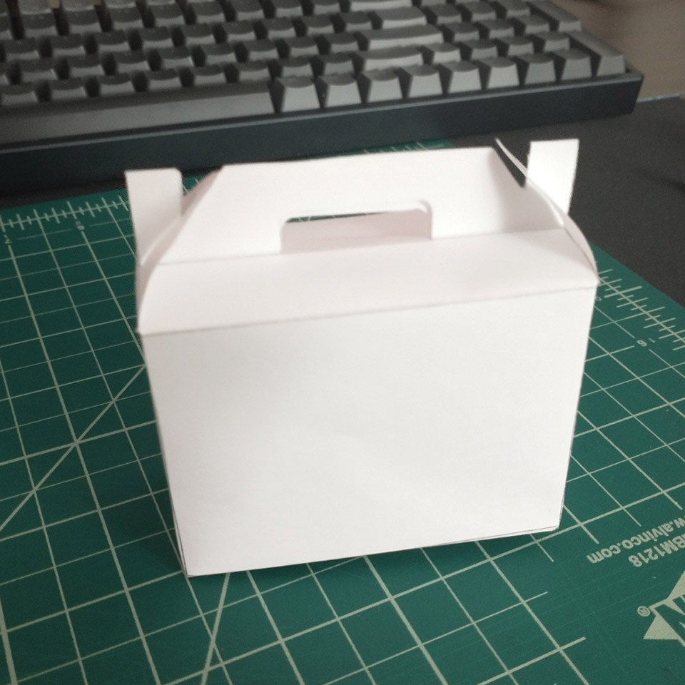
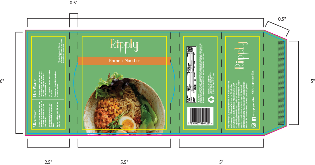
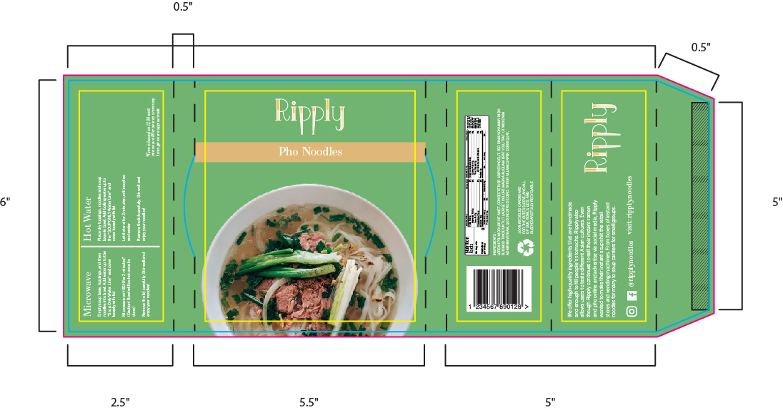
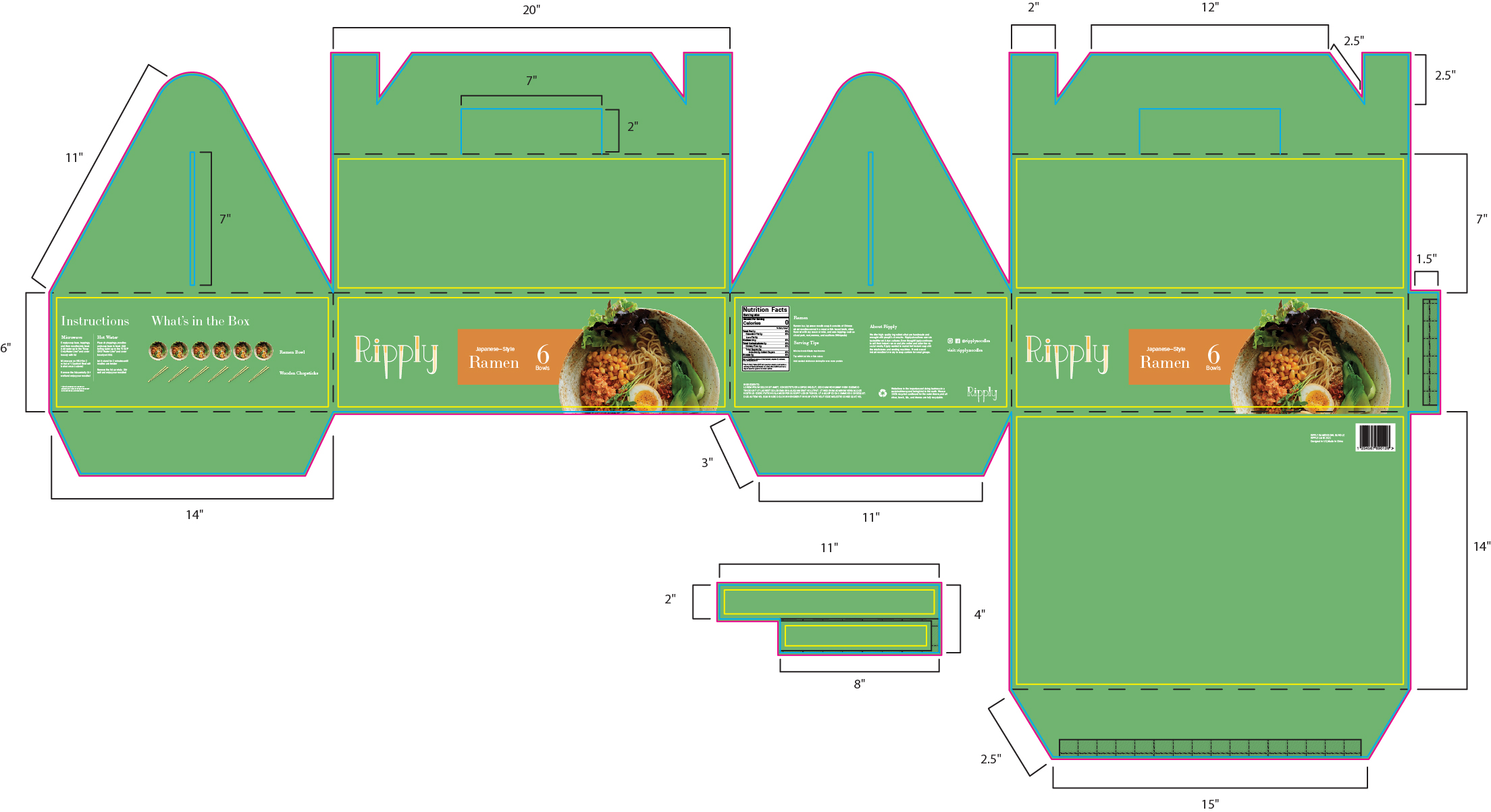
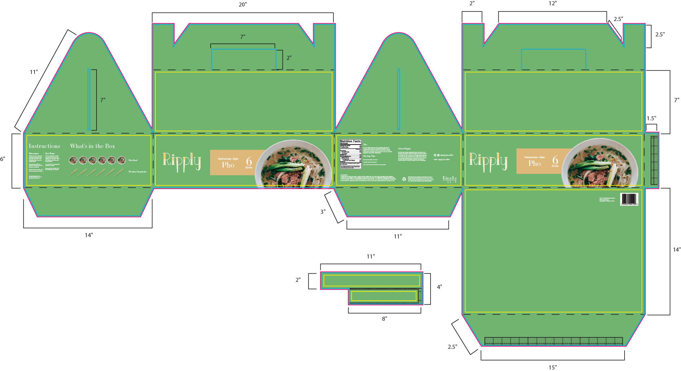
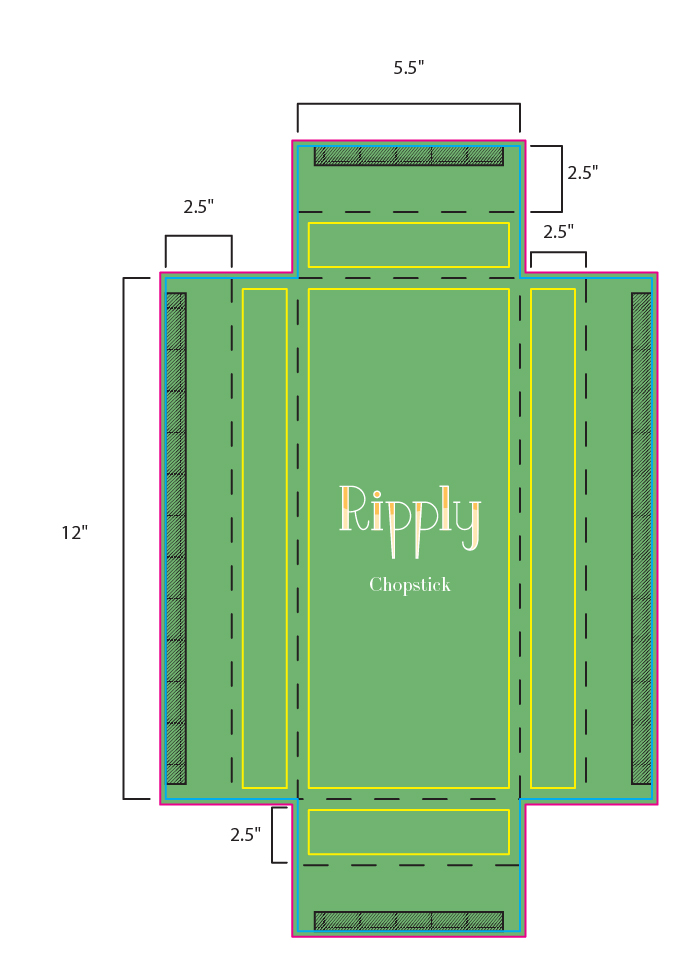
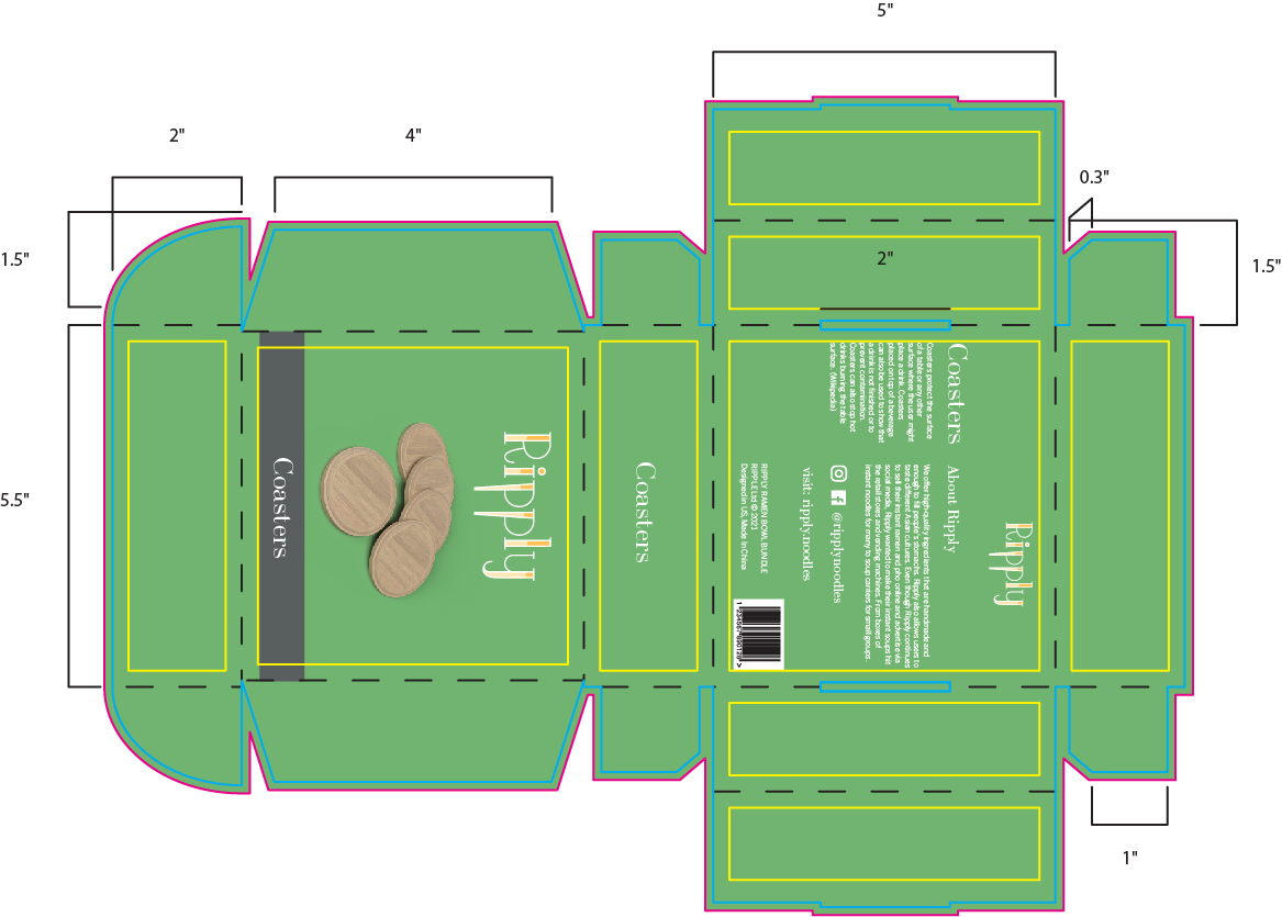
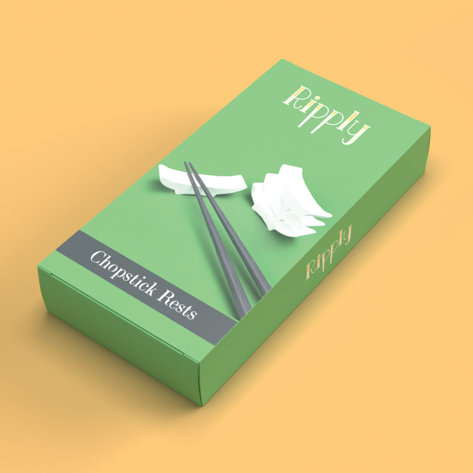
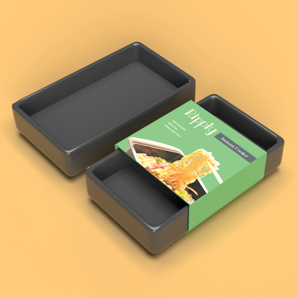
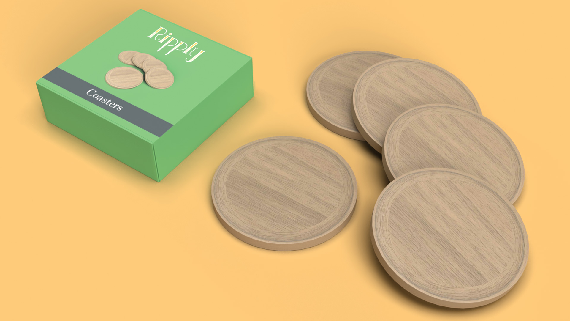
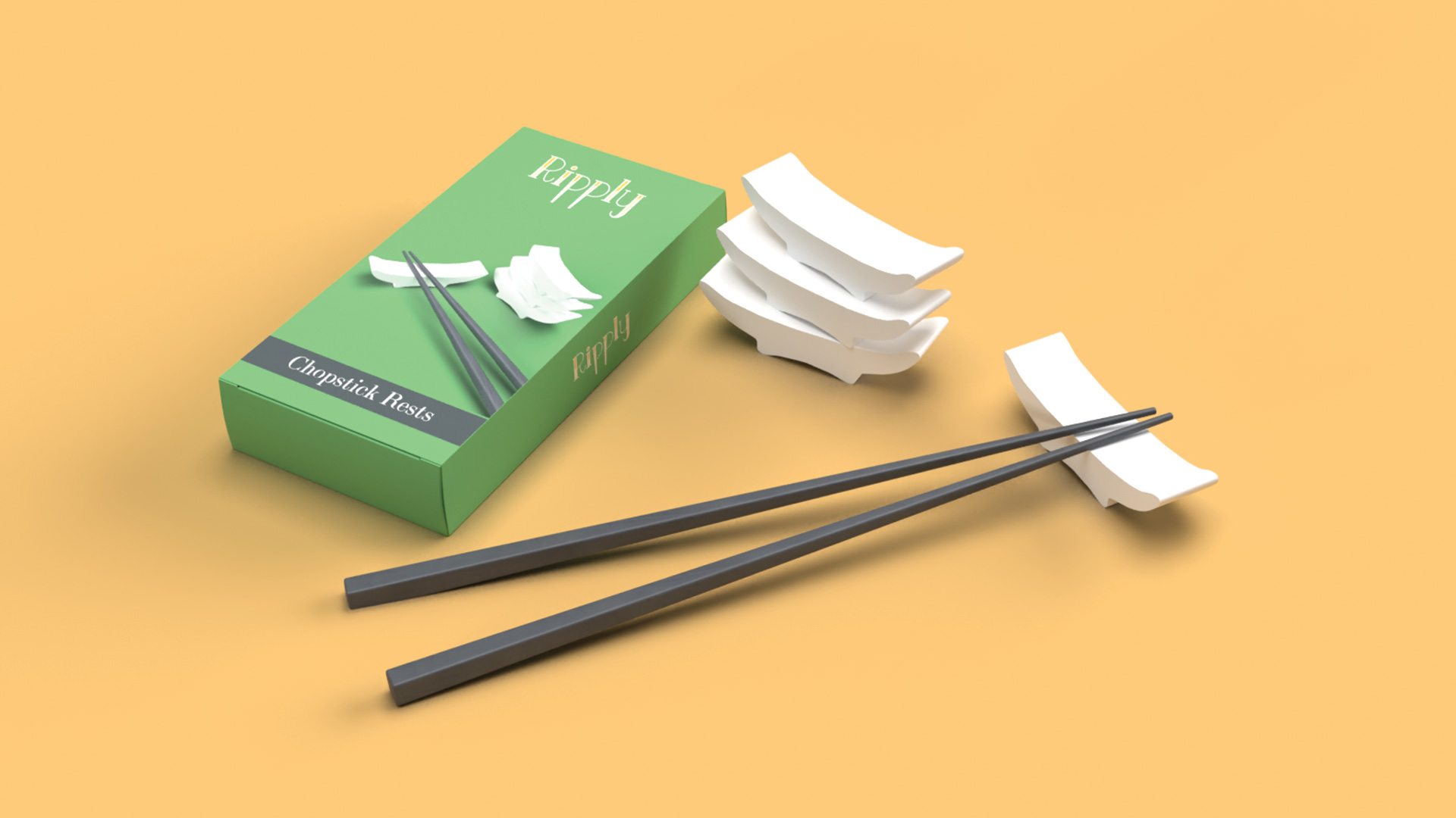
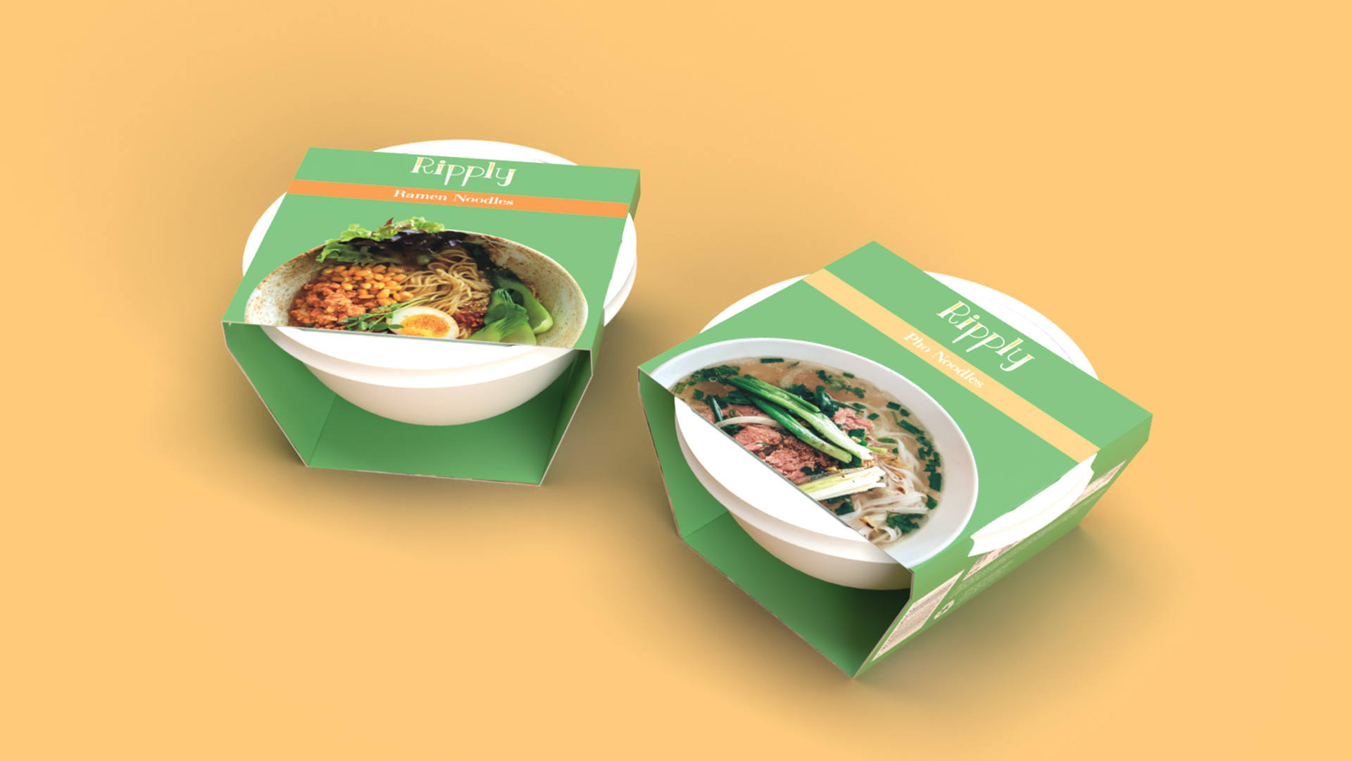
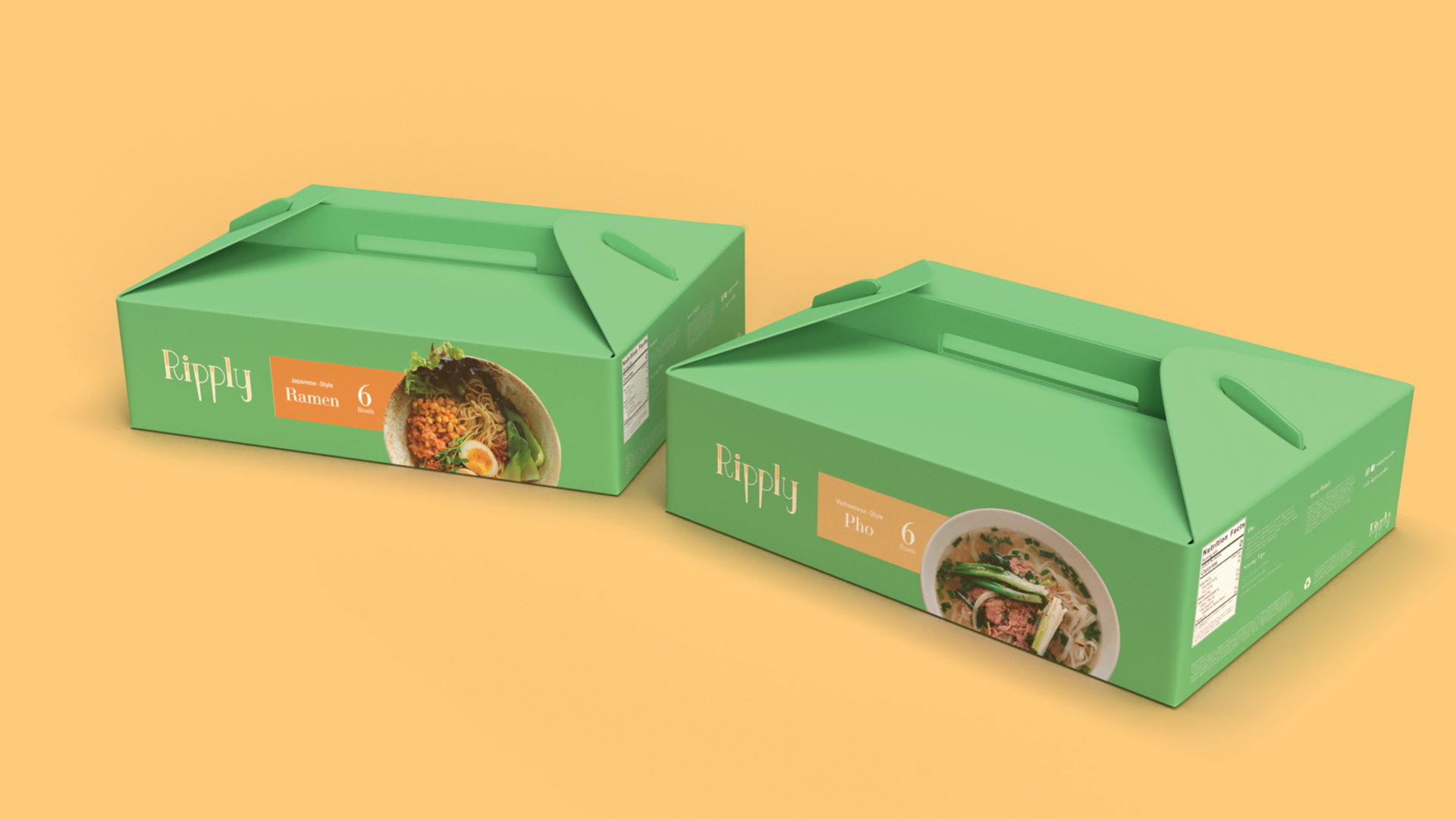
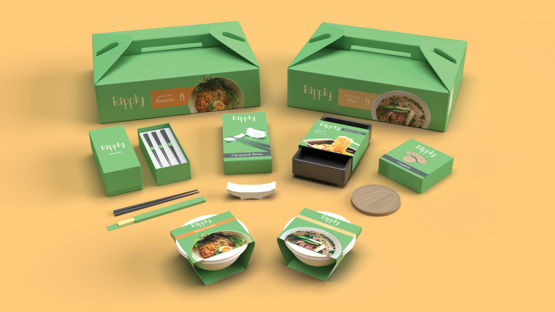
Ripply’s tone is comfortable and not loud. The tone makes you feel right at home since Ripply’s instant foods are handmade. The goal of Ripply to have a rich and elegant feel to stand out from the competition (Maruchan, Cup Noodle, Top Ramen). The packaging is your traditional line up such as the noodle bowl and the multiple bowl box (noodle bowl carrier) while having new additions to the lineup including premium chopsticks, coasters, chopsticks rest, and instant cooker. During the process, Ripply is going to have a lettertype logo with little or no illustrations for the logo or the brand guidelines itself. I sketched out hand letterings like cursive, serif, script, and san-serif. In the end, the direction is to have a hand-lettering serif with a wave motif to represent the ocean and the soup.

Final Design

Brand Identity

The serif lettering represents the precision of being handmade along and high quality with the tail being wavy like noodle soup. The single letter logo is used for very small spaces like social media and mobile app icon. The sticks on the “R” are chopsticks. The colors are represent as homemade and oraganic. The green, brown, and black are made for background colors. Yellow, Orange, and gray are for foreground colors and accents.


Lettermark Logo

Live Area = x/2, when x = width of the Lettermark Logo
min usage = 0.4” width


Symbol

Live Area = x, when x = Height of the Symbol
min usage = 0.2” width


App Icon

Google Play & App Store

Color Usage

Typeface & Colors

Brand Color 1

cmyk: 10/10/10/0
rgb: 226/221/219
hex web safe: #cccccc
pms (solid coated): 664 C

Brand Color 2

cmyk: 0/10/30/0
rgb: 255/230/179
hex web safe:#ffffcc
pms (solid coated): 7499 C

Brand Color 3

cmyk: 0/40/70/0
rgb: 250/168/98
hex web safe: #ff9966
pms (solid coated): 1485 C

Background Color 1

cmyk: 60/10/70/0
rgb: 112/178/118
hex web safe: #666633
pms (solid coated): 465 C

Background Color 2

cmyk: 0/20/60/30
rgb: 179/143/71
hex web safe: #333333
pms (solid coated): 532 C

Background Color 3

cmyk: 0/0/0/100
rgb: 35/32/131
hex web safe: #333333
pms (solid coated): Neutral Black C

LTC Bodoni 175 Pro - regular

Primary: Heading, Display, Page Titles

Trade Gothic Next LT Pro – Light

Secondary: Paragraphs

Trade Gothic Next LT Pro – Light Italic

Tertiary: Captions

Visuals


The visuals Ripply should beusing are photos of showcasing of their products or the items assiocated with their products whether its for display or someone using it.

Packaging

Sketches

During my time designing the wireframes and early digital mockups, the goal was to have all feature buttons on one screen but it ended up being too cramped on one screen. The early visuals of the UI were entirely different from the final version. The design theme and tone are set to be friendly, trusting and relaxing to look at. When you boot up the app, it will show you right away if you want to start using the flip switch in the middle “Charge Mode”, which is the switch to receive points while charging. When “Charge Mode” activates, your phone must stay put and can not leave the app. Charge Mode will turn off if the app is closed or interrupted. You receive points based on the duration of your charge. The longer the charging, the more points you will receive. Before and after using Charge Mode, an ad will be on display. The size model for the design is based on Android Devices such as LG V20 and Google Nexus 5.

Die Templates

Packaging

For the noodle bowl outer sleeve and the bowl carriers, they have a Ramen version and Pho version. The noodle bowl is stand alone item or in the carrier box. Recycled cardboard are used in every pacakging for Ripply especially for the Carrier and Noodle Outer Sleeve. They do not expect users to keep the packaging forever but recycle them and serve a different purpose.

Noodle Bowl: Ramen

Noodle Bowl: Pho

Noodle Bowl Carrier: Ramen

Noodle Bowl Carrier: Pho

Unlike the chopsticks that are wooden and wrapped with paper on the noodle bowls carrier, these chopsticks for this packaging are more premium. The chopsticks itself are fiberglass making them lighter weight than metal and more durable than wood. It is also rust resistant and dishwasher safe to maximize their usage for years. The packaging is a two-piece cover with a support tray to hold on to two sets of chopsticks that are made of double layered corrugated cardboard. It feels more premium and it is also recyclable too.

Premium Chopsticks: Top

Premium Chopsticks: Bottom

Premium Chopsticks: Insert Tray

This is an outer sleeve to cover up the instant cooker. To reveal part of the instant cooker pan itself. There is a large area where the adhesive is placed and connect inside the back of the sleeve. The coaster package is a mailer’s box style packaging that contains around six circle shaped coasters. Chopsticks rest are accessories that can be used to take off the chopsticks off the table by placing them on top to prevent them from rolling off the flat surface. The chopstick rest for Ripply is an upside down arc-like shape that’s wide. That’s enough room for a set of chopsticks to lay on. The chopstick rest is made of ceramic.

Instant Cooker

Chopsticks Rest

Coasters

3D Render Mockups

Packaging

Congratulations!

You Made it!